• 1241373-gf

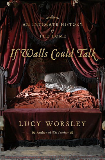
    Just finished Lucy Worsley's If Walls Could Talk, a social history of various rooms of the house, in the vein of Bill Bryson's recent At Home : A Short History of Private Life. Worsley has a unique perspective, being chief curator at Historic Royal Palaces, where she is surrounded by living-history re-enactors, and has in fact actually done many of the things she talks about here: blacking a range, carrying the hot water to fill a bathtub, sleeping in a Tudor bed, and so on. Her book is rather light, I thought, and such an easy read that I finished it in about two days of not-particularly obsessive reading, which lightness I found something of a disappointment, but she has some very interesting things to say in her afterword, that history seems to be circling back on itself where houses are concerned. Because of dwindling energy supplies, natural fuels and methods of house construction are returning — chimneys for both heat and ventilation, thicker walls and smaller windows, shutters, natural building materials, earth toilets — and design is also, perhaps unconsciously, looking to the past in its return to multi-purpose rooms. Town planning, too, is looking to the past, with the increase in walkable communities with their mixture of residential and commercial, high- and low-income. And she makes an interesting point about these last, that separating the rich and the poor can be argued to have disastrous social consequences, that it benefits everyone to have, as she calls it in relation to a place like Hardwick Hall, "a common endeavour". "We don't know enough about our neighbours, and the dwindling of natural resources which have fuelled our way of life since the eighteenth century will force us to change and to share more fairly both the work and the reward."
    1041855

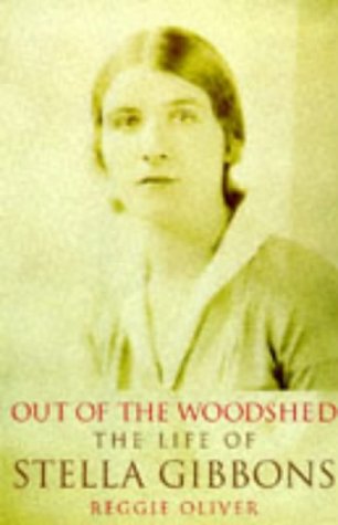
    As part of my recent discovery of Stella Gibbons, I have been reading the biography of her by her nephew Reggie Oliver. I discovered somewhat accidentally Gibbons's 1938 novel Nightingale Wood, as I was trolling about at Amazon looking for free Kindle titles — although Nightingale Wood was in fact a purchase, it sounded too fun and interesting to pass up, and I'm glad I did, for the moment I finished it I turned around and read it again, so charming and funny and perceptive it is. It is an unashamed re-take on the Cinderella story, complete with poor yet naïvely optimistic heroine, handsome prince, "ugly" stepsisters, and fairy godmother, yet all of these are at once both recognizable and turned on their heads — Viola is amiable but unimaginative, Victor (the prince) is handsome but not a little shallow, and one of the sisters, thirty-five and feeling desperately unloved, has a crush on the much-younger chauffeur. I must admit that this last storyline was the one that caught my imagination the most, since being of course a Cinderella story we already know that the heroine will get her prince, but not how the other storylines — and there are a number of them — will go, and having been one myself I tend to be especially sympathetic to such Unclaimed Treasures as Tina. What I appreciated most about the book was that Gibbons kept me not only laughing out loud at times but on tenterhooks wondering what was going to happen — and all I will say about this is "yes, and no!" — and that she manages to give even her unlikeable characters moments of real sympathy.

    5357813

    I have just started reading Jonathan Bate's Soul of the Age, which he pointedly subtitles "A Biography of the Mind of William Shakespeare", and so far at least he is refreshingly judicious and non-speculative about the lack of concrete evidence about Shakespeare's life. (I'm still astounded by Anthony Holden's blithe assertion that Anne Hathaway was homely. Is there even circumstantial evidence for this?).  I suppose that Shakespeare, being Shakespeare and in that respect utterly unlike literally anyone else, deserves equally unique biography, and I am certainly of two minds in the works-as-autobiography school of thought (remind me to speculate about this in respect to Stella Gibbons, in fact), but with Shakespeare, Bate is making eloquent and convincing arguments that there is much to be gleaned about the man from the works.

    I've also got from the library Patricia Meyer Spacks's new book chronicling her year-long project of re-reading various novels, from childhood favorites to canonical works she feels she should have liked but didn't and "guilty pleasures". I so enjoyed Anne Fadiman's collection of essays by various writers on the same subject that I am looking forward to Spacks's musings. (But, rather ironically, I notice, for a book that one actually might want to re-read in itself, there is no index for you to find Spacks's thoughts on, say Pride and Prejudice or Dickens or in fact any one of the innumerable Bertie Wooster stories, which though Spacks considers one of her "guilty pleasures" I adore quite openly and unashamedly.)
    Bestway907a

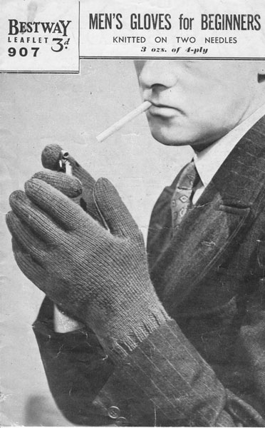
    For the D.E. Stevenson list, we have just finished reading Crooked Adam, Stevenson's 1942 spy thriller — yes, spy thriller! an unusual departure for Stevenson, yet recognizably her usual brand of gentle humor and romance. Here, a crippled schoolteacher, the "Crooked Adam" of the title, discovers a plot to steal the plans for a scientific invention that could Change the Course of the War. I must say that for me this is obviously a D.E. Stevenson novel — it certainly has her light touch with dialogue — but is not perhaps one of her best efforts. I wonder how long ago it became a cliché to have villains who love to hear the sounds of their own voices, who end by wrapping everything up for the hero and the reader because they can't stop talking about how they did it. Well, for my "Stevenson Knitalong", I've chosen the above 1940s pattern (via The Vintage Knitting Lady), for its usefulness in chasing Nazis across the damp Scottish hills, as well as for the photograph's not-a-little sinister look of half-seen smokers!

  • 478px-Meister_des_Halepagen-Altars_001

    Someone on the HistoricKnitting list posted this today, surmising that the woman's cap is knitted.  The pleats could have been achieved in fabric, of course, but the edge does look like a cast-on.  The top, too, looks like a straight tube that has been folded and sewn (or knitted) together. 

    I wonder if there is a back view of a similar cap in something by Bruegel or Hieronymous Bosch …?

    Master of the Halepagen Altar, "Double Portrait of a Praying Couple" (c.1500).

  • Gee’s Bend Fail

    Gees medallion variation

    I bought this Gee's Bend "Medallion Variation" quilt kit from Windham Fabrics at Tuesday Morning a while back for about a third of the sticker price.  The quilt, I think that anyone who knows me, or perhaps even reads this blog much, is not my usual choice of colors, but something about its graphic boldness appealed to me.  What I wanted, too, was a hard-working quilt that would go camping or picnicking, and be not only hard-wearing (i.e. not show stains!) but bright and cheerful.

    I was expecting the fabrics to bleed a bit upon washing — they're hand-dyed, okay, there is a warning on the label that they'll bleed, "but they all [rinse] clear in most cases after one or two wash cycles" — so I kept notes, curious about how the fabrics would behave.

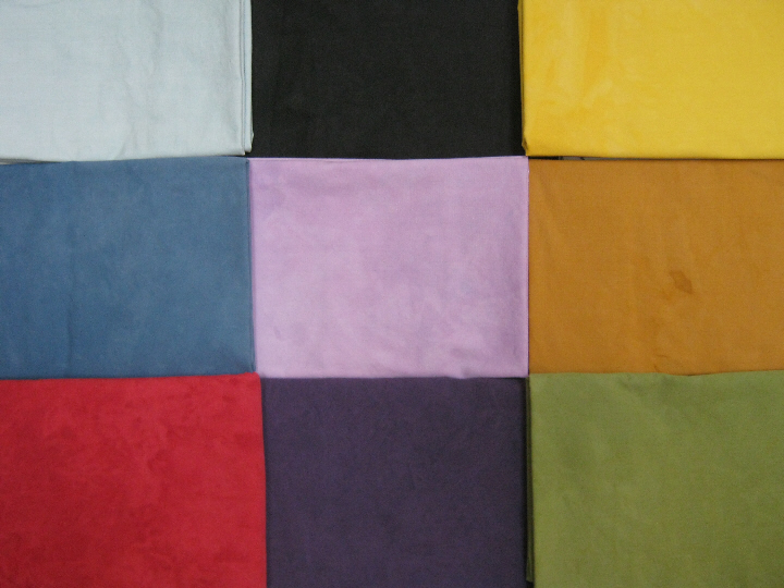
    These are the nine fabrics before washing,

    2238

    and after,

    2877

    All of the colors bled a bit, but with only a small amount of bleeding in the yellows and the lighter green and purple, a fair amount in the black and purple (which both bled reddish tones, curiously), and quite a lot in the medium-blue, which strangely bled reddish-purple, and the red.  Obviously, the red dye is the least stable by far.  But the red piece would not stop bleeding.

    It was not clear from my initial research — nor from the pre-washing instructions that came with the quilt kit — that there is a difference between Retayne and Synthropol.  I decided that I didn't want to use Retayne, because it contains formaldehyde, and I think the less of that stuff around, the better, so I bought a bottle of Synthropol, as well as a box of Shout Color Catchers, also recommended.  In fact, I learned later, Retayne is for setting the dye, and Synthropol is for keeping the loose dye from attaching to other items in the wash (e.g., the other fabrics in the finished quilt).

    I went through the entire bottle of Synthropol, perhaps eight washings, with absolutely no effect on the bleeding whatsoever.  I then heard that top-loading washing machines are much better at extracting loose dye from fabric than front-loaders such as my new and gentle LEG washer, so I schlepped the fabric over to my mom's and washed it in her top-loader.  Repeatedly.  Over a series of weeks.  I've now gone through all 24 Color Catchers, with no improvement.

    2883

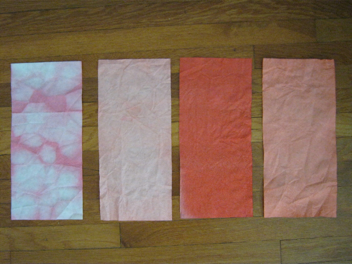
    By the way, the instructions on the Color Catchers to put the sheet in a lingerie bag if you have a front-loader machine are bunk.  Here is what you get with the sheet in a lingerie bag (far left) and with it loose in the machine (the other three) — and remember that you want the sheet to come out with more stuff on it, because that means there is less of the dye on your other clothes!  The dark sheet is one of those that went through the top-loader.
    I heard that soaking with vinegar and salt and very hot water, not just for an hour or so but overnight, will do the trick.  Not on this stuff!  The water in the dishpan the next morning was only slightly pink, and I thought "oh, that's done it at last!" but upon washing in my usual gentle cycle warm-wash cold-rinse, the white cloth tester was as pink as usual.  The sheet on the far right is in fact after the vinegar/salt bath, which instead of setting the color actually seems to have loosened it even more.
    So, yeah, this piece of fabric has gone through at least FORTY washes, perhaps a third of those in a top-loading machine, in various permutations of Synthrapol, vinegar, salt-and-vinegar, and detergent, with almost no decrease in bleeding.

    David was very snarky this week — said, "Honey … I admire your determination … but it's time."  Twice.

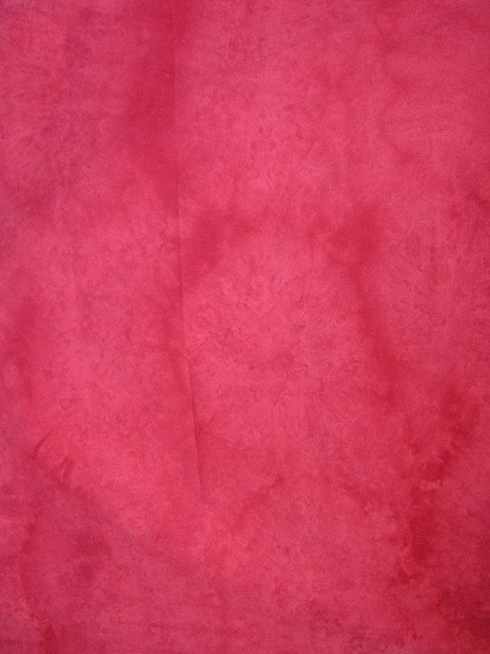
    Red

    It's more obvious, with so much of the unstable dye gone, that it has this "hand-dyed" effect, which by now looks almost like batik.

    I suppose I should not be surprised a) that the kits were at Tuesday Morning, which is, yes, for stuff that didn't sell retail, or b) to find that Windham Fabrics has since "archived" this color.

    Not sure what I'm going to do yet.  Toss it all out in disgust?  Use the pattern with non-"artisan" fabrics?  Keep trying??

  • Genius

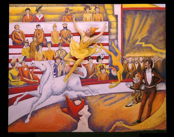
    We went to see the Pageant of the Masters in Laguna Beach last night — I had in fact never been.  If you've never heard of it, it is an annual production of tableaux vivants, recreating works of art through elaborate sets and costumes.  The theme this year is "Genius", exploring, as the website puts it, "the fascinating and unpredictable relationship between art and technology with a cavalcade of masterpieces illustrating how breakthroughs in different fields have also altered the path of art history and the way we see the world".  "!"

    Genius?  There is certainly a surreal meticulousness about the whole thing, and I must say it was fascinating to appreciate the illusion.  I enjoyed it very much, though I almost wish we'd forked out for the $100+ seats (almost), as viewing it through binoculars from the middle of the side seats, which those glasses-wearing members of our family had to do, was certainly not as remarkable as the full effect, I'm sure.M6penv-b78955392z.120120705130321000g7118js3u.1
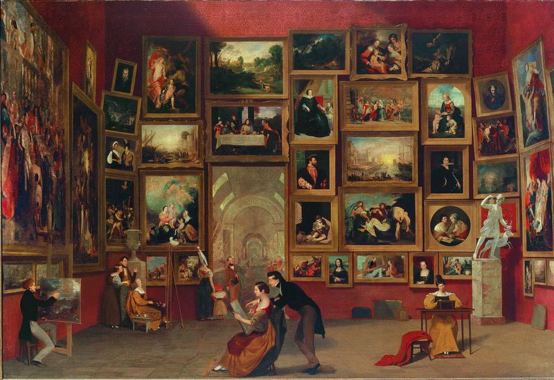
    "Gallery of the Louvre" (detail)

    Gallery of the Louvre

    and the real thing, the painting by Samuel F.B. Morse.

    05 FollowFinal_LeCirque-thumb-580x455-31898

    Follow04_LeCirque

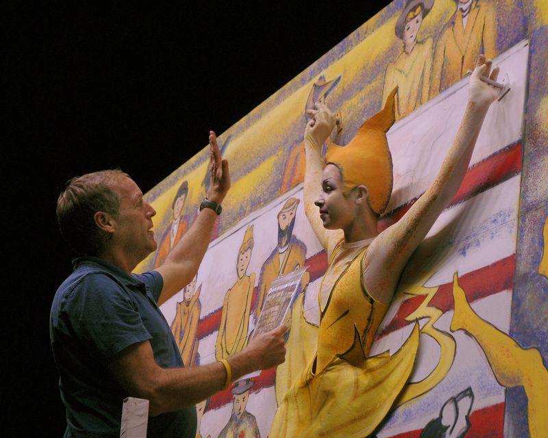
    Seurat's "Le Cirque", with another angle so that you can see how it's done.  Many of the performers are actually poking the upper parts of their bodies through the painted set.

    06 Manet_MusiciTuileries

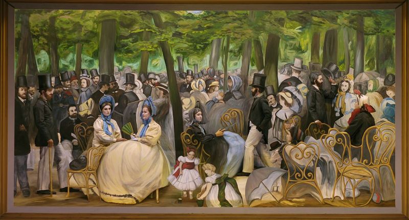
    Manet's "Music in the Tuileries Gardens".

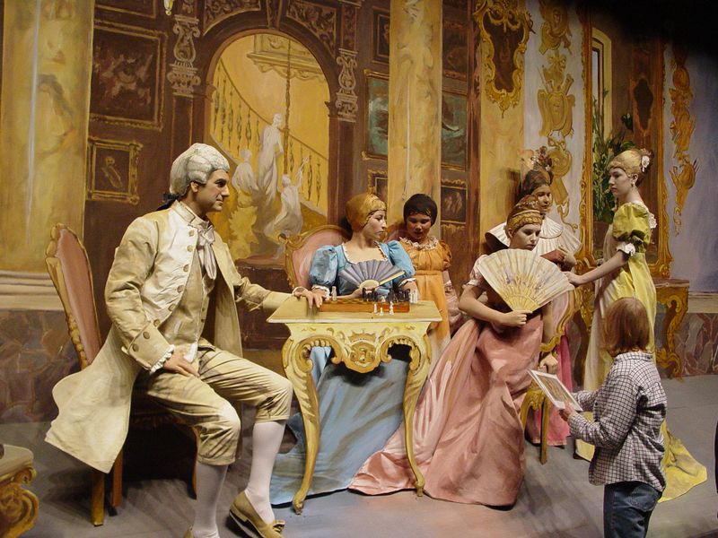
    I was almost more intrigued by the illusion than by the end result, and found myself this morning collecting those photographs that show the slight tweaking of the illusion by the less-than-straight-on angle.  (The links under each are to the source of the photograph, all newspaper press releases since there is "no photography allowed" during the performance".  I chose large images so that you can click on them to see much more detail, though there are lots of other interesting professional-photographer images out there.)

    Chessgame071

    Beda's c.1880 "The Chess Game", from the 2007 Pageant.

    06.pageant2.0703.lo_

    Don't know this picture, apparently from the year they did fairy tales …

    Moon Viewing over Sarashina Rice Fields (1891) by Yoshu Chikanobu

    POM-Moon_Viewing

    "Moon Viewing over Sarashina Rice Fields" (1891) by Yoshu Chikanobu, real and tableau.

  • Koppor

    There is a lot about genealogy that is amusing — beards, bits of graffitti in church-books — but equally there is a lot that is quite sobering.  Koppor is the Swedish word for smallpox — the priest has marked here each smallpox death with an O.  You don't need to know much at all about smallpox to realize the devastation it must have caused in a country parish like this, that almost all of the deaths were for children under ten years old, most much younger than that.

  • ,

    Tie Dye

    The theme for our Girl Scout Day Camp this year was of course the one-hundredth anniversary of Girl Scouts in the United States.  We did a different decade each day — Tuesday was the 'teens, Wednesday the Forties (we made a no-bake ration cake), and Thursday was the 1970s.  We made tie-dyed bandanas that day, and there was enough dye left over to bring home the leftovers and do some more stuff ourselves.

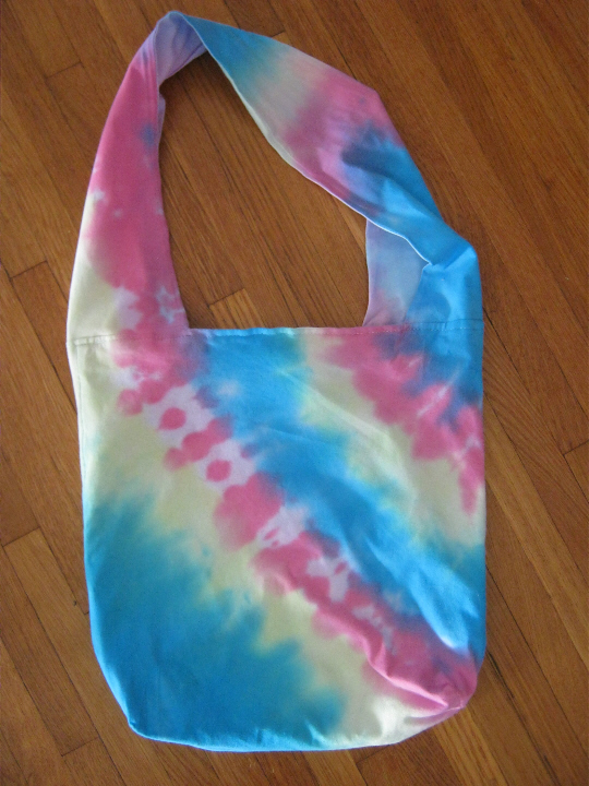
    I got a couple of "hobo bags" from Michaels as well as some t-shirts.

    Tie dye 1

    The bags are from Simplicity, only a few dollars so they're not super-fancy, but are fully lined (cotton knit on the outside, cotton muslin on the inside) with a large pocket divided in two on one side.

    Tie dye 2

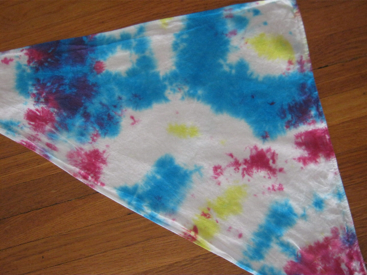
    The bandanas that we did at camp were a kit with triangular bandanas, wash, pre-soak, and yellow, red, and blue dyes.  Julia, though often so meticulous about her art, did this random tie with equally-random splotches of dye.

    Tie dye 3

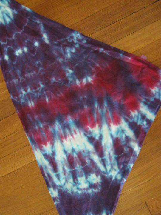
    Laura pleated hers before tying.  It was so black when we brought it home in the Ziploc bag that I did not have much hope for it by the next day, but quite a lot of the blue rinsed out, leaving this wonderful purple with a surprising and very cool red streak.

    Tie dye 4

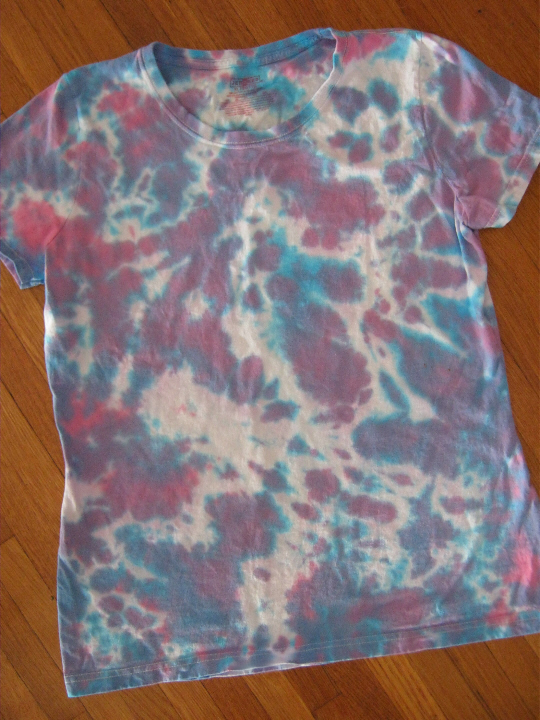
    I was hoping for the same dark-purple effect on the t-shirt later, but despite also being 100% cotton the fabric took the dye much differently, and much more of the dye rinsed out.  This was a sort of scrumble-tie, just gathering it all up into a kind of disc shape and tying across with the rubber bands.  It is still fascinating to me how differently fabrics take the same dye, as well as the different effects you can get with the same tying method — the bag at the top is also pleated-and-tied.  Maybe the pre-soak also had some effect on the bandanas, keeping the colors so much brighter?

  • 2867 small

    I'm not knitting much, I'm afraid, though this project has been great for these first few weeks of summer — a cowl/neck scarf in Noro Sekku — as it is small, portable, and completely memorized.  I stuck it in a Ziploc bag and took it with me to Girl Scout day camp, and at lunch time actually managed to knit a round or two every day before our girls wandered back and said, "What are we doing this afternoon, Miss Jeanne?  Ooh, what's that?  Is that knitting?  I wish I could knit!"  The colors are much more vivid in real life — I'll try to get a better picture when it's finished.

    (Yeah, it's Noro.  When I came home with it a few months ago, David said, "I thought you were never ever going to buy Noro again!"  Well, what can I say?  The colors are fascinating.  I still don't like knitting with it.)

    I've been reading much more than knitting.  Yes, that's a Kindle — I finally succumbed.  I looked at all of the yellowing classics on our shelves one day, and thought, "I suppose I could get a Kindle and have all of these in less than an inch of shelf space."  I've been downloading freebies like a wild thing since then — P.G. Wodehouse, Mrs. Gaskell, Jane Austen.  I confess that a few purchased ones have made their way across the ether to me as well — this one is Edith Pargeter's The Brothers of Gwynedd, after I found that you still can't get the Brother Cadfael series in e-books.  I'm a little vexed with some of the features of the Kindle — don't like the font and that you can't change it, don't like that you can't flip pages fast when you're looking for a particular spot (mine at least often gets stuck in a circle of three pages, and just goes round and round those three) — but it's still amazing enough to me that you could have hundreds of books in one little place that I'm still happy.

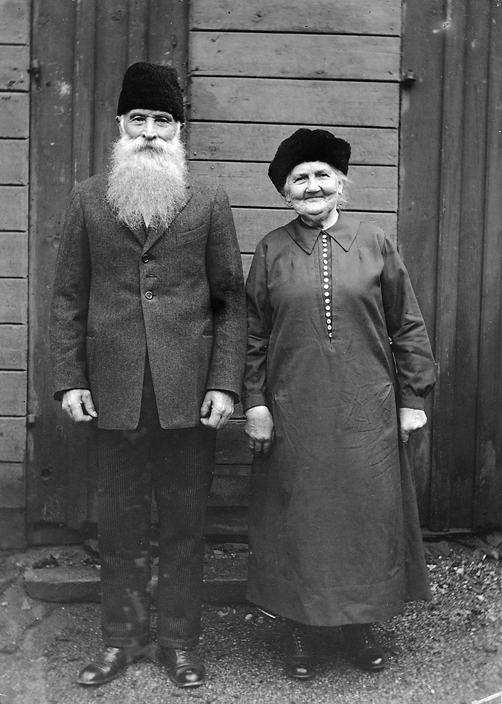
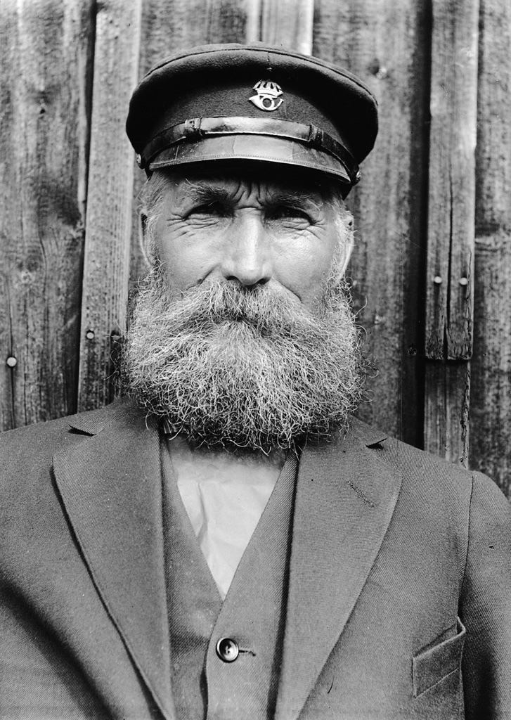
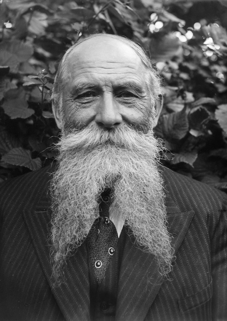
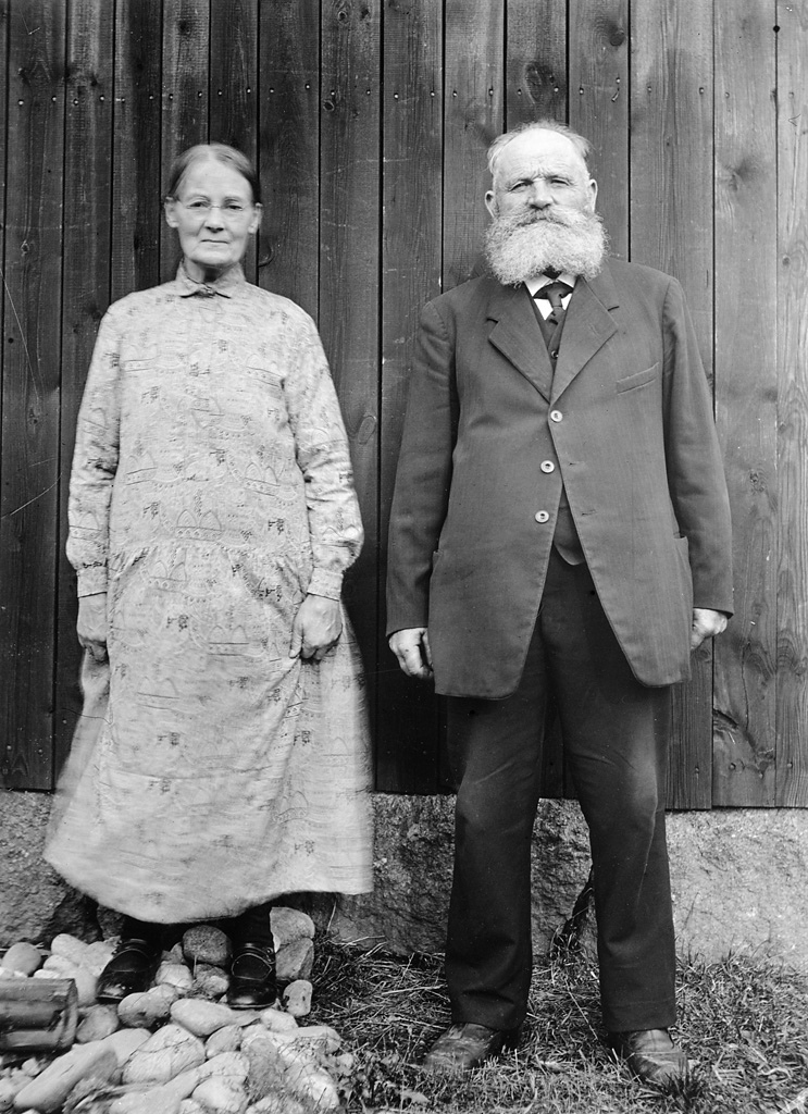
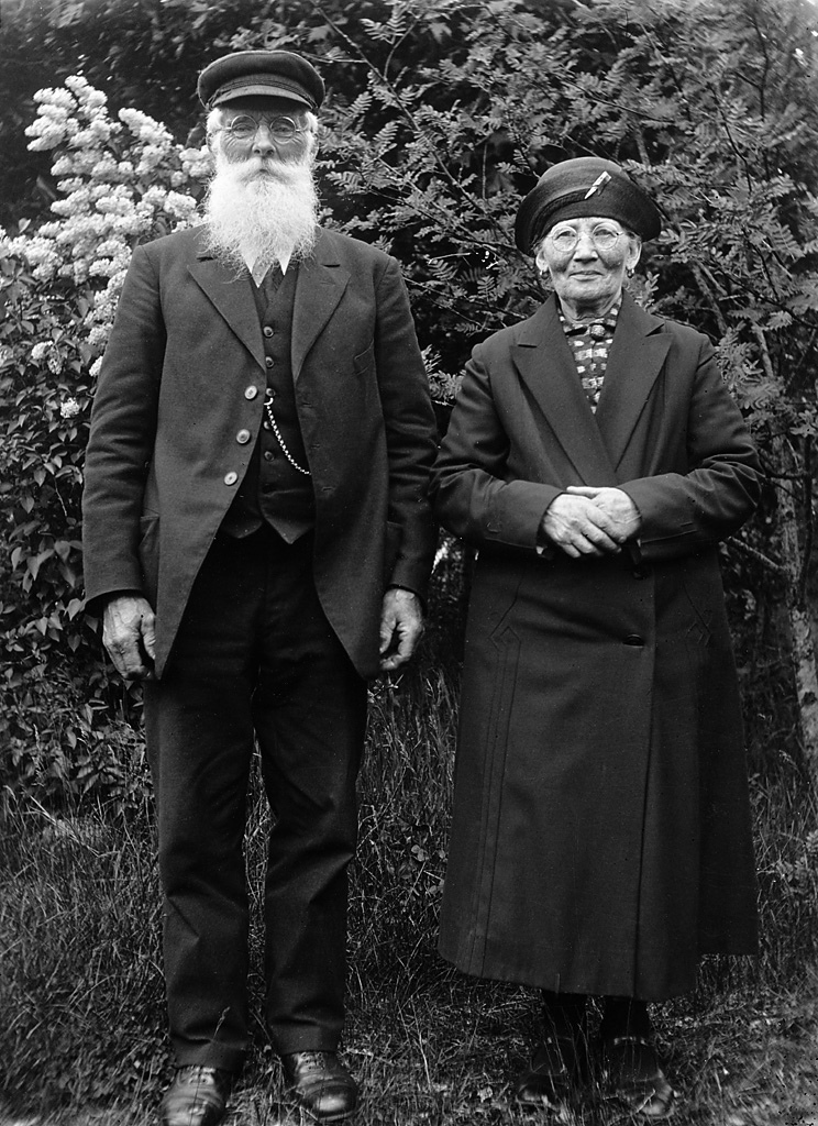
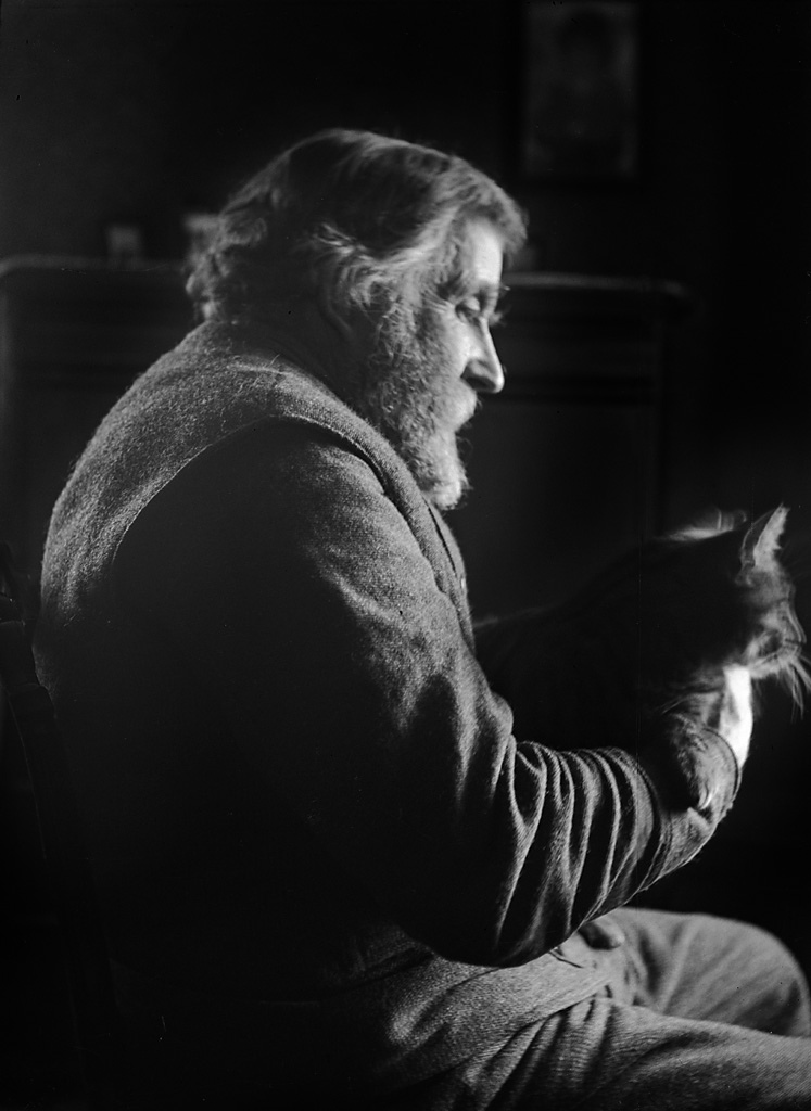
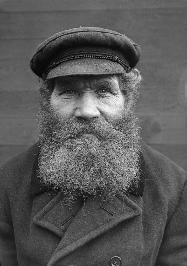
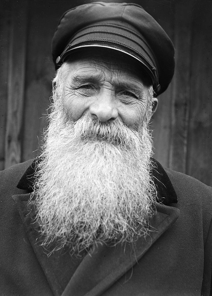
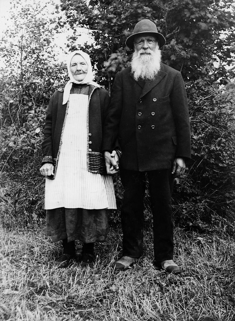
  • I came across this set at Flickr this morning, part of the Swedish National Heritage Board's collection, and was struck by the generous and wonderful beards on every one of the men.  These particular photos were all taken by Einar Erici in the 1930s — he was obviously a talented and sensitive photographer, to judge by the character studies that each of these photographs becomes.

    5493555519_0fca683ccf_b

    The coachman C. P. Lundström, born in 1851, and his wife, who lived in Södra Trädgårdsgatan street in Gävle, Gävleborg province.

    5493538707_d58ed6b54f_b

    The postman Anders Wedin in Enånger, Hälsingland. Born in 1866.

    5621323917_04be52ccaf_b

    The master painter (målarmästaren) Olof Nilsson, Kulladal, Skåne. Aged seventy; born in 1865.

    5692806744_725dbbfb10_b

    A man on the doorsteps to a house, place unknown.

    5715447686_7dd3ce8183_b

    Churchwarden Anders Andersson, born in 1866, and his wife, of Brunn, Gästrikland.

    5760965385_f1a9245022_b

    The verger (kyrkvaktmästaren) Andersson, born in 1858, and his wife, of Skederid, Uppland.

    5692303603_6bb124bb6b_b

    The farmer J. Johansson, seventy years old, with a cat, in Åslunda, Uppland.

    5578824675_a88ed66600_b

    The crofter G. V. Gustafsson, born in 1872, of Margretelund, Uppland.

    5859501260_5279aafed7_b

    Oskar Almgren in Stockholm, born in 1852, smith at the Maritime Pilots Administration.

    5493576767_b71d1e71b6_b

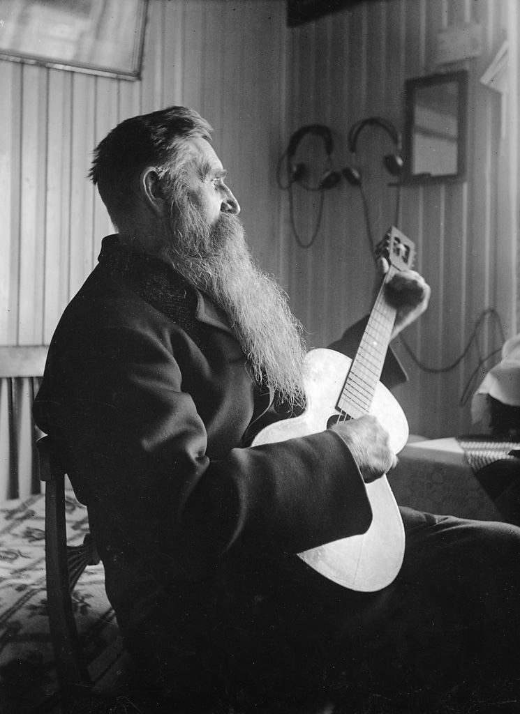
    The parish constable (fjärdingsmannen) August Ländin in Åkeshov, Uppland playing the guitar. Born in 1863.

    5621987070_aa3317a588_b

    The yeoman farmer (hemmansägaren) Carl Anders Samuelsson, born in 1857, and his wife Anna Lena, of Stigåsa, Småland, in 1932.

  • IMG_2264

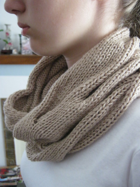
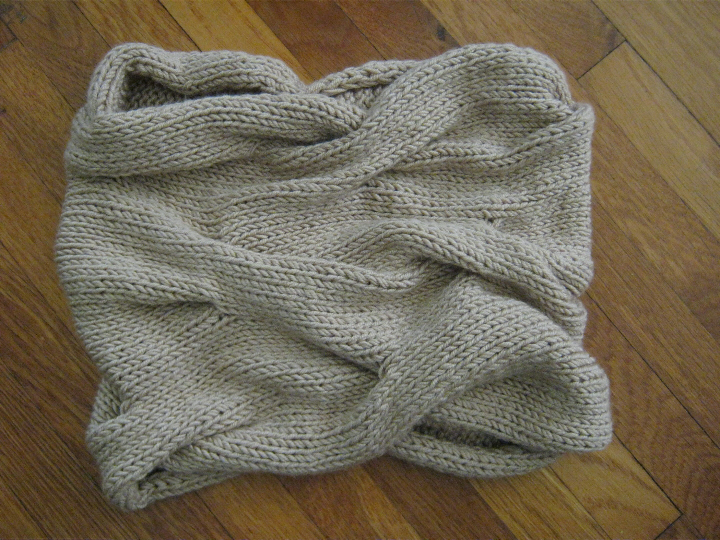
    This is a gift for a friend, a sort of knitted hug-from-afar.  It's the Burberry-Inspired Cowl from Julianne Smith at The Garter Girl, a simple, quick knit — yeah, if you don't cut the yarn too short for weaving.  It's cables but isn't cable-y, more just sort of ripples, or in this particular color, kind of like sand dunes —

    Burberry inspired cowl

    This is the Filatura di Amigo Cashmere/Seta yarn I got from Joy in Hong Kong umpteen years ago, and made a Backyard Leaves scarf out of not long after.  Still have tons left over.  I remembered how much this yarn stretched, so I worked it a little tighter this time than I might have done, and hoped it would stretch enough to soften and show the cashmere to its best advantage. 

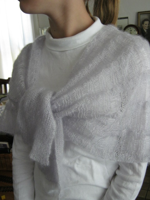
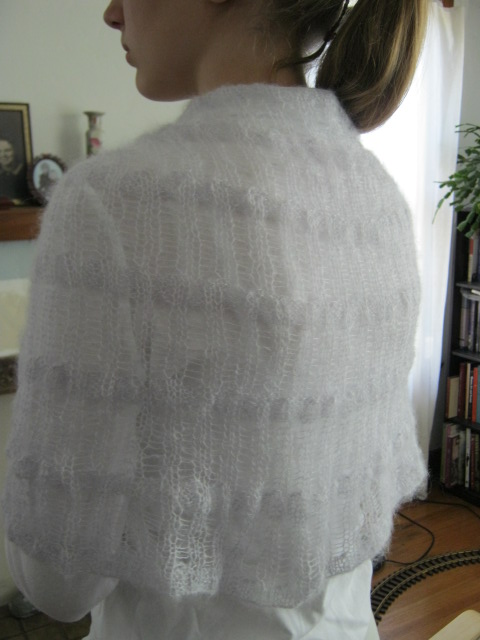
    And of course the recycled Kidsilk Haze, this time into nona's "Tie One On" Wrap from Knitty —

    IMG_2267

    I do not like knitting with Kidsilk Haze.  Scratchy and hairy, and with an unpleasant feel almost like very thin wire, not to mention unkind when you make a mistake.  This color is wonderful, though — "Ghost" — a very soft purply-grey neutral.

    Tie one on wrap

    But the pattern is, like the cowl, a quick and satisfying knit, and I think will be pleasant to wear on a cool spring afternoon.  Just be warned that you will not be able to make the ribs line up.

    IMG_2270

    Not sure I will knit much for a while, as summer is rapidly approaching here in Southern California, and although I was wearing wool socks and a slipover just last week, this morning I am in sandals and short sleeves!  But a sewing project is on the cutting board —

  • Ksh 3

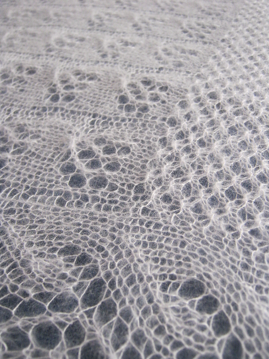
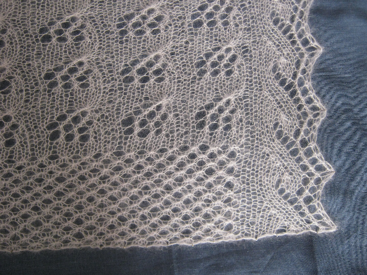
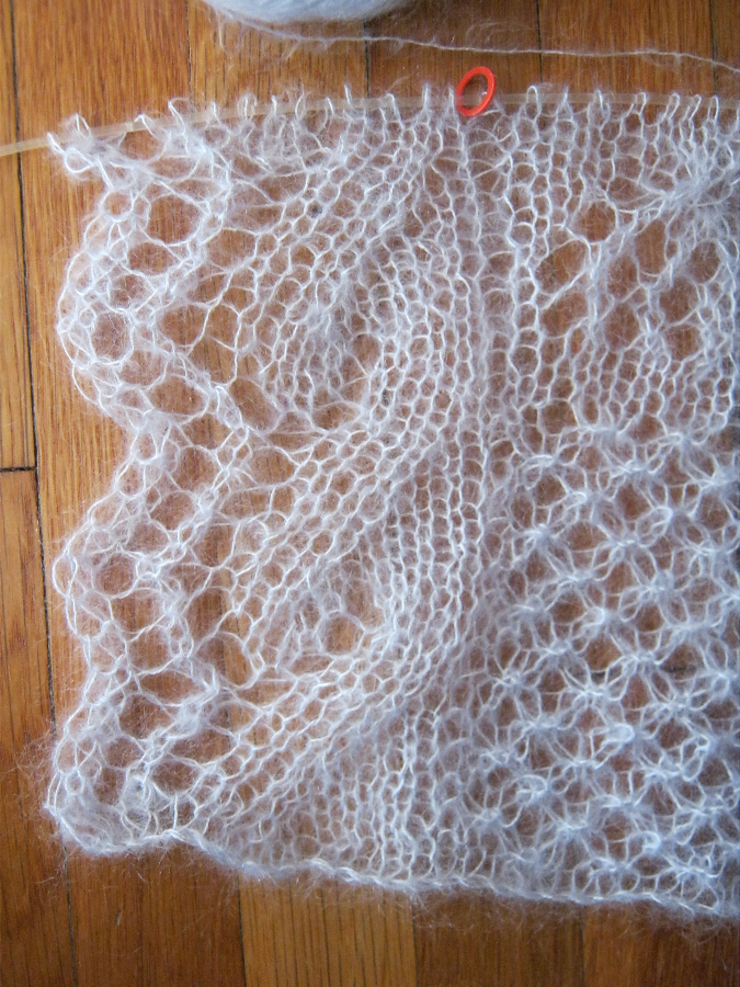
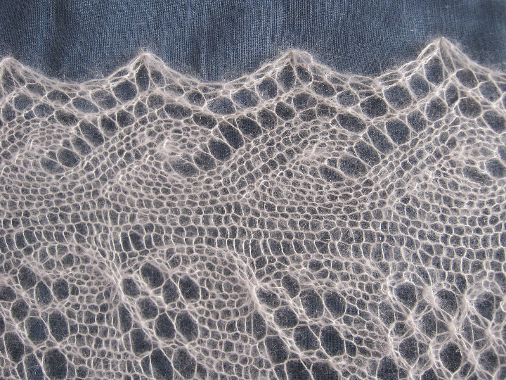
    Well, this wanted to be a pretty lace wrap, but — alas.

    It is the Kid Mohair Wrap from Susan Cropper's Pretty Knits: 30 Designs from Loop in London of 2007, reprinted in Canadian Living a year or so ago (there's no date!).  I was a little surprised to find almost no mention of this around the blogosphere, thinking that surely I could not be the only one seduced by the photograph.  I wonder now if knitters just gave up.

    As I mentioned before, there are a few errors in the border pattern, not earth-shattering ones, but enough to be worth fixing.

    Border

    This is a fairly-standard lace edging, found in Martha Waterman's Traditional Knitted Lace Shawls, among others I'm sure, and there called "Ocean Waves".  Here it is written worked in opposite directions on the right and left edges, so that they are mirror images.  The right-side edge has a three-stitch "wave" that swirls upwards towards the left, while as written here in the Kid Mohair Wrap the left-side edge has a two-stitch swirl.  It is not entirely noticeable at this lacy gauge, which is one of the reasons (the other being Kidsilk Haze's resistance to being picked out and re-knitted) that I simply left it there and went on.  The decrease used in the pattern is a left-slanting sl1-K1-psso, but it should be a right-slanting K2tog.  I worked the second repeat this way, and to my eye it looks much better, certainly a mirror image of the right-side border.  After working the second repeat, I realized that the one triple-decrease on the left-side border should be changed as well, from a sl1-K2tog-psso to a K3tog — you can see the second repeat's sl1-K2tog-psso at the top of the first "swirl", just to the left of the last yarn-over hole, where the triple decrease is leaning the wrong way.  I worked a K3tog instead on the third repeat, along with the line of K2togs, and it looks much tidier.

    Ksh 2

    Hokusai - great wave off kanagawa

    So my recommendations: In Row 3, change the second sl1-K2tog-psso to K3tog, AND in Rows 5, 7, 9, and 11, change the second "skpo" (i.e. sl1-K1-psso) to a K2tog.  This will also need to be changed in the crossed-eyelet section, thus: In Row 31, change the second sl1-K2tog-psso to K3tog, AND in Rows 33, 35, 37, and 39, change the second "skpo" (i.e. sl1-K1-psso) to a K2tog.  There is another typo in Row 35: after the second "slip marker", K2 should be K3.

    There also should be an asterisk in Row 39, after the first "slip marker", but this is only a slight hiccup.

    The scarf version apparently simply continues a narrower version of the knot-stitch section all the way up, omitting the crossed-eyelet section — but a commenter on the Canadian Living version of the pattern notes that Row 28 in the scarf version says to repeat Row 14, ie. Row 4 of the knot-stich pattern, but that this should be Row 2, not Row 4.

    But the biggest problem for me is that two balls of Kidsilk Haze is not enough by some way to complete a 30×60-inch wrap.  I pin-blocked what I had worked so far to a 30-inch/76cm width, which to me looked far too stretched, so I repinned it to what looked good, which was 28 inches (71 cm) wide — although certainly this was not proper blocking, and the results may have been different, but I suspect not much.  The result was a 28×22-inch piece, which of course with only one more ball of Kidsilk Haze would not have made a wrap that measured 60 inches by any means.

    Ksh 1

    So, well — it's pretty, but the yarn is now well on its way to becoming nona's Tie One On after all …