• 5065

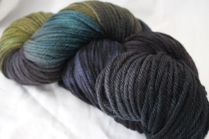
    Yes, well, when I saw the Gaea "Say Nevermore" version of this scarf at Knitty a few months ago, I somehow found myself on the Blue Moon website clicking "purchase" as though in a trance.  Maybe it was the daze, maybe it was the summer heat, maybe it was just the idea of paying over thirty-five dollars for one skein of yarn — however indescribably gorgeous — but when I sat down to knit the scarf, I discovered that the pattern actually calls for two skeins.

    4567

    I thought, and for some time, I admit, about ordering a second skein, but luckily the weather was cooler, and sense won out.  So this is the "Economical Baker Street Scarf," modified slightly from the original by Joan of Dark.

    5066

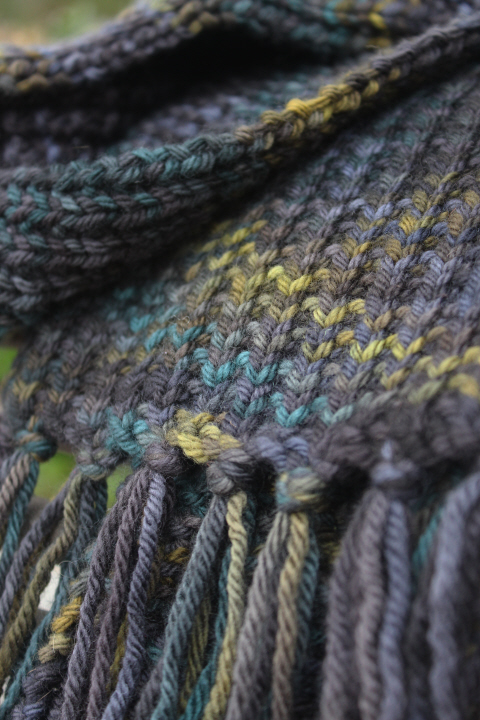
    My version is over 32 sts, but this is different from the pattern only because the label was vague enough that with the original stitch count I might have ended up with something anywhere from 6" to 8 1/2" wide (!), so since I was already being economical, I shaved 2 sts off of the original count.  This still got me 6 3/4 in. on US8 needles!

    I also, as I say, used pretty much all of just one skein instead of two — when I got close to the end, I unwound the rest of the ball and from the non-working end cut fringe for the cast-on edge and attached it, then cut more-or-less the same amount (in one length, to keep it from becoming a mess), then worked as far as I possibly could with the remaining yarn — the only bits left are the wobbly piece from the beginning of the skein, a length that I cut too short to add to the fringe, and a shaving or two from the finished fringe.  The resulting scarf is about 6 3/4 in wide x 50 1/2 in. long, not counting the fringe (17 x 128 cm.) — so considerably shorter than the 6 ft. of the original (!) but also a lot more frugal. 

    5074

    5068

    A word of warning — it does curl.  The stitch is very easy to memorize, and looks handsome, though different, on either side, but it does curl, so if that's important, knitter beware.

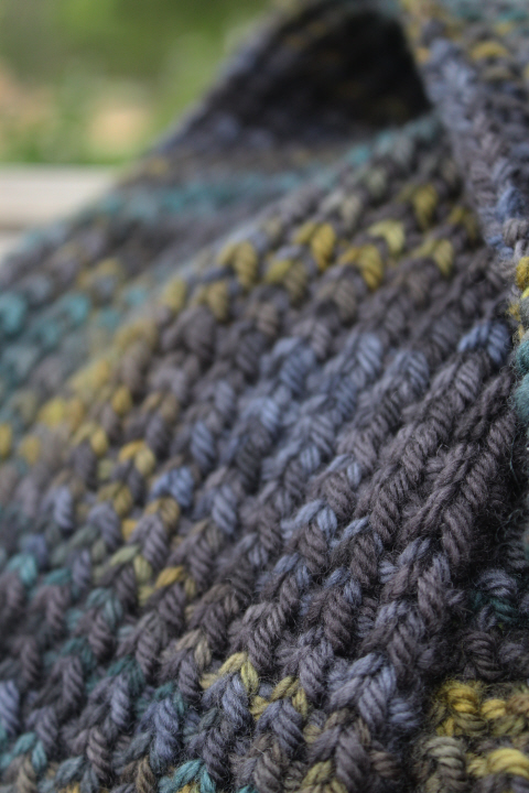
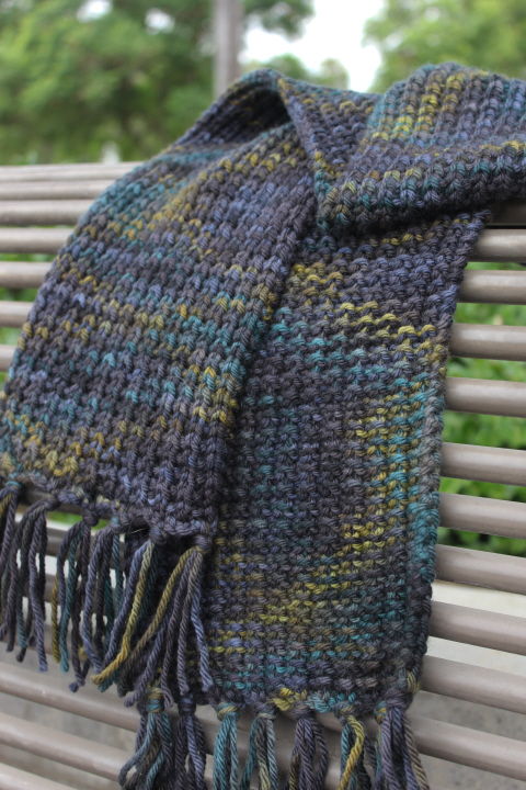
    But the yarn is delicious — you can tell that I think so by the number of close-up photos I've taken! — with a subtle blend of navy/black with a lighter blue here and there, and a little revelation of tawny gold and perhaps even a hint of teal at times, and it has that wonderful quality of revealing more or less of the colors in different lights.  I am delighted to say, too, that I wrapped it around my shoulders this morning after I took the photos, and the weather is cool enough that I am still wearing it an hour later …

    5067

    5072

  • Marple 6

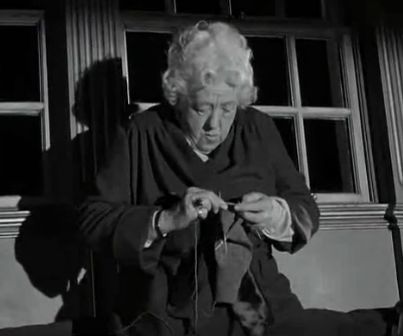
    It seems appropriate to end this little series of knitting in the movies and television with Miss Marple, Agatha Christie's famous amateur sleuth, one of whose main characteristics is that she is often to be found knitting, and it seems that in the half-dozen-plus films and series featuring Miss Marple over the years, the knitting part has come more and more into play.

    Marple 4

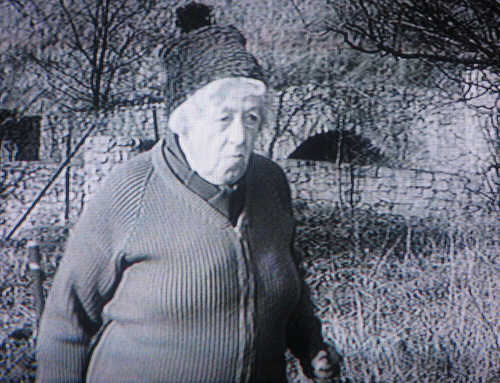
    Margaretrutherford

    I admit that I haven't seen any of Margaret Rutherford's 1960s Miss Marple outings in full, and so I don't really know whether she actually knits much in the films, but I could find only the one image to use in this post.  She isn't actually knitting in the second one, obviously, but she is wearing a wonderfully dumpy cardigan as well as a knitted hat, with characteristically Rutherford pompom of course.  (Apparently, she insisted in wearing her own clothes to portray Miss Marple!)

    Marple5

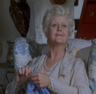
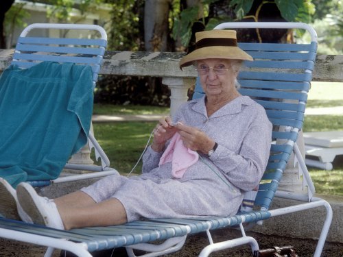
    Angela Lansbury played Miss Marple in a single outing in 1980, so perhaps there was not much time for knitting.  I don't see a single image of Helen Hayes as Miss Marple actually knitting, which is a shame — I don't remember her two films, though I must have seen them, so I will certainly make the effort to do so again.

    Marple 2

    Joan Hickson played Miss Marple in the late 1980s and early 90s for the first television series, one that remains firmly in the consciousness of many viewers as the definitive Marple.

    Marple001

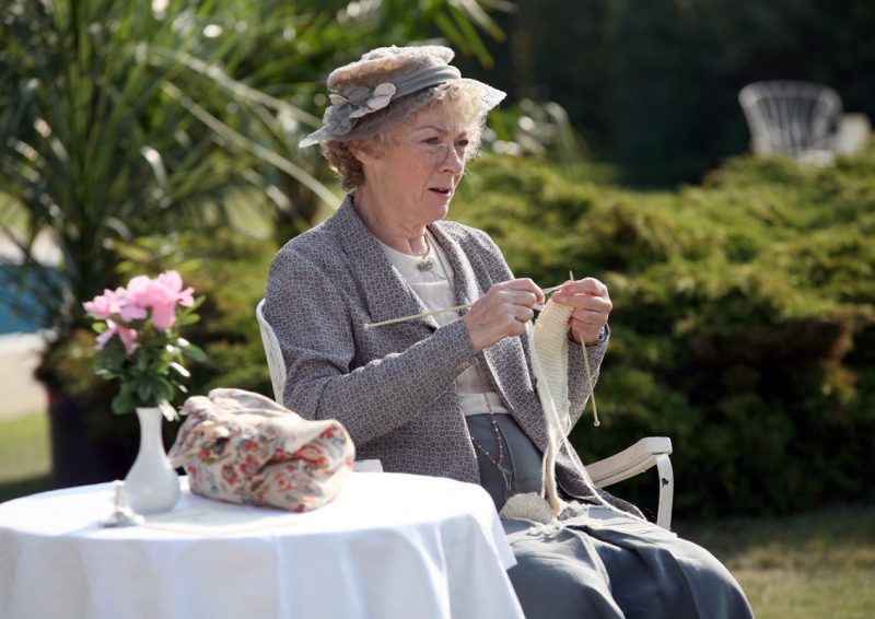
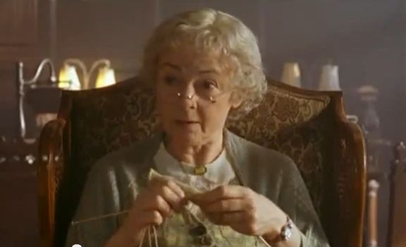
    The production values and attention to detail for Geraldine McEwan's tenure as Miss Marple in "Agatha Christie's Marple" were high enough that she was often shown knitting, although I will not be the first to say, nor the last I'm sure, that for a series called "Agatha Christie's Marple" it strayed rather far from the original at times.  I am still hoping that McEwan was simply doing what the director asked for.

    Marple 1

    Marple 8

    Marple02

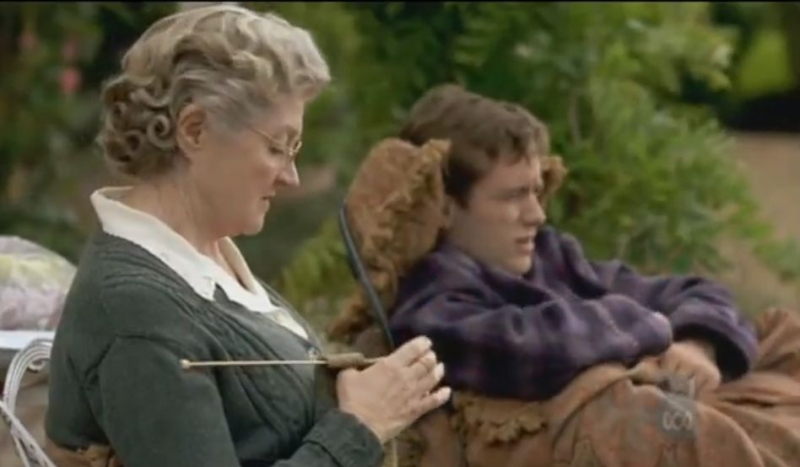
    Julia McKenzie took over from McEwan after the latter's retirement, and I must say that she fits my mental image of Miss Marple rather more (I won't say "better" because I admire McEwan tremendously) — and of course I love the fact that pictures of her knitting in the series abound!

    Marple 3

    Marple 5

    Marple 7

    Bonus — slightly out of order, but how could I not end with this? —

    Marple 9

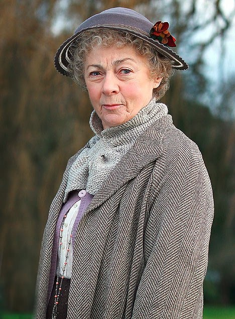
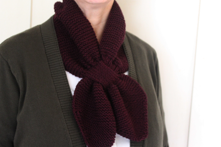
    Miss Marple herself wearing a classic keyhole scarf.  Free patterns are available for Skiff's Miss Marple Scarf here, and another one here by SusanneS-vV, and an actual 1948 one here from The Sunny Stitcher.  Just for fun, here's a faux-fox version.  I knitted mine up — in two days! — in some of the late and much-lamented Jaeger Extrafine Merino left over from my Pearl Buck Swing Jacket, in the beautiful elderberry shade 944 (about 80g).

    5038

  • Bletchley 1

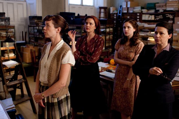
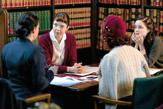
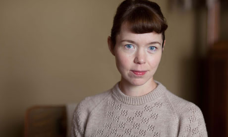
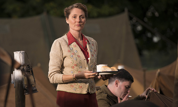
    Another series with excellent costumes and knitwear!  For some reason, I avoided "The Bletchley Circle" when it first aired in 2012 or '13, then started watching it on Netflix about a year ago, and though I don't remember much at all now about the mysteries, I was intrigued by the characters themselves, the relationships between the four women and the way the four actresses pulled everything together.  I was also — all right, I'm a knitter! — charmed by the sight of Susan (Anna Maxwell Martin) knitting in her sitting-room.

    Bletchley 2

    Bletchley 4

    Bletchley 9

    Bletchley 10

    ("Dear Sir" spotting: "The Bluebell Railway is excellent to stage late 1940's or early 1950's scenes on trains, but when selecting stock for trains supposed to be working out of St. Pancras Station it was careless to use a locomotive of the Southern Railway. St. Pancras was on the London Midland & Scottish Railway until nationalisation in 1948, when it became British Railways…. What is more, the bus that appears is an RML type which was not built until 1961 and in a livery that dates to the mid 1970's, the stations shown on the route board for the Barking line are incorrect (East Ham!!!), and a character mentions the Gospel Oak to Barking line but at this date the route ran via Kentish Town, not Gospel Oak."…!)

  • Fili bilbo ori nori

    Well, I seem to be in a bit of a house-keeping mood this week (blog-keeping?), tidying up old draft posts and putting them up.  When I wrote this in 2014 (!!) I said "I'm a bit behind with this, I know — 'The Desolation of Smaug' came out nearly a year ago!" which sounds positively ancient by now.  These photos, though, especially the studio ones, are still pretty good, and worth posting for the knitwear and my theme, even though my opinion of the movies has tumbled considerably.

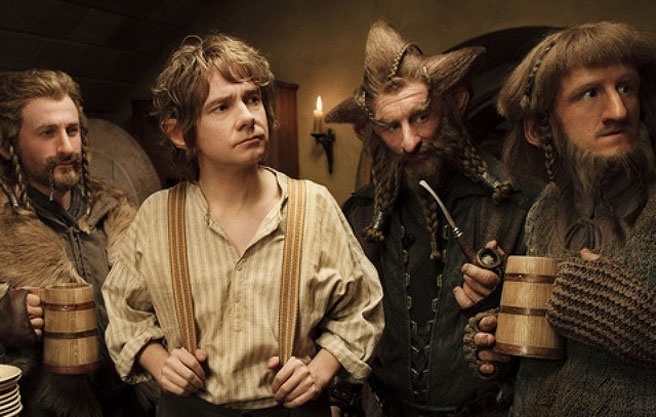
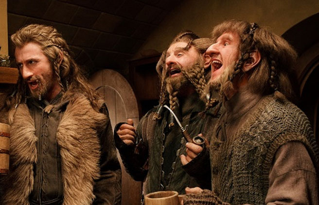
    So — these are from the first "Hobbit" movie, of course, "An Unexpected Party".  I think all of the dwarves have hand coverings of some sort, but not all are knitted.  Ori, on the far right here, has heavy garter-stitched fingerless gloves.

    Fili ori nori

    He also is the only one who has a knitted waistcoat, which gives him a sweet air of childlikeness in addition to Adam Brown's own, as though Ori's mother sent him off with extra warm clothing.

    Ori

    Sometimes he wears the waistcoat properly, and sometimes twisted and cast somehow about his neck like a cowl.  I must admit I can't quite figure out how this works, as the thing isn't circular!  Maybe he's just pulled out his arms and tucked up the hem around his shoulders.

    Oin 2

    Óin (John Callen) here has some pretty splendid knitted gloves, whose swirling cables echo that splendid beard.

    Oin

    Bofur 2

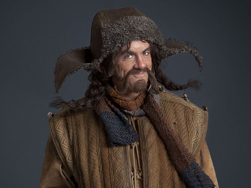
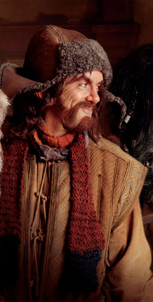
    Bofur (James Nesbitt) wears a multi-colored garter-stitch scarf.

    Bofur scarf

    Bofur

    Bombur

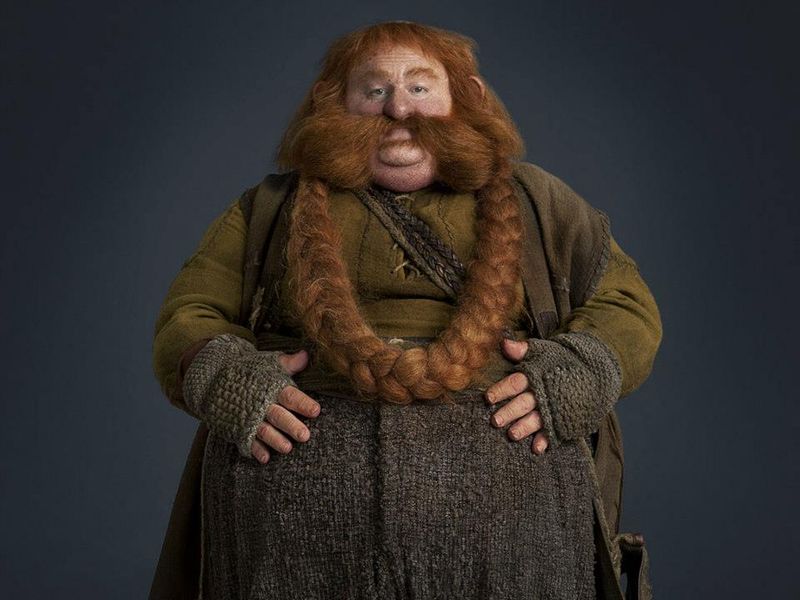
    Bombur (Stephen Hunter) has, perhaps not coincidentally, the thickest mitts, even with an extra moss-stitch patch sewn to the back of the hands.

    Gandalf

    Gandalf (Ian McKellen) has knitted mitts as well — these are apparently folded back for extra warmth on the hands.  Unlike the dwarves' mitts, these don't appear to have a knitted thumb.  (The scarf is not knitted but woven, though I'm sure someone has come up with a knitted version by now!  Here's one, in fact.)

  • Home-fires-frances_3289083b

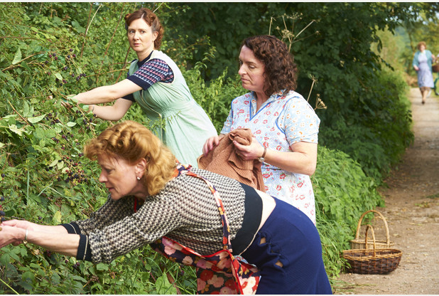
    This is a bit old, but I was weeding out the images file on my computer this morning and realized I'd not posted these yet.  They are from the late "Home Fires" — yes, it's been cancelled — which I watched sort of half-fascinated, because Blitz-era England is one of my fascinations, and half-guiltily, since it was not a little soapy at times.  I do love Francesca Annis, though, in just about anything.

    Part of these photos, I admit, are for the aprons and pinnies as much as for the knitting, though!  Above we have the ladies of the village out blackberrying — Pat on the right (Claire Rushbrook) has a fairly typical cardy in a basketweave stitch.  Each of the women has a different yet very typically-1940s apron, Erica (Frances Grey) a wrap-around, Frances (Samantha Bond) a scoop-neck, and Pat a full one, probably H-back but we can't see this.

    Home fires aprons 1

    Home fires 2

     An apparently favorite slipover worn by the butcher's son with the overprotective mother (Will Attenborough and Claire Price respectively), who has presumably knitted it herself.  Don't get me wrong, I completely understand not wanting to send your son off to shoot and be shot at, but she's a bit mad about it at the same time.  She herself has an interesting raglan-sleeved cardigan in a rather lovely sea-foam green.

    Home fires

    Curiously, Frances's apron seems to have no ties, which I think would be fairly annoying, with it dragging in things.

    HOME_FIRES_2__EPIS_3331867b

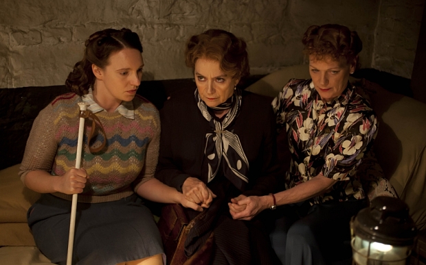
    An absolutely bang-on perfect 1940s pullover in chevron stripes on the blind Isobel (Gillian Dean).  If looks could kill, the entire Luftwaffe would have simply dropped stone-dead from the skies at this glare from Mrs. Cameron (Francesca Annis).

    HOME_FIRES_EP3_01

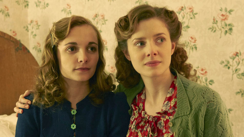
    A very pretty green lacy cardigan worn by Kate (Rachel Hurd-Wood).  I think her sister Laura (Leila Mimmack) is also wearing a knitted cardigan of some sort, but in this picture it isn't quite clear.

    Home fires 75604

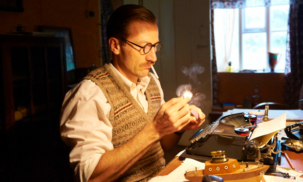
    The man we love to hate, the thoroughly-nasty Bob Simms (Mark Bazeley) in another perfectly-period slipover, this one a classic faded Fair Isle.

    Home_fires_ep1_33

    104529

    Sarah (Ruth Gemmell) has this very pretty cardigan in the famous King Charles brocade stitch, accented presumably with embroidered flowers inside lines of the diamonds at the front.

    Meet_the_cast_of_ITV_s_Home_Fires

    The wardrobe for this series is really excellent — full marks, especially for including lots of period-looking knits!

    And if you like the soundtrack, it was composed by Samuel Sim, with the haunting title track sung by Synergy Vocals, and for the time being at least, you can listen to the whole album on YouTube —

  • 4868

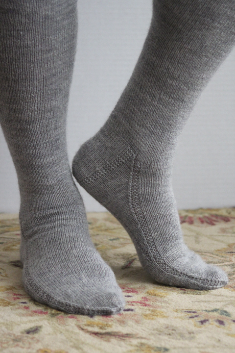
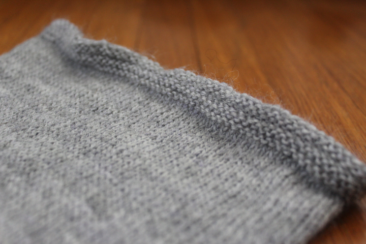
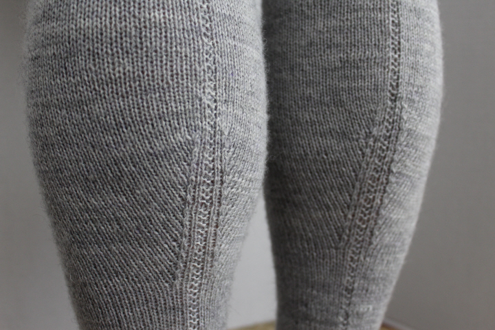
    These stockings have been finished for some time, awaiting the photographs, for which it has been a sort of ready/not-ready comedy — David is out of the country, David's home but I'm sick, it's just too hot to even think about wool, the bathroom tap exploded, etc. etc. etc. — so at last here they are!

    4858

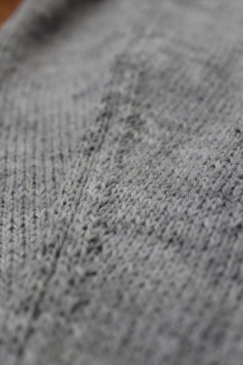
    After some internal debate about wools back in January, I chose Regia 4-ply, since I've used it before (on my Spey Valley socks) and those have pilled a little at the heels but are still in very good shape after over six years!  This color is Grey Heather (no.1991), which seemed to be a good "natural wool" shade, and goes well with the rest of David's Faire clothes.  I like the grey-sheepy homespun look of it, and the color is lovely.

    3620

    These stockings took ages to knit as not only are David's legs quite impressive, but I miscalculated any number of times and had to rip the first stocking back (and occasionally out) in annoyance, and he was away on multiple business trips for so long that I didn't want to risk "hoping it would fit".  But of course once the first one was done and I knew it was all right, all I had to do was make the second one exactly like it!  (As it turned out, one was still a bit longer than the other when he put them on, but this must be due to the wool — humor me, here — since there really are exactly the same number of rows in each stocking.)

    4864

    4874

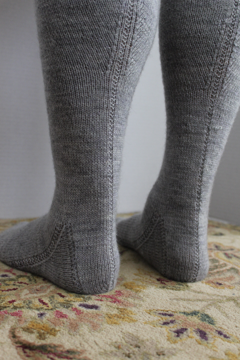
    I liked the welt on the Carnamoyle re-creation by Lady Angharad Rhos ferch Rhain (Allison Sarnoff) so I started with that, although as it turned out the finished welt contracts so much that you can hardly tell that it isn't just reverse stockinette.  Because my math skills are mortifyingly bad, I depended heavily for the leg shaping on basic advice about stockings from Elizabeth Zimmerman's The Knitter's Almanac with specific math from the calculator at Let's Get Knitting.

    3615

    4863


    Stocking foot - mid 16th century - Museum of London A13833

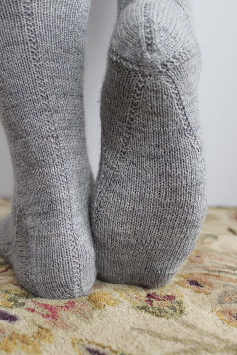
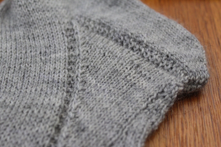
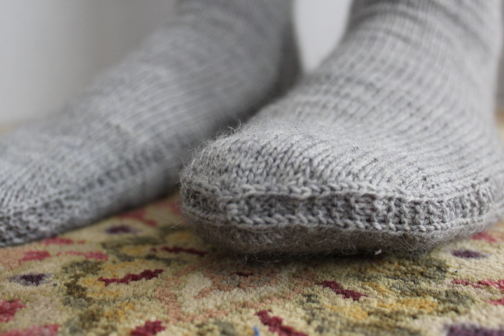
    I was very taken with this stocking foot now in the Museum of London (no.A13833), which I mentioned when I was planning these stockings at the beginning of the year.  I had already decided on the so-called "Barnim" foot, with its inverted gusset on the sole and then thought that it wouldn't be much of a step from the Barnim foot to this one, so I decided to follow the Cheapside lead, as it were.  The Museum writes that this foot is "the only example of its kind in England" and I can believe that, for I've not seen anything like it on historical-costume blogs, so I'm tentatively dating it, as the Museum does, "mid-16th century" with the stricture that it is "unusual" and therefore probably expensive (i.e. upper-class if not higher), though my version is considerably rougher than the original.

    So in keeping with the idea that knitters in the past would probably have borrowed ideas from the finished garments of other knitters and not from patterns as such, and therefore could also have stood in front of a Cheapside stocking-maker's window and said to themselves, "Fifteen shillings!  Marry, I can make something much the same for a pittance, and from good English wool!" — here is the Cheapside foot.

    4860

    I am putting my first version of this foot pattern on a separate page, for other historical knitters to make suggestions on and, if I'm lucky, possibly knit and make suggestions for improvements.  I will admit up front, though, that the at-the-same-time shapings for sole gusset and instep gusset really defeated me, what with balancing different rates of converging increases and decreases, which occasionally came together with a whacking great clump.  As it turned out, I had to write down the instructions in a Word table with separate columns for the two gussets, so that I could keep them straight, and check rounds off one by one — I did manage to get this into a fairly logical pattern-style format, but it was a lot to keep track of, so knitter beware.  The bright side was that I am positive that both stockings are knit exactly the same!

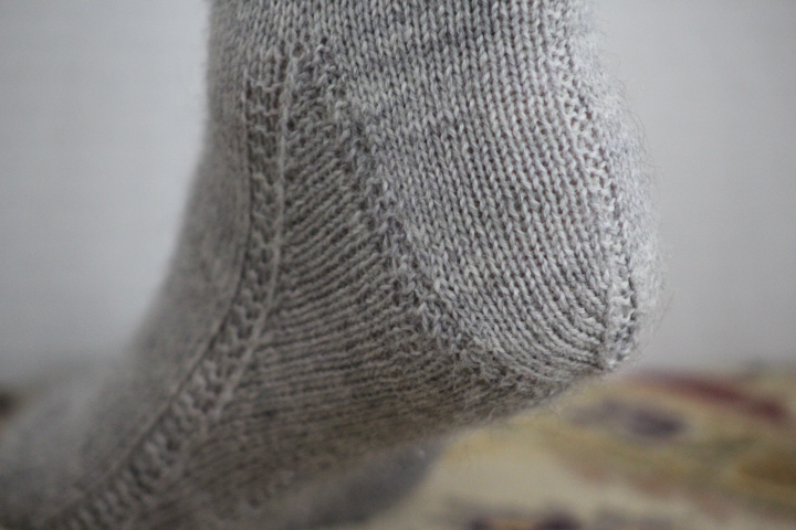
    The decreases at the side of the heel flap, which are fairly clear in the Museum's photograph, are very elegant, so this variation has been incorporated here along with the garter edging, into the shaped common heel.  Unfortunately, the original heel of the Museum of London stocking seems to have disintegrated at the back, so it's impossible to tell, from the photograph at least, if it was straight or shaped, but certainly the shaped one is more comfortable and handsome.

    4875

    I did err on the side of caution with the length of the sole gusset, and it is obviously considerably shorter than the original, but I'm not sure if I could have done it reasonably at this much-larger gauge anyway — mine is 28 sts to 10cm, vs. an amazing 72 on the original (!!).  I started the "first draft" with the decreases further apart, but it just didn't look good.  The original sole gusset clearly continues pretty much all of the way to the point of the toe, whereas mine peters out about two-thirds of the way there — this could certainly be "corrected" for a shorter foot, by simply using the same rates of shaping on the sole gusset, which would go farther on a shorter foot.

    3617

    3618

    4865

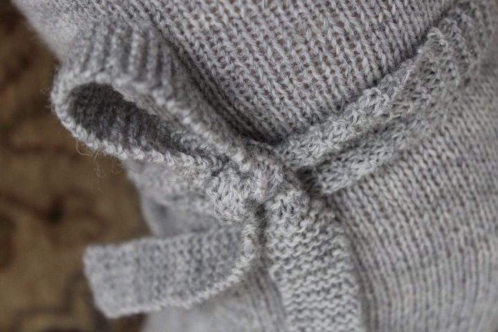
    The garters are simply 7-stitch strips of garter stitch, about 34 in. long unstretched.  They stretch quite a lot, even when wrapped not especially tightly.

    4876

    Histknit2016 button 1

    The details —

    The Project: a pair of man's stockings, with garters
    Year or Period: 17th century, possibly mid-16th
    Materials: most of 5 balls of Regia 4-fädig Uni in color 1991 (Grey Heather)
    Hours to complete: about two months
    How historically accurate is it? the modern sock yarn is obviously not period, and I suspect that the shaping is more towards the end of the century than the beginning, but for that it is fairly accurate
    Sources/Documentation: the extant silk stocking foot at the Museum of London thought to be from Cheapside (museum no.A13833), with modifications of the shaped common heel per Nancy Bush in Folk Socks, and of the "Barnim foot" as outlined by Anne DesMoines in her “Barnim-Style Stockings” in Knitting Traditions magazine, Spring 2014 issue

    Knitting instructions for the Cheapside foot are here.

  • 4742

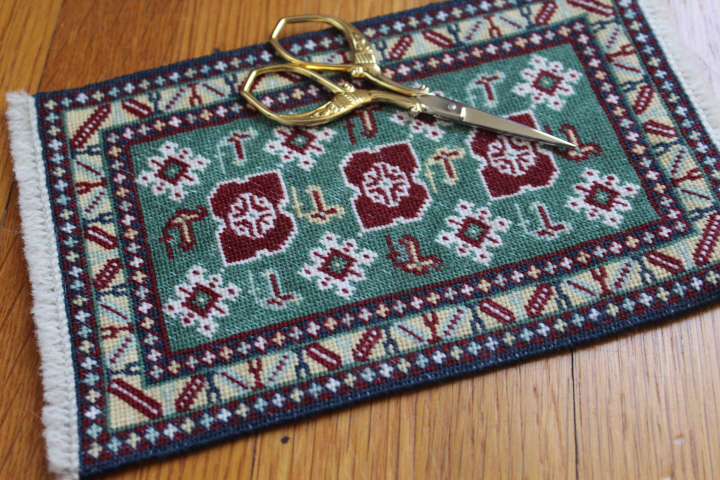
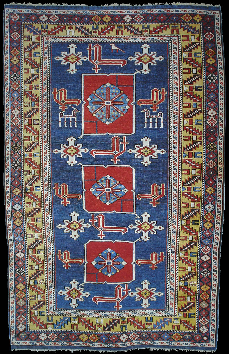
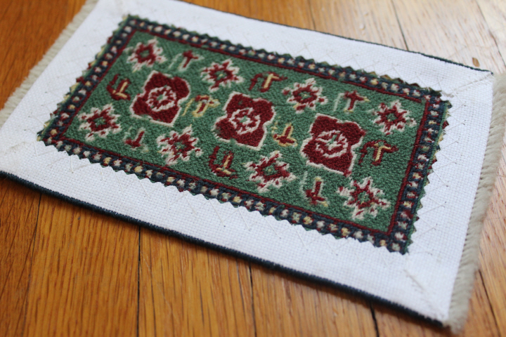
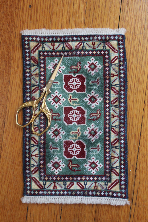
    This is the Karagashli carpet, number ten in Meik and Ian McNaughton's Making Miniature Oriental Rugs and Carpets. 

    4743

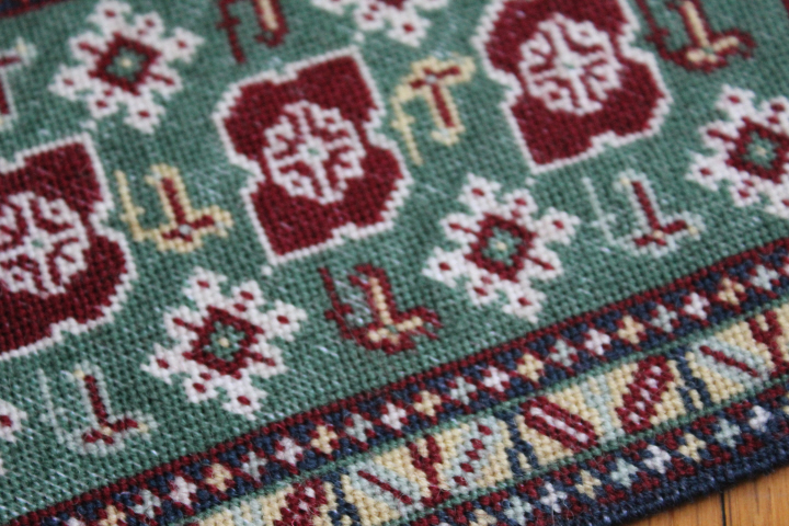
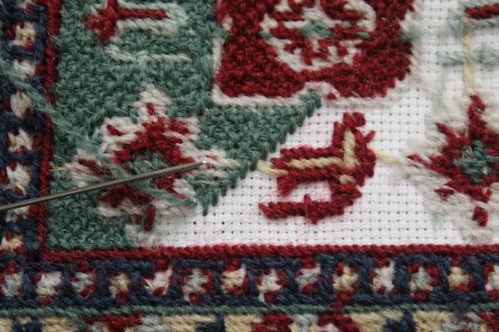
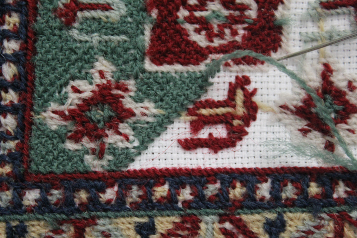
    It is worked in Appleton's crewel wool on 22-count Hardanger canvas, something of an experiment as I haven't been able to easily get hold of 24-count canvas, which is what the McNaughtons use throughout their book, and I had only 22-count and 28.  The coverage of the Appleton's is erratic at this gauge, even inadequate in some places, I'm afraid.  I noticed that the lighter colors have better coverage than the darker ones, so perhaps this is due to the peculiar effect of different dyes on the same kind of wool — I've noticed this in knitting wool, certainly.  I wanted a good-sized carpet, so I chose the larger gauge, going on various needlepoint websites that assured me that Appleton's is for 18-count. I did get the wool to bloom a little in the blocking, though — soaked it in warm water for a few minutes, roughed it up a bit, whacked it on the side of the sink — which did actually work a little, but you will have to take my word for it as I'm afraid I forgot to take a "before" photo.  There are still some noticeably thin spots, but, well, I will just call it "wear and tear" on an "antique" carpet, I guess!  I purposely didn't block it very hard, either, to leave it looking even more aged.

    4753

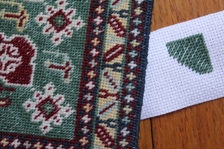
    I had just enough of the green wool left to make a small sample to compare "before and after".  I suspect now that much of the inadequate coverage has to do with the particular stitch used, as you can see on my afterthought-sample that the canvas shows through on regular diagonal lines every other stitch, and I have also noticed in other projects that the stitches lie differently when the continental is worked to the right than when it goes to the left — so, like knitting, it apparently can make a noticeable difference what direction the wool goes in at the back of the canvas as it comes in or out of the stitch on the right-side.  It is possible that continental stitch would have provided better coverage, but of course with more attendant warping in the finished piece.

    (On closer inspection, I see that even some of the other carpets in the McNaughtons' book show a little canvas in the darker background sections, so perhaps even 24-count canvas is a bit skimpy in some projects.  Oh, well.)

    4750

    This is the second carpet I've worked from this book, and while the first chart was flawless, this one had a small but fairly glaring mistake in the outermost border (repeated, because apparently the chart was mirrored for printing) but it was so obviously wrong that it was not at all difficult to spot it before I worked that area.  I did notice — eventually! — that the three red rhombus-ish motifs in the center are actually slightly different from each other, but whether this is a mistake or intentional, I don't know.  ("Only Allah is perfect.")  Mine are worked slightly differently, because I assumed that they were all the same and wasn't working strictly to chart!  But otherwise I'm delighted with this design, and the planning that went in to making the odd-sized motifs fit into a regular field — notice that the white "stars" touch the border at the bottom end, while there is a single line of green background on the opposite end, and that the whole arrangement of central motifs at the bottom is not quite in the same places relative to each other as in the top part — by only one row — but since it is only one row, you hardly notice it, only that everything fits neatly.  This ever-so-slight imbalance is in order to accommodate a perfectly regular arrangement of the border motifs, and I can only admire the meticulousness of designers whose corners have full, continuous motifs, not lopped-off overlaps.  And I would also highly recommend this particular chart for a beginner to petit point, as the border is very logical and therefore easy to work, yet the central panel is rather fantastical and interesting.

    I suspect that the McNaughtons' designs are not based on specific antique carpets, as Frank Cooper's are for instance, but they label this one as "mid-19th century" so perhaps it is more in the style of a mid-19th century Karagashli than a miniature version of a particular one.  They write, "Karagashli is a village near Kuba in the eastern Caucasus.  Many carpets woven there display a series of banner-like red rhomboids on a turquoise background, surrounded by white cruciform stars and strange, bird-like motifs.  The pattern in the main border is known as 'leaf and chalice' pattern.  It is not peculiar to Karagashli, but is widely used in Caucasian weaving."

    Here are two full-sized Karagashlis, in fact, from the very helpful and interesting identification guide at Azerbaijan Rugs in San Francisco —

    Kuba_karagashli10

    Kuba_karagashli14

    which clearly show the inspiration for the miniature version.  It would be fun to work the McNaughtons's chart again with the dark-turquoise background, though I do like the green.  There are also ones in the guide where the abrash is quite noticeable, and a handsome one where the two background colors are reversed, with a mid-blue on the leaf-and-chalice border and a golden-ivory in the center panel.  (Interestingly, the guide calls the border "leaf and calyx" — like the McNaughtons, I guess, I certainly immediately saw chalices!)

    4682

    4755

    New skill for me on this project: basketweave stitch.  Most needlepoint guides, online and in print, tell you to do larger swathes of single-color stitching (backgrounds, for example) in basketweave, which unlike continental stitch has a tendency to keep the canvas true.  I'm guessing that this comes from the strong angle of the back of the continental stitch, which you can see here in pretty much everything except the green background and the red in-fill of the large medallion.  Presumably the vertical/horizontal alignments of the back of basketweave stitch counteract the slant of its front.  But I got my nerves all a-jangle by various sources warning that you must alternate the vertical and horizontal rows or you get a little ridge visible from the front — fair enough, but the instructions on how to do this seem to involve a whole lot of trying to keep straight which is the warp and which is the woof of the canvas and whether you have used vertical on the warp or on the woof, say by going "under" on the "overs" (or is it "over" on the "unders"??) and this all just made my brain go aaaauuggghhhhhh.  But since this particular piece had already turned out to be a "teaching moment" I thought, "right, just try it" and dove in.  After carefully working a good-sized plain section in one corner, I realized that this is the back of a "down" row —

    4676

    and this is an "up" row —

    4681

    It seems quite a simple matter to me to tell which is which, so I worry that I'm missing something and it actually is really tricky.  As long as you have a long-enough row for the stitches to be clear, it shouldn't be a problem — but since this revelation I have been making it a point to stop on a long row like these where it is quite obvious how the stitches are lying, or even better to start a row and pause it in mid-stitch so that I can see right away in which direction I've been traveling.

    4752

    4747

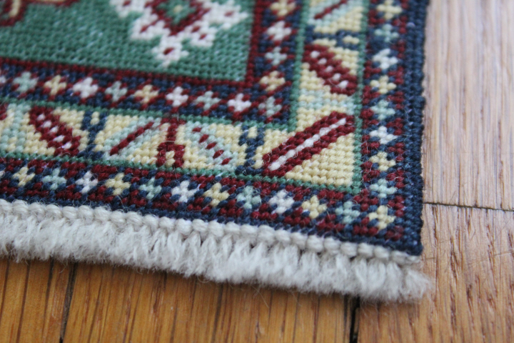
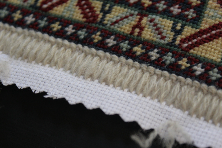
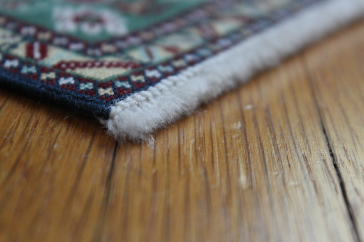
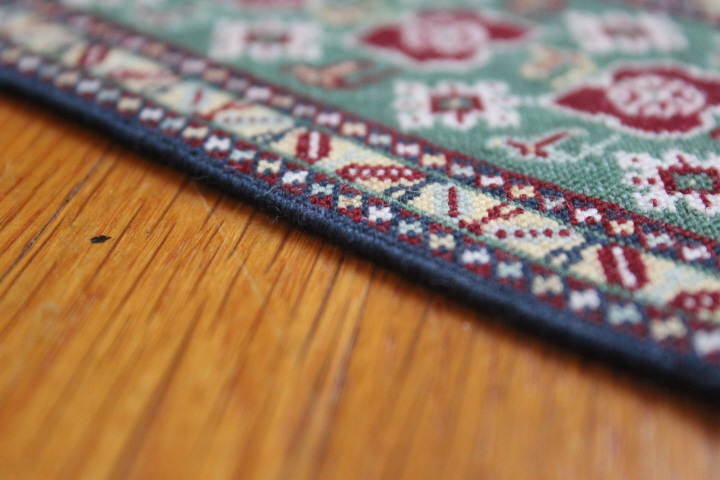
    This is the overcast edging, as Janet Granger uses — I wasn't sure if there was enough blue to work one of the "braided" edgings.

    Now that I've had a chance to look at it finished, I'm less unpleased with it than I was before, so perhaps if I put it in a darker corner of some roombox, the wonkiness will look quite natural!

    4741

  • ,

    “Apron for B”

    4653

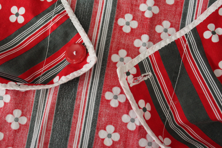
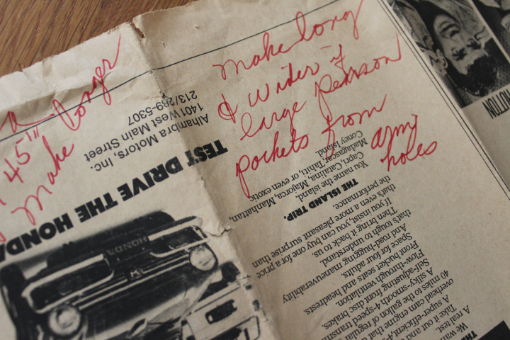
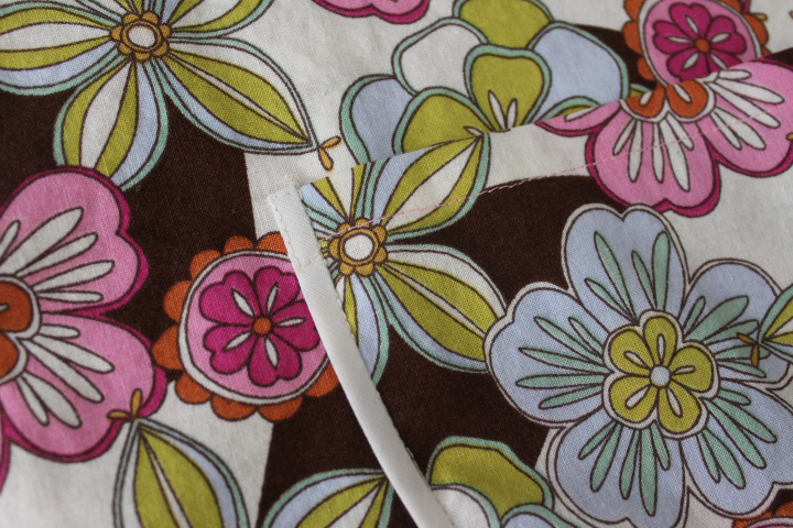
    Some time ago my mom gave me an apron pattern that my grandma had made from newspaper, which upon closer inspection I realized was the pattern for the apron Mom has had for just about as long as I can remember, so when I recently found a remnant I'd picked up somewhere that had a groovy late-60s vibe, I decided to make one for myself.

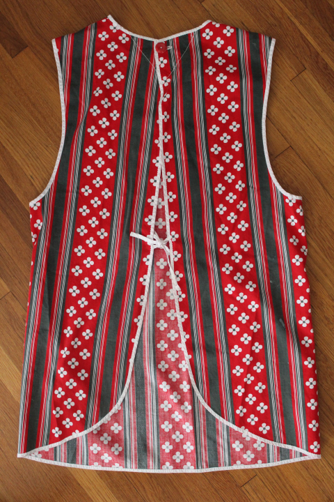
    This red-and-black one is the original apron.  The newspaper doesn't have the date on it, but it has ads for "On a Clear Day You Can See Forever" and "Airport" and "Song of Norway", which premieres-in-the-present-tense November 10, 1970.

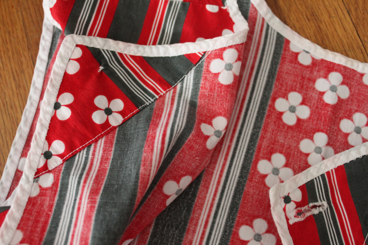
    I don't have very many things left that Grandma sewed — and she was a master seamstress, especially I remember at coordinating Easter dresses for us four cousins! but it seemed there was always something going on the sewing machine in her bedroom, and stray pins in the carpet — so this apron is fun for me to see her stitching.  She took a shortcut with the bias edging, and just sewed it on all at once with a zigzag stitch, but I don't hold that against her at all.  There is also a little, erm, digression on the button facing, but she was getting on for seventy by then!

    4649

    4650

    4651

    4652

    4654

    Mom doesn't actually wear an apron that much any more, but this one obviously saw quite a bit of use back in the day.

    4667

    4671

    4672

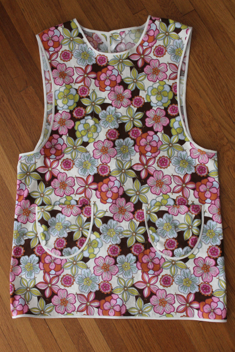
    Here is my version —

    4656

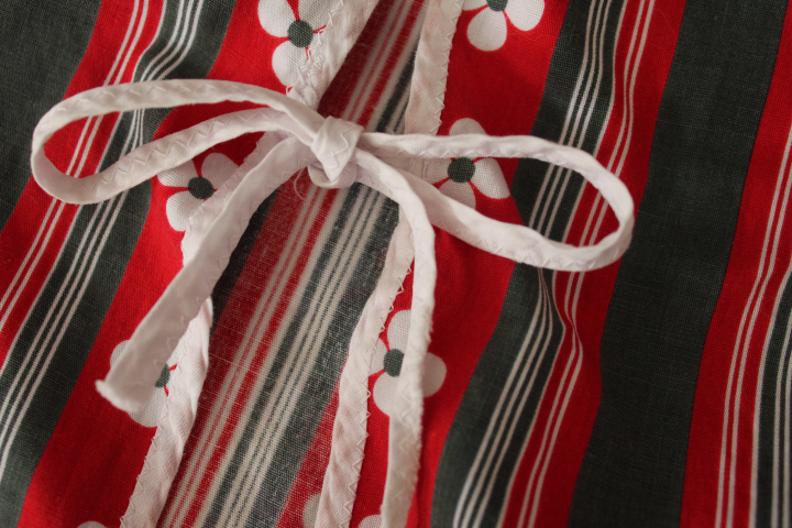
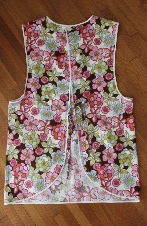
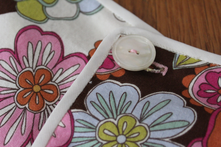
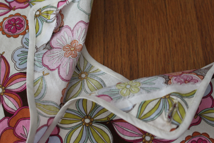
    I made a few changes — I did make it longer than the paper pattern, as Grandma suggested, but first cut a 1 1/2" strip across the grain of the fabric at one end to use as the ties, then extended the length of the apron the full length of the remaining fabric.  (I prefer narrow ties on my aprons, but I found after wearing Mom's a few times that the narrow-bias-tape ties are too narrow for my liking.)  I made two pockets — why not, there were two pieces left from the armholes! — and cut the two little facing triangles from the selvedge edge so that I wouldn't have to hem them.  I also did a turned hem on the top of the pockets, instead of using the bias tape edging, and I did felled seams at the shoulder because I loves 'em.

    The apron from my scant yard of remnant is just finger-length.  I should have made the straps a smidge wider, as they were just too narrow to sew them inside-out and turn them, which I prefer, but there it is.  I used two packages of narrow bias edging, with quite a bit left from the second package.

    My stitching certainly isn't going to win any prizes — I can't seem to "stitch in the ditch" for anything, as the wobbly bits in these photos prove, but it's an apron, and I'm happy!

    4661

    I did not plan, by the way, for the fabric pattern at the button closure to match so nearly perfectly! a happy accident, to be sure.

    4658

    4659

    4662

    4663

    4664

    4665

    4666


  • 4627

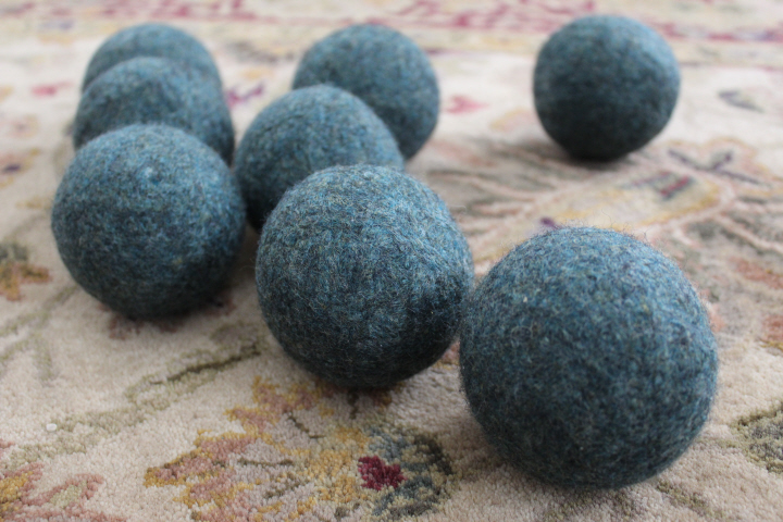
    Somewhere in a late-night rambling on the internet, I came across mention of felted-wool dryer balls.  You toss a few in the tumble-dryer and they help to move the drying clothes around, decreasing drying time — they also help to remove static and to soften clothes without chemical fabric softeners.  I'd heard of using tennis balls for this, but when I was having a bit of a late spring clean the other day and came across some decades-old knitting wool that I really have no knitting use for but couldn't bear to throw away, I thought, "well, felted dryer balls, of course!"

    4612

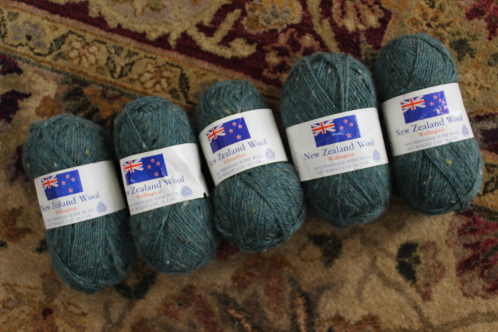
    This is New Zealand Wool "Wellington", 100% Perendale wool in a handsome heathered green.  I had eight skeins — it's a doughty wool, to be sure, but not really something I'd want to wear near the skin, which is why I haven't done anything with it in the last, oh, twenty-five years.  I remember how unusual it was to come across real wool at Super Yarn Mart, which is why I was so susceptible to it when I did — doubtless the reason that I bought this, plus that it was from exotic New Zealand.

    4614

    4617

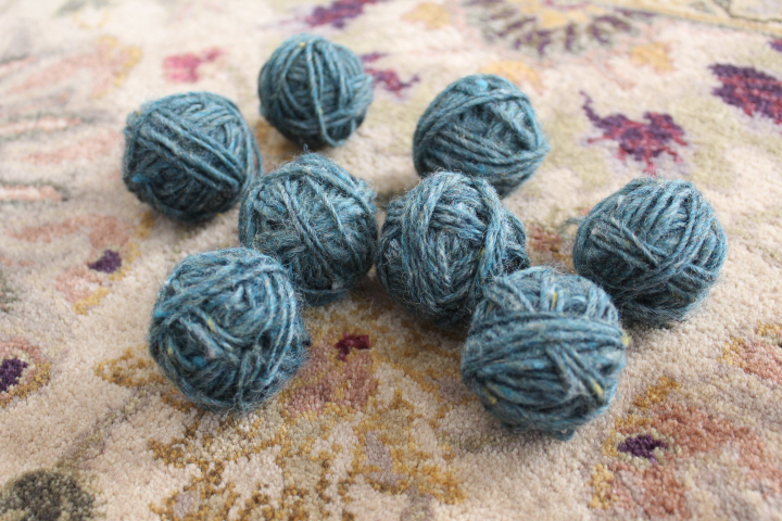
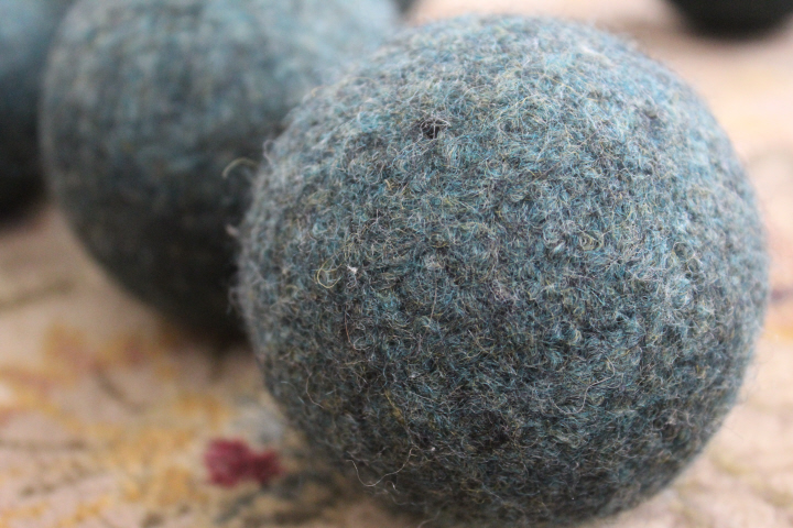
    I used the dryer-ball tutorials from Good Mama and DIY Natural, which could hardly have been easier.  I wound up golf-ball sized balls, one from each skein (about 4 grams' worth of wool), tied them into a "caterpillar" in the leg of an old stocking, with a tie between each ball, then ran them through a couple of cycles with our regular laundry yesterday, and this morning wound the rest of each skein onto the resulting felted centers. 

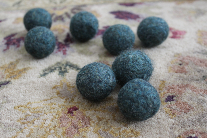
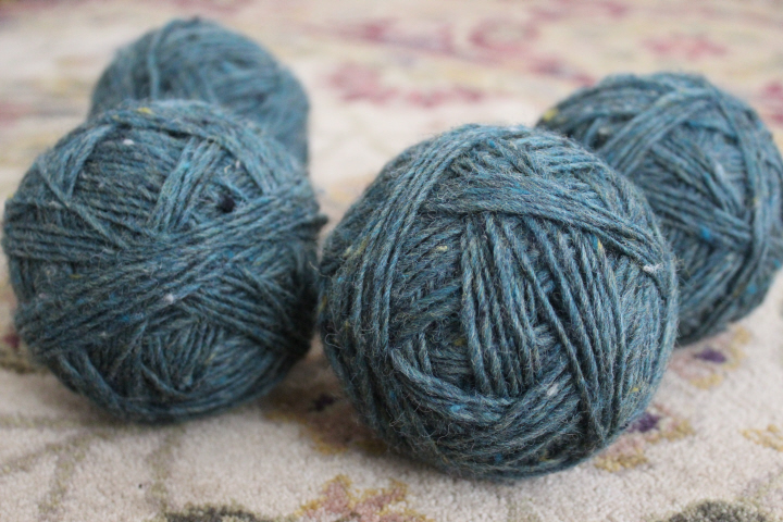
    To continue the sports analogies, the fully-wound balls — 2 oz. of wool, though generously five or six more grams than the 56.5 indicated on the label — were about the size of softballs, which felted down to about the size of baseballs.

    4621

    The only warning I'd give is not to attempt to felt two "caterpillars" in one load of laundry!  It took a good twenty minutes to get them untangled and I had this song stuck in my head for hours afterwards.  Some of the balls also came out a bit wonky from being smashed up against each other in the stocking, and some of the fibers got enmeshed in the nylon, though only giving it a sort of aura that didn't last through the dryer cycle.

    But the wool felted beautifully, with almost no visible lines at all from the strands of yarn, and I expect that after a few loads of laundry, they will be fully felted and quite round.

    4624


  • 4603

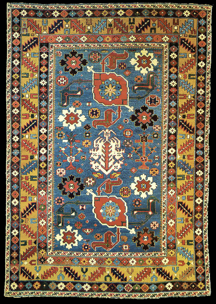
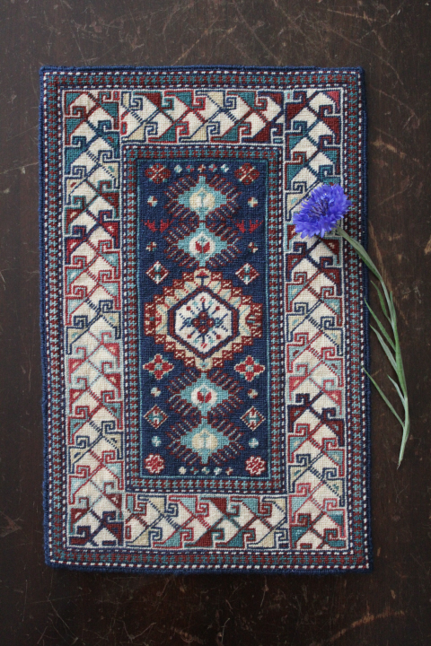
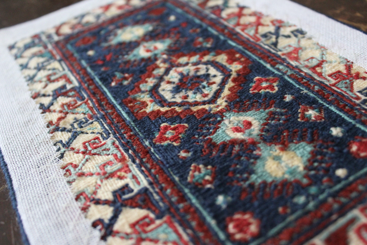
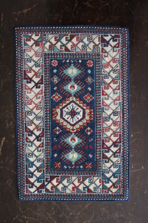
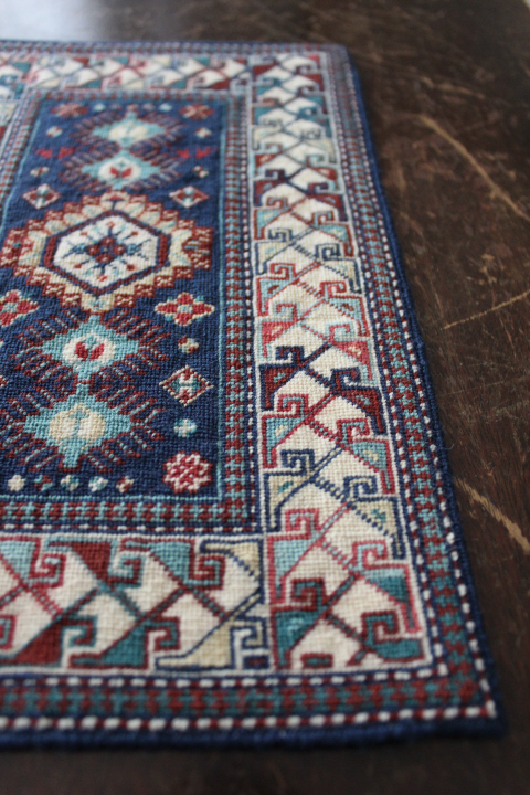
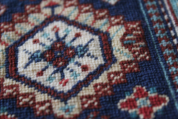
    Here, at last, is the Shirvan I miniature carpet from Frank Cooper's book Oriental Carpets in Miniature.  This is the first piece I've worked from the book, so I really only had the photos for clues as to its worth.  I don't know why it spoke to me so very much, but although there are others in the book that are more "my style" (whatever that is), I found myself coming back to this one again and again.  It has, I think, a really charming raucousness to it!

    This particular chart (one of three Shirvans in the book) is based on a 19th-century original, wh. unfortunately I haven't seen yet.  Now part of the Azerbaijan Republic, Shirvan is an historical region in the Caucasus, on the western side of the Caspian Sea.  There is a Wikipedia article about the Kuba "family" of carpet styles from this region, and a longer one here about Shirvans, from an antique-rugs dealer.
    4592

    As for the chart, one of the bigger flaws in Cooper's book, I must say, is that there are similar symbols for similar colors, so here, for example, you have a large X for dark green and a medium-sized x for medium-green, resulting for me at least in constant checking of the key and trying to decide if that's a small x or a big one (because the chart is tiny even when enlarged 200%).  At one point, I ended up photographing the chart with my camera at the highest resolution, and printing out sections of the center panel enlarged as big as the piece of paper would hold them.

    Quite a number of the figures in the center panel are not the same in the chart as in the photograph of the finished carpet, mostly in the color choices, but occasionally in the shapes as well — this is a fairly serious flaw too, in my opinion, and only adds to the difficulty of reading a very small and rather indifferently reproduced chart with similar symbols for similar colors.  But, really, I love this carpet.  I did simply turn the chart face-down and work from the photograph at times!  Throughout the book, Cooper does sometimes point out that after writing a chart, he changed his mind and worked a particular figure in a different color, but while that isn't really an issue (because you know about it ahead of time), the sheer number of "inconsistencies" in this particular carpet lead me to feel that these are mistakes, not design choices.  So, on the whole, stitcher beware, and if you want your piece to look like the photo in the book, you'd best keep a close eye on it as you progress, but if you are willing to either modify as you go or pick out sections that you just worked by-the-chart, then you'll have fun.

    This carpet is worked in Paternayan wools on 22-count canvas, a bit smaller than the original 18-count.  I think that this is pretty much as small as one should go with Paternayan, as the irregularities in some of the strands made it quite crowded (or thin) in some areas, though thankfully most of this doesn't show in the blocked piece.  The Paternayan didn't worm on me nearly as much as Appleton's has, so there is that to be considered!  I made a rather stupid mistake when buying the wool and assumed that when Cooper said "15 strands of blue" or whatever, he meant strands in the way that you buy Paternayan, which comes in a triple strand — whereas he meant single strands, so I ended up with pretty much three times as much wool as I needed.  I can't think why I didn't look at my basket — since I was there in the shop with the stuff in my hands — and think "this is far too much wool for a miniature carpet!" (blush).  I may end up adapting another chart to use up some of this stash, now!
    4530

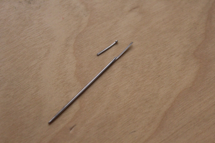
    I also somehow broke two Bohin tapestry needles, one snapped clean in half and the other a broken eye, both used on this project alone, as they were in a new packet.  The third seemed to compress about the eye as I worked, as it was easy to thread at first but then got more and more difficult but is still in one piece.  I am prepared to admit that my use of Paternayan on 22-count canvas was on the snug side, but was the breakage due to this or to the needles themselves?
    4597

    As for my own modifications, I changed the gauge of the canvas, as I say, since 9 x 14 in. was considerably larger than what I wanted — as it is, mine is 7 1/2 x 12 in. (19 x 30 cm), quite a large carpet in 1/12 scale.  Aside from the most obvious but unavoidable use of a dark blue a shade lighter than in the book — because that was what the shop had in stock (thus 501 for 500) — I sometimes used a lighter shade for a darker one, especially in the center section where they sometimes seemed to sink into the dark blue.

    I decided not to attempt to learn something new for this carpet, despite some of the Petitpointers listers assuring me that basketweave stitch would work perfectly on the backgrounds here, since I had already started working some sections in continental and the advice also had it that I shouldn't change in mid-stream.  I never did get the finished carpet quite straight, even after three hard blockings, so I will definitely try the basketweave in similar situations in future!  On the bright side, I really wanted the carpet to look if not well-used then at least not-brand-new, so in that sense the wonkiness is actually a plus.
    4595

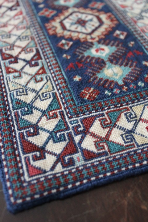
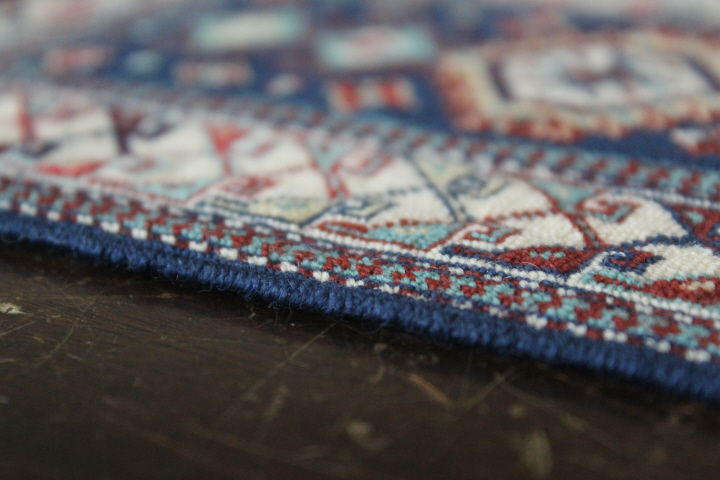
    I also used the long-legged cross-stitch edging, which at this scale I think was a little too much, since it is naturally rather thick, with all of the overlapping stitches, and mine ended up a bit lumpy in places, possibly due to the thick/thin variations in the Paternayan, or to my tendency to switch from working it horizontally to vertically — I think, certainly with this particular edging, consistency is key.
    4599 2

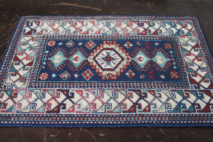
    Amusingly, I still can't decide which is "right side up".  The little dog-like figures in dark red in the center section certainly want to be this way up, but since the chart was the other way around in the book — and so that is the way I worked it — what Cooper calls the "eagle-head" figures in the large border look completely upside-down this way to me!

    I get the feeling — assuming that the miniature version copies faithfully the full-sized carpet — that the weaver improvised a lot of it.  The color choices are not particularly well-balanced — the eagle-head figures in the border have a kind of splotchiness to them if you just look at light vs. dark, and if I had planned the design out on paper before weaving, I would definitely have switched the two pairs of circley figures in the corners of the center panel, so that the light/dark balance would be better.  The center medallion is also really lopsided — why? that would have been an easy fix — when you look at it from the side.  But, on the other hand — I really love the improvised look of the finished piece, so that every complaint I have about the design makes me shrug and say, "I just love it anyway!"
    4598

    4600

    One of the things that appeals to me most is the use of colors in the big border, the way they flow back and forth between light and dark, and the subtle differences between the three greens, and between the three reds.

    (I learned a new term from Cooper, by the way — abrash, which is the variations in shade in a particular color, due to dye lots or fading over time.  You can see a built-in example of abrash in this carpet, where Cooper has used a darker green at the ends of the carpet, which goes all of the way across as it would if woven, and seems to "change" dye lot to a lighter shade in the middle.  I "faded" one of the outer puzzle-piece borders accidentally, when I picked up an even-lighter shade of green, but happily this looks quite natural!)
    4602