• Hobbity
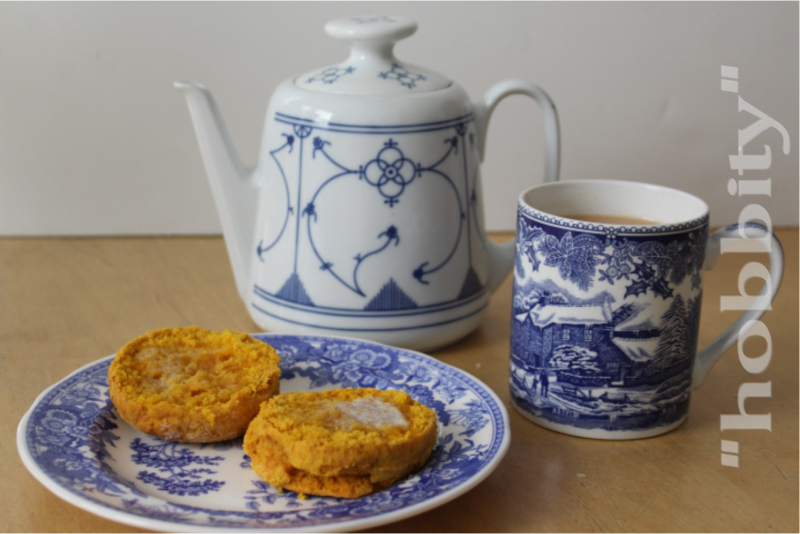
    "Hobbity".  And of course, "hobbit tea" (see what I did there?!), though for a hobbit this is probably the bare minimum for elevenses.  Still — it is comfortable and appealing, being indoors and eating a warm scone with a cup of tea on a cold, bright winter afternoon, and what could be more hobbity than that?

    Here is the recipe for the pumpkin scones, translated into American for us benighted non-metric folks, and adapted only a bit to my own preferences from Lady Florence Bjelke-Petersen's famous one —

    1 tablespoon unsalted butter, softened
    1/2 cup brown sugar (you can certainly use white, as in the original)
    1 egg
    1 cup mashed pumpkin
    2 cups all-purpose flour + 1 tablespoon baking powder + 1/2 to 1 teaspoon salt OR 2 cups self-rising flour

    Preheat oven to 425° F.

    Cream the butter and sugar.  Add the egg, then the pumpkin, mixing well, then stir in the flour, baking powder, and salt.  Mix until just combined.

    Turn out onto a floured board and cut as you like.

    Bake for 15-20 minutes, or until done.  (I usually use a stoneware tray, which takes a little longer.)

    All of the versions of FBP's recipe say "cold pumpkin" but I'm pretty sure this is because the recipe is from the days when a housewife grew her own pumpkins and made the mash, and you would want to have the mash well-cooled so that it didn't start cooking the egg just from its radiant heat.  And there are never any spices in the recipe, but you could certainly add nutmeg, cinnamon, etc. to good effect.

  • 1607

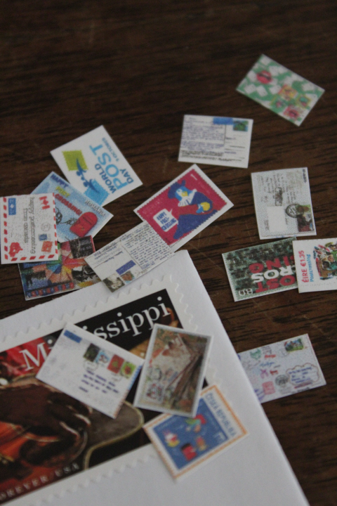
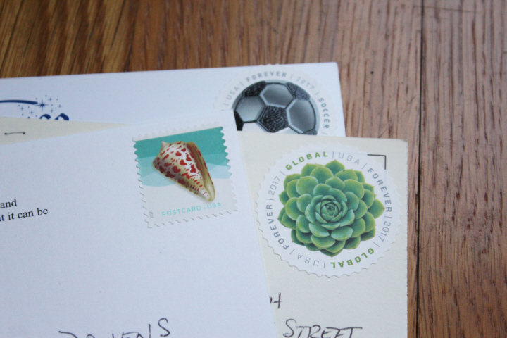
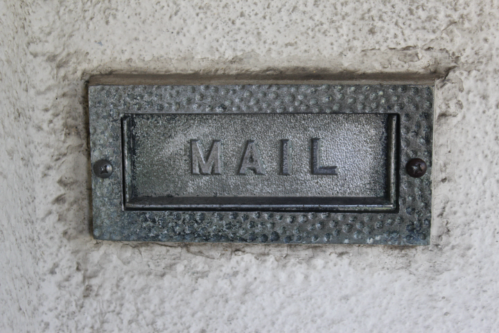
    I am a bit ahead on the Month-of-Letters-writing, if you go by numbers instead of days (wh. you shouldn't, of course, the point is to mail something every day!) — wrote two Postcrossing cards this morning and a thank-you note, sent a birthday card to my mom on Saturday, and a proper letter the day before that.  Above are last Thursday's effort, a letter and some 1:12-scale postcards to a fellow Postcrosser I've been exchanging e-mails with, post-postcard, because she likes miniatures and genealogy. 

    There are some printables around the internet for postcards, but most of them are one-side-only (presumably you arrange them in your particular setting and leave them there, or even glue them down, and the unprinted side never shows), or you print the two sides with an edge butting up against the other, then fold and glue them together.  I was fairly pleased with my two-sided sheet-music experiments and wanted to see if the method would work for postcards, so gathered an assortment of actual Postcrossing cards — because some dedicated Postcrossers have put their collections online, with the message and the stamp and the postmark, and in some cases even the full address, and of course because I'd decided to send the better results to C. — and images of actual postage stamps from various countries around the world honoring Postcrossing.  (Ireland has one, also Austria, Slovenia, the Channel Islands, Finland, the Netherlands, etc.)  I used the postage-stamp images as the front of the postcard because I suspected that most postcard images are too detailed to scale down that small, and that an already-small postage-stamp image would "read" better as well as reduce more clearly.

    My experiment I think was a qualified success — in theory it should have worked well, as I arranged each image, scaled down to 1:12, with the fronts of the cards evenly spaced with their left edges down the left margin, and the backs with their right edges down the right margin, then printed onto plain cardstock two copies of the page, printed front-and-back.  Some of them worked just about perfectly, lining up very well, but some were off by just enough that they are clearly wonky — and at this scale, even a millimeter is apparent!  This might have been due to the printer feeding the cardstock with slight hesitations now and then — I can hear it do that as the cardstock feeds through, but of course that's unavoidable — or it might have been a miscalculation on my part, I don't know.

    It probably would have been better to choose images for the picture-side that have a good portion of white space around the edges, because that way a slight misalignment isn't nearly as obvious — the Irish one in the middle of the right margin in the photo, for one, and the "World Post Day" one at upper left.  But — on the whole, I'm pleased, and although I sent the better set to C., I still now have a stack of postcards for a future desk setting!

  • ,

    Sewing for Knitting


    1634

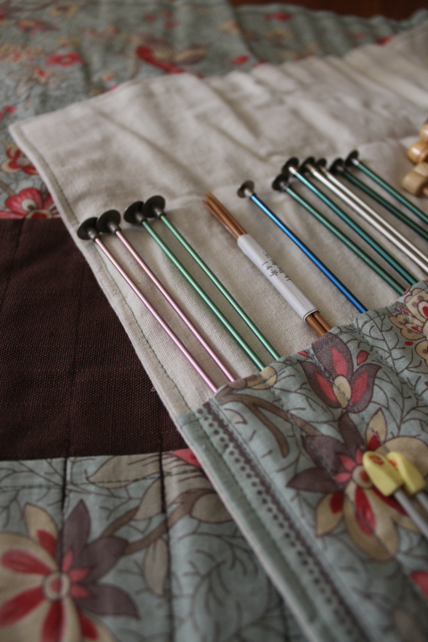
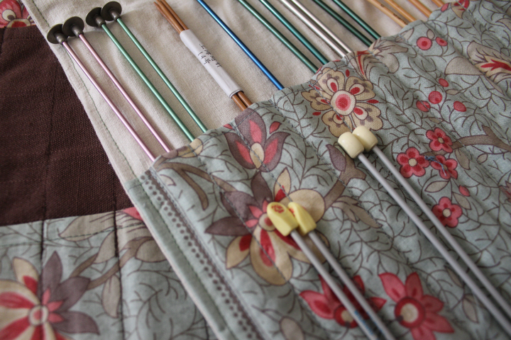
    After yet another quarter-hour or so taken up with searching through my bin of knitting needles looking for a pair of US6s, I thought "Right — needle rolls."  I have a little Martha Washington cabinet of my grandmother's, the kind with three drawers in the middle and two half-round bins at either side — some years ago I went through all of the loose knitting needles and made cards for the loose ones, with holes and stepped folds and all, but while this was a step in the right direction, it was still a chore to have to pull out a pair grab-bag-like until I found the size I needed.  And so in a burst of organizing energy not coincidentally around New Year's, I sewed up a pair of large needle rolls, all out of fabric left over from other projects.

    A needle roll isn't a terribly complicated thing, but neither did I feel inclined to reinvent the wheel, as the saying goes, so I spent some time poking around the internet, and then more time narrowing down the myriad of choices …

    1618

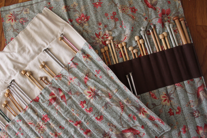
    The first roll is from a tutorial at Guthrie & Ghani, which with some fiddling makes slots with more depth than just laying two pieces of fabric atop each other and stitching a bunch of lines.  This is certainly a handy idea if you have a number of really large needles, but my stitching leaves a bit to be desired, as the slots are clearly of almost-random sizes and depths, and it is more difficult to ensure that the slots are the same depth at top and bottom as well.

    I wasn't sure I really needed two pockets, but unlike the lovely needle rolls one sees on Flickr and Pinterest, I don't have a uniform set of needles but a hodgepodge acquired over many years, of surprisingly variable lengths and knob sizes, so as it turned out, two pockets are handy for the shorter pairs.

    1620

    The second roll is therefore just the two pocket assemblies laid atop each other and stitched down.  Since it was clear, once I had laid out all of my needles in a row, that not only do I have a lot, but that I have a penchant for smaller needles (five pairs of nearly-identical 3.25mm!), I realized that having shaped slots in a roll for the finer end of the range would actually be a drawback, since snugger ones would be more secure.  QED!

    (I vaguely remember that I used a tutorial for the dimensions of the second roll, but have no idea now which one …)

    I had to piece some of the pockets, but all of these seams were easily hidden.  I was delighted to be able to accommodate the lining fabric's decorative edge, too —

    1620
    1622

    I still, I confess, need another roll for my dpns, and probably another for crochet hooks — I have only about four of those, but it wouldn't hurt to have them all in one place, would it!  I am getting close to the end of the birds-and-flowers fabric, so we'll see.

    The archivist in me was unable to throw away all of the original packaging, so I admit that I have kept some, partly for sentiment — I'm sure I inherited that set of aluminum Boyes on the left, ca.1970s if not earlier, and the Peace pair (presumably in a project somewhere …) were bought in Hong Kong — partly because, well, librarian.  The Takumis don't come in that nearly-indestructible green sleeve anymore.

    1637

    1623

    In my wanderings around the internet, I found quite a lot of other interesting projects, as one does, and so yesterday I made a pair of these, the "Brigitte Needles & Notions Zippered Pouch" from a tutorial at VeryShannon.  Although I did have some hiccups in the process, I nevertheless managed to make two of these in one day, which is certainly a compliment to the tutorial! 

    1630

    These are fraternal twins, as it were, made from three coordinating fat quarters (anonymous, alas) — I would certainly have been able to make at least one more pouch, probably two, but I had only two zippers.

    I had a bit of trouble with the zipper installation here, which has you stitch around the lining and then around the outer pouch, in two steps — I couldn't get things to either meet in the middle or line up neatly — and so ended up going back to the one I used last summer, which has you stitch the two sides in one go, as well as a slightly simpler method of attaching the zipper to the lining. 

    The next time I make some of these, I would also make the outer-pocket flap a bit longer, maybe just a scant quarter-inch, and also stitch the lining a bit short, as it tends to wrinkle a little inside (because both the outer and the inner are pretty much exactly the same size, and therefore one doesn't fit inside the other quite neatly).  These, however, are minor issues, and I'm pleased with the finished pouches!

    1627
    1627

  • Fog

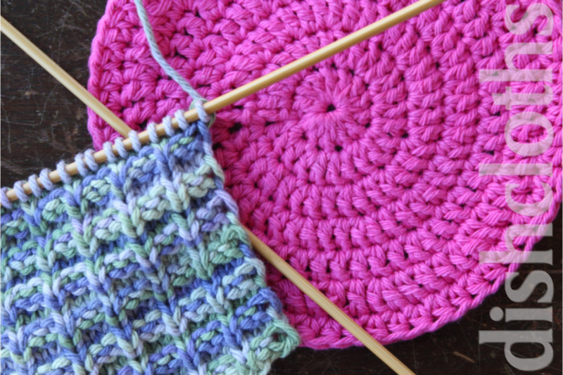
    "Orbital" in pink, and "Double Bump" on the needles.  I am still a rank amateur at crochet, and find it difficult to know what it is I'm looking at, so this took three or four tries before I got into the rhythm of it!  Still not pleased with the jog, but there it is.

    Echeveria setosa

    Fog

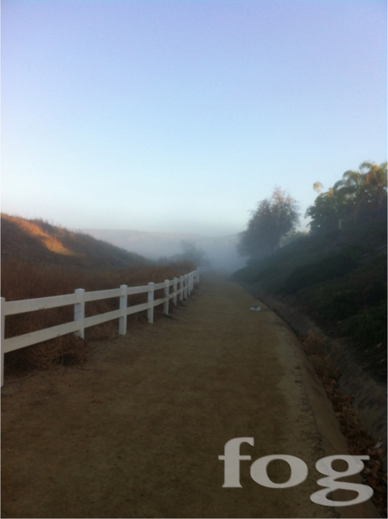
    We've been having a bit of summer in February lately, with temperatures in the 80s (pushing the 30s C), but yesterday morning it was suddenly foggy and cold — by the time I went out for my daily walk, it was beginning to clear but still clinging to the valleys and dips in the landscape.  Unfortunately, it had all burned off by about 9:30 …

  • 1589

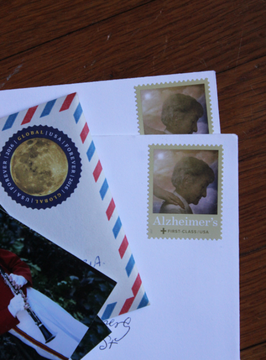
    Today is the 7th, and my tally is at six for the "Month of Letters" challenge, so I am pretty much caught up after the late start.  Yesterday I sent a Postcrossing postcard, a long-delayed Christmas thank-you, and a postcard to a young family friend who baked a cake for our get-together Sunday afternoon.  (I of course stitched willfully ignorant through the ostensible reason for the gathering ….)

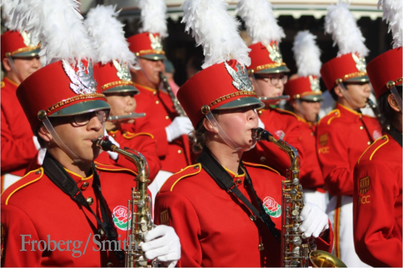
    And this afternoon I sent Julia's photo in her Rose Parade band uniform to the grandparents and honorary auntie —

    1602

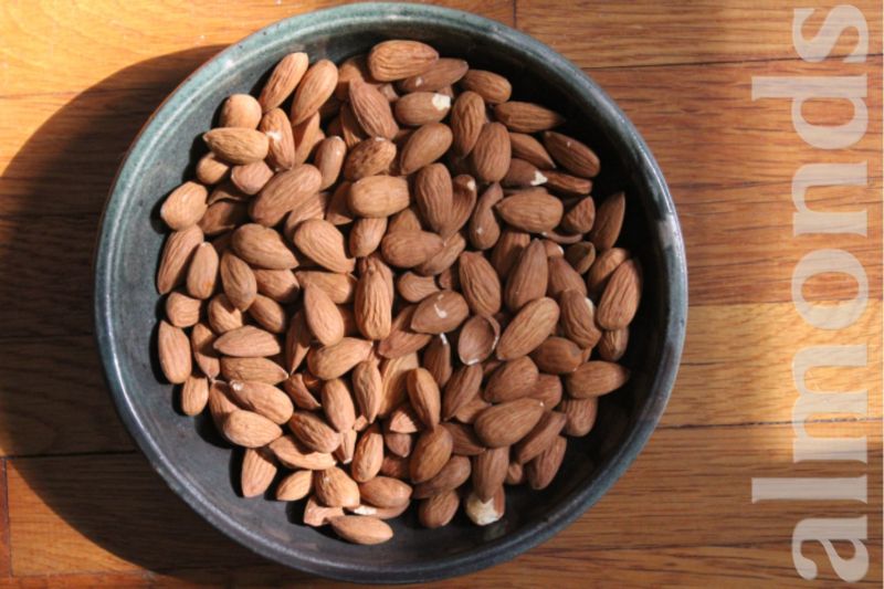
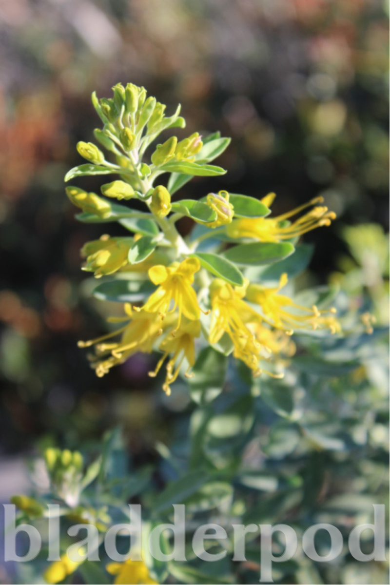
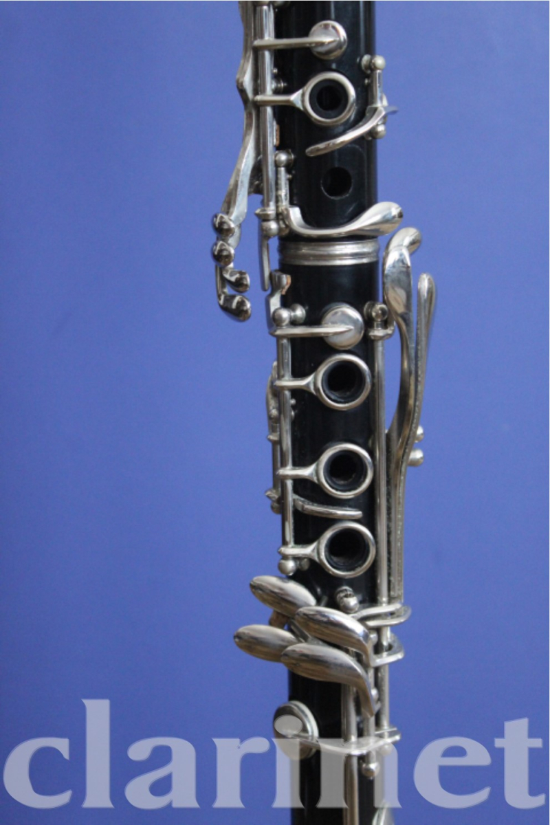
    I started to read Nancy Enge's blog a few months ago because of her miniatures, but a recent post struck a chord, albeit one in a minor key, talking about being in a bit of a funk — I recognize that feeling of vague disappointment in everything one does, the paradoxical combination of restlessness and general fatigue, even the buttery-fingers part.  I had a very stressful Christmas, and have already suspected that my starting a dozen or so new books and projects in the weeks since is both a symptom and a sort of self-cure.  It's just that the restlessness tends to be a bit frustrating, too, when what you need is to relax, to re-focus.  I have been tempted now and then to start up something along the lines of Blackbird's "Show and Tell Friday" — but more immediately, Nancy wonders if an "arbitrary and not-too-difficult challenge practice might help" to jump-start the creative energy — thus the ABChallenge, to take a photo of something representing each letter of the alphabet in order, something simple and really not demanding at all, just to blow those cobwebs away, as it were.  I took these photos the other day — yes, the same day I decided to do the Month of Letters, that's what I mean! — and I have to say right up front that I like Nancy's watermark/caption so much that I have promptly lifted the idea for myself!  Here is A, B, and C —

    Almonds

    Bladderpod

    Clarinet

  • ,

    A Day to Remember

    0556

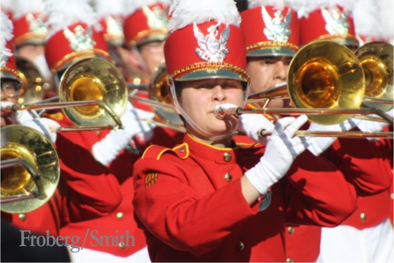
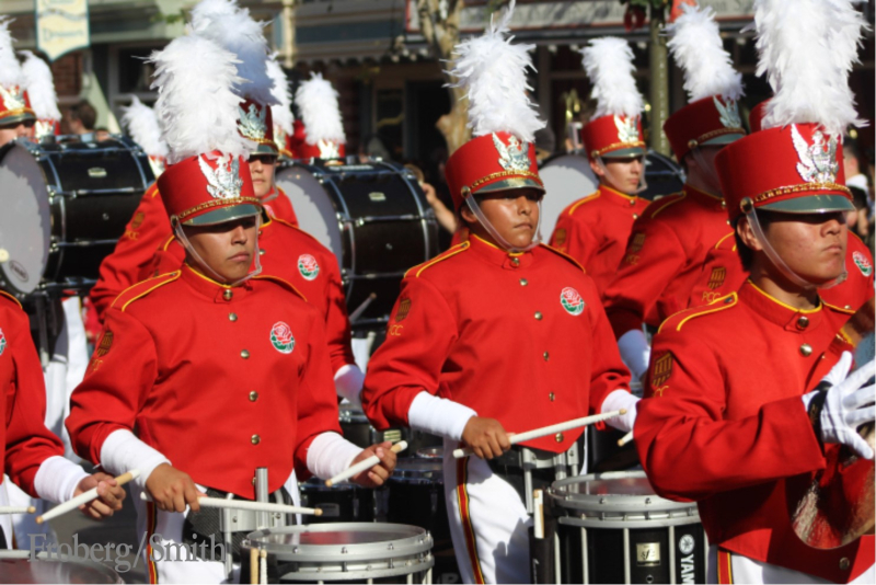
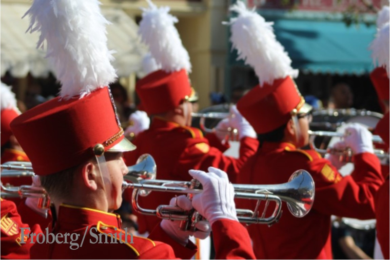
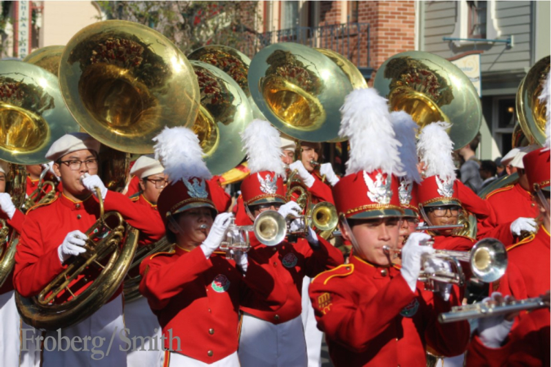
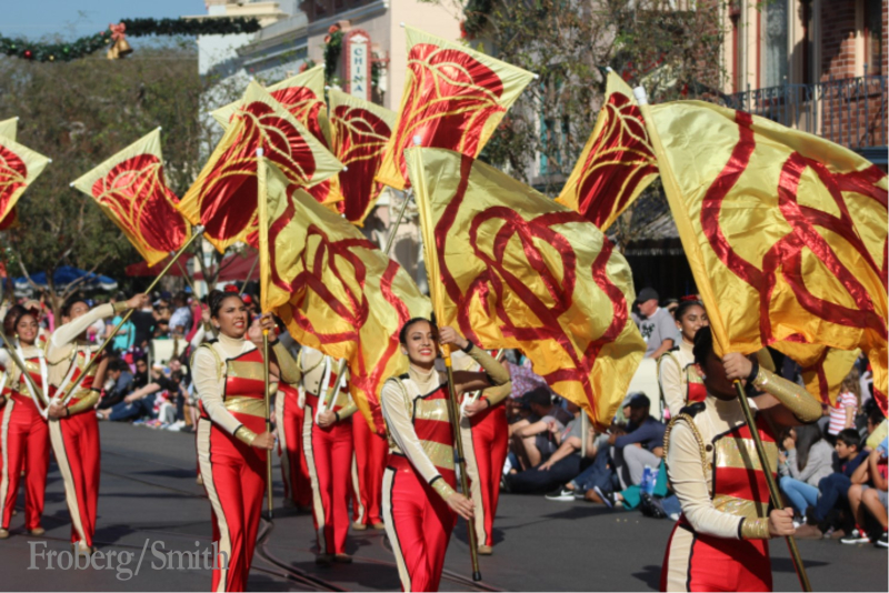
    Good heavens, I've just realized that I forgot to write here about going to see the Rose Parade this year.  I have lived here all my life, and never seen the Parade in person!  But we had an especially-good reason to go this year, as our Julia was marching in it, as a member of the Pasadena City College (PCC) Honor Band.  Our buttons were busting, I can tell you!  She was one of the (very) many high-schoolers who auditioned, and one of the (relatively) few chosen to swell the numbers of the college marching band.  This entailed a great many drives to Pasadena and back for rehearsals, and a very early morning on New Year's Day for an eight o'clock step-off, but it was worth it for everyone concerned, I think!

    We had pretty good seats for watching the Parade, in a grandstand about halfway along the route, but not so great for taking photos, as what seemed to be a small palm tree and a distant street sign turned out to be quite often right in the middle of where I wanted to take a picture, so I was especially glad that the band had also got to march down Main Street at Disneyland a few days earlier, for which I had an excellent view through a telephoto lens — my photos are from that day —

    0600
    0556
    0634
    0648
    0660
    0690

    And the band in the Parade on January 1st —

  • 1573
    Just discovered, via the Postcrossing blog, that February is the Month of Letters.  This would be a pleasant idea even if it were only to try and write more letters than one usually does, but there is another more active participation level as well.  The challenge part is two-fold — first, to mail at least one item every (postal service) day of the month, and second, to write back (by mail, mind) to everyone who writes to you.  I joined Postcrossing a few months ago, as I said before, because I miss not just the delight of finding something personal in the mailbox, but because I also miss the pleasure of sitting down and writing by hand, of thinking — if even just for a few minutes at a time — of the person I'm writing to, the reality of them, and the feeling of connection to that person, and thus the world, that that brings.

    Obviously, I've missed the calendar beginning of the challenge, but I am not far behind, and have already today inadvertently made it to 2 postcards sent, having woken up wide awake in the dead of night and half an hour later thinking, "well, I might as well get up and write a postcard, eh?!" and I wrote two, one for Postcrossing and one half-forgotten Christmas thank-you.

    I am not participating officially, as a signed-up member of the Month of Letters group I mean, but I am certainly going to take the challenge!  If anyone would like to help me reach the "letters sent" goal, feel free to leave a comment including your e-mail in the box provided on the comments form, and I'll reply off-blog so that you don't have to leave your address in public view.

    2018-LetterMoBlueSm

  • Cloughmills-crochet-knitting-image-hooks-village
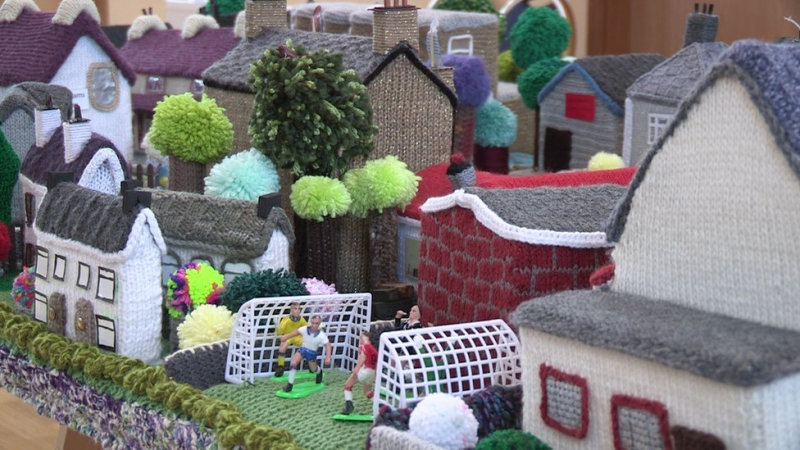
    Three cheers for the ladies of Cloughmills Crochet Club in Co. Antrim! who have recreated their village in crocheted and knitted miniature.  This looks like it was a lot of fun!

  • Mini Friday

    1542

    I've been fiddling with miniatures this past week, making little things for the regular "raffle" swap at our meetings — if you win something, you bring something to be raffled the next time (so usually everyone brings something!). There is usually an extended theme or project for the group, and the one we've just started is "nautical" — not sure what that means, as I missed last month's meeting, presumably a room-box of some sort — not that one has to bring swaps that go with the theme, but I wanted to practice my picture-making (since needless to say I have great plans for my own rooms, and happily I am not limited by silly things like money or somebody else owning an Old Master I like!), and so of course I thought, "I'll make some framed seascapes!"

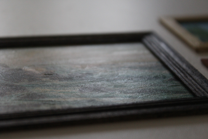
    My mitered corners are still a bit rough — I said to David the other evening, "I'm having a bit of trouble getting the miters true — and clean — what's the secret?" and he looked heavenwards and said, "If you find out, let me know," so I guess I'm not the only one.  And of course slight deviations that aren't really noticeable at full-size are really wonky at 1:12, but there it is.  These didn't turn out too badly, despite my wobbliness, so on the whole I'm quite pleased, and I really like the pictures, all copyright-free so I can give them away with a clear conscience.  On the left is "Maine Seascape" (1930-45) by the Russian-American impressionist Constantin Alexandrovitch Westchiloff, at top right is an untitled painting by the enigmatic Ken E. who has posted quite a lot of his paintings at PublicDomainPictures.net, and at bottom right is "Rolling Breakers" (1913) by the American realist George Bellows.

    I laid out the pictures to a pleasing 1:12 size on a page in Publisher, then printed them at "normal" quality onto thickish smooth drawing paper.  I have found that sometimes my printer kicks quite a lot at printing on anything other than regular paper, but this piece went through quite easily — I've also found that "normal" is the best setting, as "best" tends to add too much black, and while a lot of old paintings are darker than they should be because of age, when they get shrunk down to 1:12 scale, they can lose too much detail, so I think the sacrifice in "realism" is worth being able to see what the picture is!  I laid a coat of artist's gloss medium over the pictures, both to seal them and to add a bit of texture — I tried to make the gloss look like it could be "brushstrokes" too.
    1528

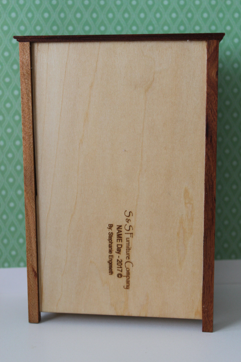
    The frames are experiments, frankly, but I think ones that turned out pretty well.  The Westchiloff is in some generic molding from HouseWorks, stained with two coats of Dark Walnut from a Minwax pen (two coats was definitely better than one) — luckily for me the dark frame pretty much completely disguises that one of the miters meets for only about half of its length….  The lighthouse is in just some plain 3/8" lumber from a scrap bag I bought years ago, painted with an undercoat of off-white and then two coats of gold craft paint.  The Bellows is in off-cuts of mahogany from when David was practicing cutting that for the Arts & Crafts bed, wiped just once with the oily cloth I was using to apply linseed-and-beeswax finish to my NAME-Day armoire — so I was pleased that not only does it work well with the painting, but it was thrifty and doesn't look it at all!
    1540

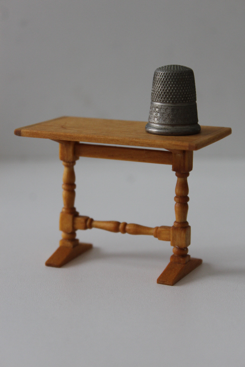
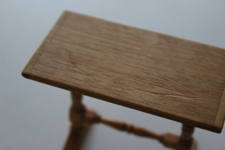
    This charmer is the trestle stand (kit no.40072) from House of Miniatures.  All the while the kit was sitting in my cupboard, I had pictured the finished piece in my mind as a dark wood, but when I looked online for images, I found that many trestle tables were a pretty golden sort of maple, so I thought I'd finish it with just the Tried & True, but after one coat thought it needed to be a bit darker, so it ended up having two coats of Danish oil in "Golden Oak" and then three more coats of Tried & True.

    I also banged it up a bit on purpose, to make it look more like it has been around since "ca.1770-1790" — this was surprisingly difficult to bring myself to do!  But I softened the edges quite a bit with sandpaper (unevenly), then took a key to the top —
    1542

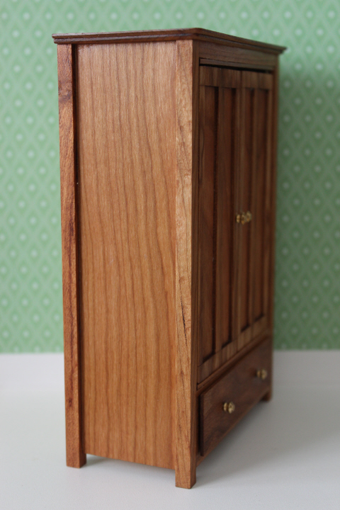
    And after some weeks of working steadily at it, then a month or so with it sitting while I tried to decide what to do about the hardware — I finished the NAME-Day armoire!

    1549r
    1549r
    1549r

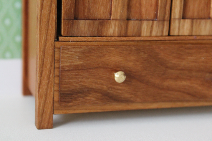
    I didn't much care for the knobs and handles that came with the kit, and I didn't mind at all making my armoire a little different from everyone else's, so I changed out all four for a set of "brass doorknobs" from Houseworks.  This involved quite a bit of fuss — gluing a strip behind the drawer holes because otherwise they weren't nearly deep enough, and filling the door holes with wood filler and re-drilling holes the right shape.  I didn't get the latter placed quite right, and I'm not sure any of them is quite sturdy enough — one of the drawer knobs popped out after I had put the finish on, and I had to scrape the old glue out of the hole before I could reglue it — but I do like the look of them.
    1551
    1551

    The finish is three coats (just one on the inside) of Tried and True.  This was a real pain to apply, with all of the nooks and crannies, and it seems to take a long time to stop feeling ever-so-slightly oily, but I think the results are worth the bother, and I really like the idea of using the traditional finish.
    1564

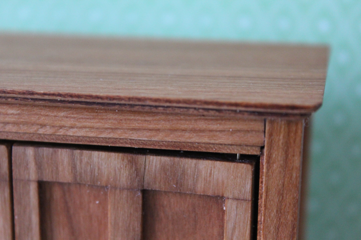
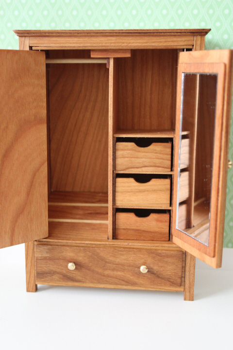
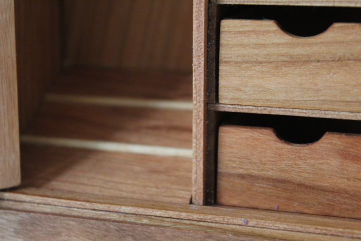
    The inside of the wardrobe is something else! Look at all that detail!  This is certainly the most fiddly kit I have ever done to date, and I had some problems with the kit itself (some unclear instructions, the shelves holding the three internal drawers not being wide enough) and some of my own doing (right angles not quite true, inexperience in thinking ahead, etc.), but I managed to either figure it out or come up with a solution that worked.  If I had it to do over again, I would certainly center the two doors more by eye than by distance.

    I'm not sure I really like the laser-cut kits unequivocally — obviously, the amount of detail possible can be had at a much lower cost, but on the other hand, sanding off the scorch marks along every laser-cut edge is not only tedious but risky if one sands too much.  (The door spacing might have been due to this, that the instructions didn't allow enough for removing the scorch marks? I don't know.)
    1564
    1564

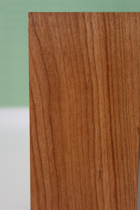
    The wood is very pretty — I chose maple, and it has a lovely grain, which the finish really brings out.  I could wish that the different pieces of the kit were matched a little better, as the frames on the doors are a slightly more silvery maple than the golden of the panels and the lower drawer, but there it is.  The drawer front is an exceptionally pretty piece!

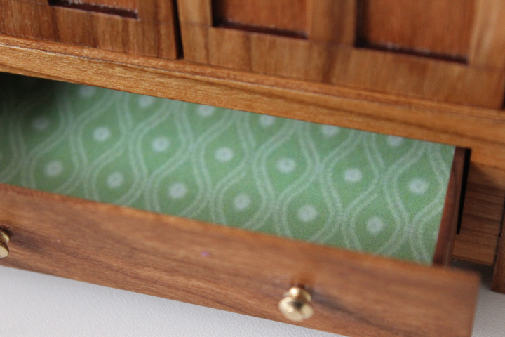
    The paper in the background is a vintage wallpaper miniaturized and available free from Jennifer's Printables. After taking most of the photos, I lined the drawers with it! —
    1564