• Grammar-389907_960_720
    I like to think that I don't get up onto soapboxes very often, but I've been reading some rather graceless prose lately, so that I especially appreciated these grammar jokes that my mom sent me.  I've no idea where they came from, sorry, nor how long they've been floating about the internet, but they are worth reprinting.

    Grammar isn't scary, folks! 

    Some of these are examples of errors, some of mere laziness, and some are just funny — I love the passive-voice one, for example, especially because I appreciate the passive voice when used well, and I remember Laura's freshman English teacher's abhorrence of it (which I still hope was only to make his students aware of the passive voice! thanks, Mr. I.!)

    • A dangling participle walks into a bar. Enjoying a cocktail and chatting with the bartender, the evening passes pleasantly.
    • A bar was walked into by the passive voice.
    • An oxymoron walked into a bar, and the silence was deafening.
    • Two quotation marks walk into a "bar."
    • A malapropism walks into a bar, looking for all intensive purposes like a wolf in cheap clothing, muttering epitaphs and casting dispersions on his magnificent other, who takes him for granite.
    • Hyperbole totally rips into this insane bar and absolutely destroys everything.
    • A question mark walks into a bar?
    • A non sequitur walks into a bar. In a strong wind, even turkeys can fly.
    • Papyrus and Comic Sans walk into a bar. The bartender says, "Get out — we don't serve your type."
    • A mixed metaphor walks into a bar, seeing the handwriting on the wall but hoping to nip it in the bud.
    • A comma splice walks into a bar, it has a drink and then leaves.
    • Three intransitive verbs walk into a bar. They sit. They converse. They depart.
    • A synonym strolls into a tavern.
    • At the end of the day, a cliché walks into a bar — fresh as a daisy, cute as a button, and sharp as a tack.
    • A run-on sentence walks into a bar it starts flirting. With a cute little sentence fragment.
    • Falling slowly, softly falling, the chiasmus collapses to the bar floor.
    • A figure of speech literally walks into a bar and ends up getting figuratively hammered.
    • An allusion walks into a bar, despite the fact that alcohol is its Achilles heel.
    • The subjunctive would have walked into a bar, had it only known.
    • A misplaced modifier walks into a bar owned a man with a glass eye named Ralph.
    • The past, present, and future walked into a bar. It was tense.
    • A dyslexic walks into a bra.
    • A verb walks into a bar, sees a beautiful noun, and suggests they conjugate. The noun declines.
    • An Oxford comma walks into a bar, where it spends the evening watching the television getting drunk and smoking cigars.
    • A simile walks into a bar, as parched as a desert.
    • A gerund and an infinitive walk into a bar, drinking to forget.
    • A hyphenated word and a non-hyphenated word walk into a bar and the bartender nearly chokes on the irony.

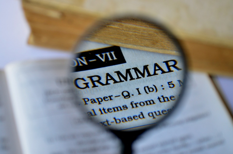
    The image is a Creative Commons one from Pixabay.

  • 3948

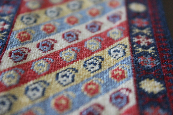
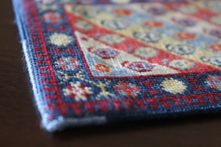
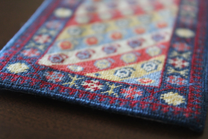
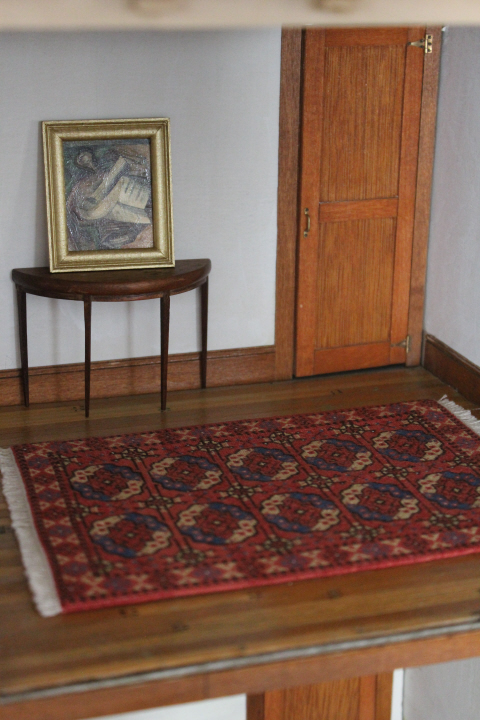
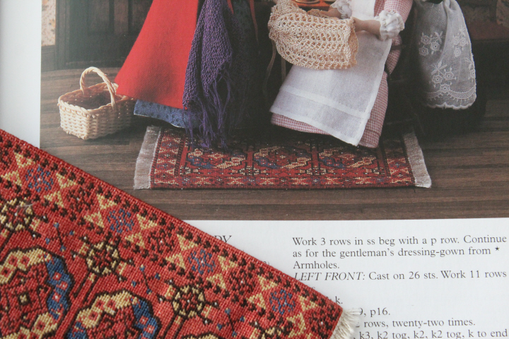
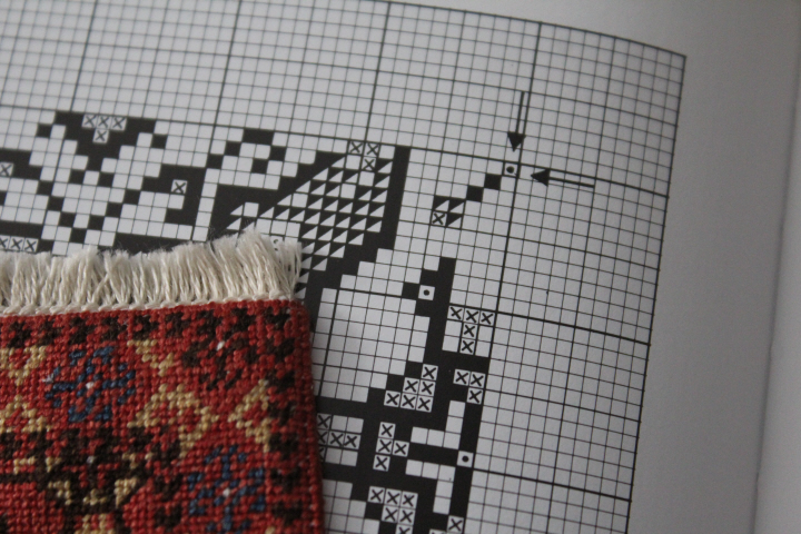
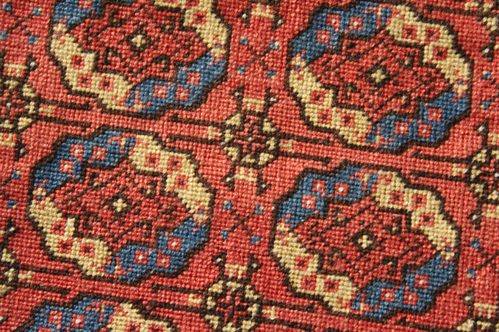
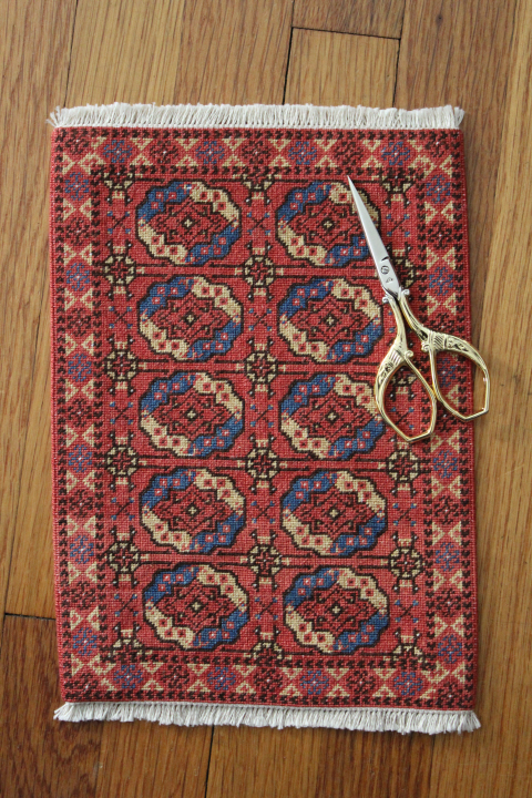
    This is the Gendje Runner, no.7 in Meik and Ian McNaughton's Making Miniature Oriental Rugs & Carpets.  I worked much of this while I was staying at my mom's this past month.

    The chart was originally designed for wool, but I've converted the shades, and "faded" them slightly, to DMC floss as I am still happy "playing around" with fibers and gauges.  I used 28-count Monaco instead of the original 24-count canvas, mostly because I've got rather a lot of the Monaco!

    3953

    This is a pleasing, fairly straightforward chart, and makes a handsome little carpet.  The McNaughtons clearly have orderly minds, as the designs are well-thought-out and tidy, and while the carpets have a more restrained feel than, say, Frank Cooper's charts, giving probably more the "flavor" as it were of Oriental carpets than the reality, the McNaughtons have done an excellent job in scaling down a wide variety of carpet designs and styles into simplified and quite manageable 1:12 scale pieces for new and new-ish petitpointers.

    3955

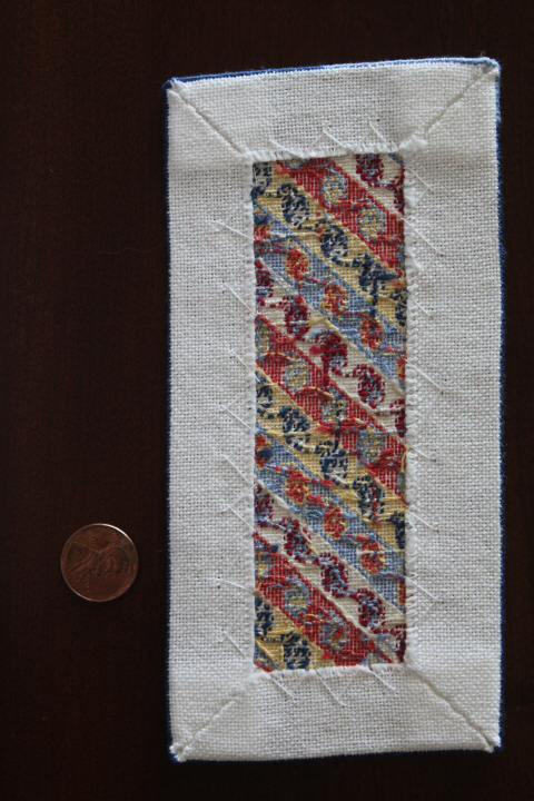
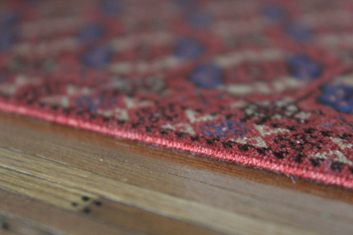
    This piece did tweak a bit as I stitched, and then while I was exploring online to find out if the Gendje runners were generally fringed or not, I came across an old example that had seen better days and in fact had a mend on one corner, noticeably a different shade of blue, and so I decided to let the crookedness go where it would, and make a less-than-new carpet — hence the "mend" —

    3957

    Gendje carpets are from the town of Gəncə or Ganja, now in Azerbaijan, in the southern Caucasus.  The diagonal lines filled here with boteh, the teardrop-shaped motif on which paisley is based, are typical of the long and narrow Gendje "runners."  The McNaughtons give a date of "late-19th century" for this particular type of carpet.

    3950

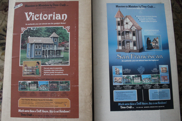
    I have been joking, to myself and others, for some time now — "oh, ha-ha-ha!" — that I need to make a carpet shop room-box to have a place for all of the miniature carpets I make.  This has been manifesting itself in occasional thoughts of buying a shop front kit and turning it around at the back of a room box, to be the view from inside the carpet shop, which I thought an amusing twist on the usual room-box "shop".  Then at my minis group meeting in June, one of the ladies said, "So I've got a friend who's had some Dura-Craft house kits in her garage since the 1980s, does anybody want them?"  Another member said she was, that she'd put one together and then give it to her favorite charity for raffling off at the next fund-raiser, and I, with a small gulp (having heard about the sheer size of some of the Dura-Craft houses!), said I'd take the other one.  As it turned out, the charity lady decided that she already has enough on her workbench — so both of the kits arrived at my house while I was away at my mom's —

    3967

    Yes, those are grown-ups for scale in the photos.  Hmm — could I make the San Franciscan into a sort of boho shop?!  The mind began to whirl …

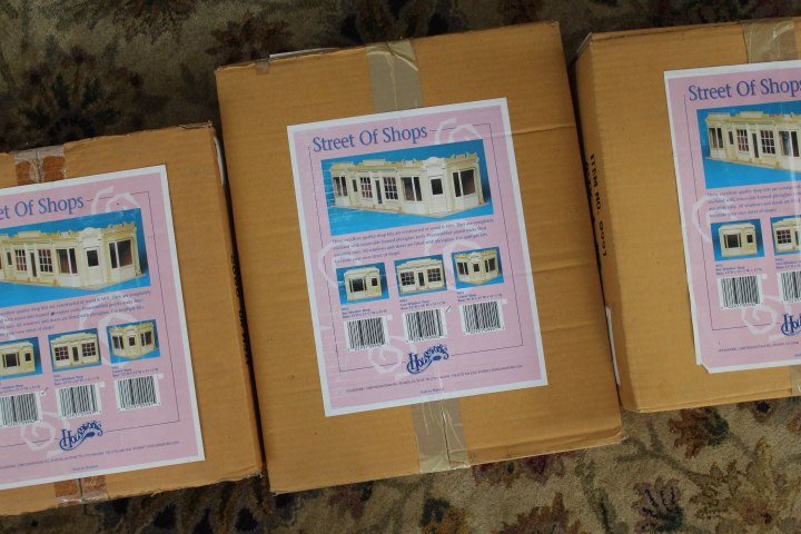
    And at the very same meeting (while I was away, remember), another of the ladies said she'd inherited the full set of Houseworks' "Street of Shops" room-box kits — three separate "shops" that fit side-by-side in any combination or order — also sitting in sealed boxes for umpteen years, and since she'd heard me joking about a carpet shop, would I like them?! 

    3966

    So my previously-whirring mind is now in fact boggling, not only at the generosity of miniaturists with their knowledge and "spare" stuff, but with the possibilities ….

  • 3890
    A month ago today, my mom had total hip replacement surgery. I've been staying with her since then, being physical-therapy coach, pill-dispenser, chauffer, chief cook and bottle washer, and of course general dogsbody — actually, she is a fairly ideal patient, uncomplaining and undemanding, and for the most part in good spirits if often just tired.  There was an unexpected falter at the very beginning, when, having been told that "probably" she would be going home the same day as the procedure, the hospital stay ended up being five days, which of course was exhausting and stressful, and meant that her physical recovery was set back that much more.  But then there was a dramatic upswing, she got to come home, and things have been progressing in an upwards direction almost continually since then.

    I knew of course that the recovery period would be extended — four to six weeks with the walker and the infamous TED hose, then a transition to the quad cane — so I came well-prepared with numerous fiber projects and books for various situations.
    3942

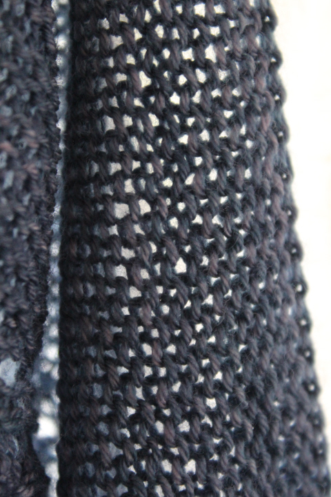
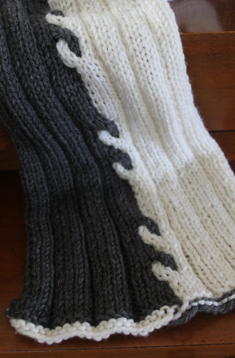
    I know, a scarf in July!  But I was indoors quite a lot during mom's hospital stay, and although I had a couple of books with me, she was surprisingly chatty considering, and I knitted on this until the grey wool ran out.  I had been looking for something in my "knitting" e-mail folder and found this free pattern in a Jimmy Beans newsletter from 2007 (!) and I thought, "hey, I have that Cashsoft in those very colors!" so I dug out a ball of each and tossed them in my bag.  It is the Storm Scarf by Iris G, and very simple with just a touch of busy-ness there in the middle.  The original pattern has you alternate the direction of the cables each time, but that didn't quite work for me so I have made them all the same.  Unfortunately, my two balls of Cashsoft are of considerably different sizes, so the "Thunder" ran out long before the cream did.  I have some more of each at home, so finishing is on hold but probably not far away.
    3785

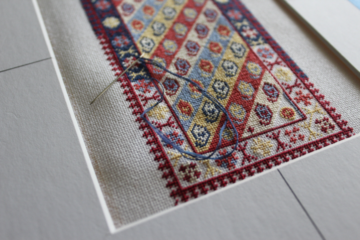
    Another petit-point carpet, this one the "Gendje Runner" from one of Meik and Ian McNaughton's books. 

    3790

    No less than three Inspector Gamache mysteries, which I found at the library used-book shop for two dollars apiece.

    (I read the first of the series not long after it came out, and enjoyed it.  I liked the Inspector, gentle and thoughtful, and the small-town Canadian setting with its quirky artists, but somehow I hadn’t managed to read any more in the meantime.  Knowing now, of course, that I’d be more-or-less house-bound for some time, I snapped them up, even though it was likely that there were gaps in the sequence, and yesterday I picked up Bury Your Dead.  And then it began.  Sentence fragments.  Piling up inexorably.  Like December snow against the door.  More and more.  I grew restless.  January.  Deeper and deeper.  Blast upon blast.  I remembered every grammar lesson I ever had – “no sentence fragments!”  Even the ones that were kinder than that.  “If you must, at least use them sparingly!”  But still they kept coming.  The snow is up to the eaves now.  And I am only in chapter two.  I feel trapped.  Battered by the icy shards.  Smothered –)
    3789

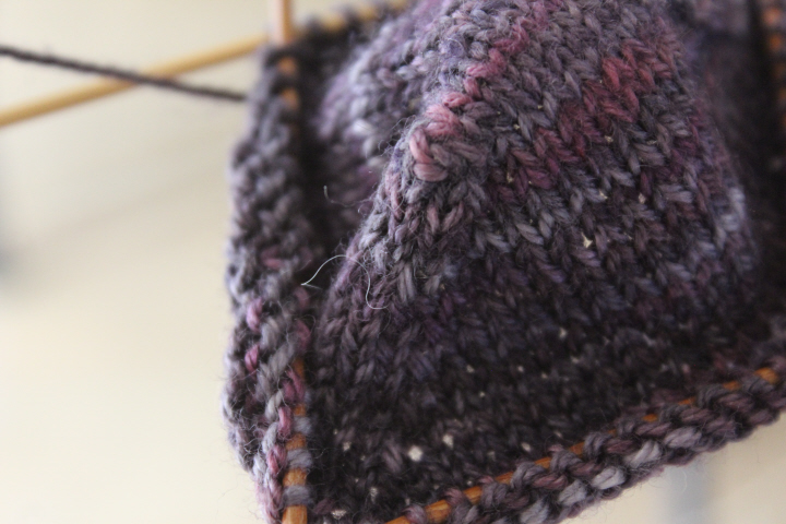
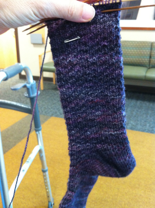
    This is the skein of Pagewood Farms' Denali in "New Horizon" that I've had in my stash since 2009.  2009! unbelievable.  I had already tried any number of patterns and was dissatisfied for any number of reasons, and tried more than one this month, including the Simple Skyp Socks which didn't quite appeal in this wool for some reason — though I will definitely put them on my future-knits list, mind you — but eventually decided on some toe-up Hermione's Everyday socks.  The cast-on I chose gave me much grief for an evening, but I eventually a) got it figured out and b) adapted the sizing to better suit my very-wide toes.  It's a beautiful cast-on, too, very clever, and makes a smooth and elegant toe.

    (Okay, how many people can't help calling them Simple Skype Socks?!  I don't even Skype!)
    3781

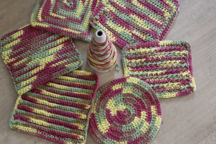
    Mom has a couple of knitted dishcloths in her kitchen drawer, but mostly uses a brush for washing.  Surprisingly to me, since of course I grew up washing dishes with a brush, I far prefer cloths now, and so since from the start of this adventure I've been the one doing the dishes, I thought, "okay, I get to do the dishes, I get to choose the equipment!" and even though I'm pretty sure mom does not care for these colors, they are just dishcloths and I had a whole cone of the cotton.  I have already made at least five cloths with it, and after cranking out a few more — a whole dishcloth in an evening, sometimes! that's one of the great things about crochet, I must say — I began calling it "The Cone of a Thousand Dishcloths"!

    The one at the right is the only one that took more than a day — it went incredibly slowly, but I had a hard time figuring out the stitch, and because I like my dishcloths worked at a very tight gauge, working it just made my hand ache.  It's the "Crunchy Stitch Cloth" from Petals to Picots, and although I will say that although it was a bit of trouble, the result turned out very well.  The others are, clockwise from there, the Spiral Double Crochet cloth, a horizontal rib cloth, the Herringbone Crochet cloth with a SC edge, Seeing Squares, and the Simplicity Dishcloth (DC edge).  I confess that I still often can't tell what I'm doing with crochet, and had the dickens of a time telling apart the herringbone and the half-double Simplicity one, but maybe that's partly because the herringbone doesn't look particularly herringboney to me …

    So it has been a strange four weeks, kind of outside of time and space while everything is discombobulated — my surroundings are different, the routine is different, the company is different.  We had some spectacularly hot weather —
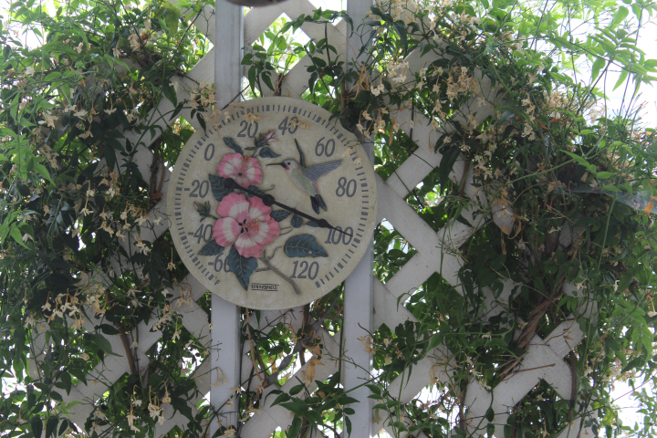
    3775

    — this was after it had cooled off! — and even an unexpected downpour —

    2870

    but also some really beautiful clouds in the evenings —

    2880

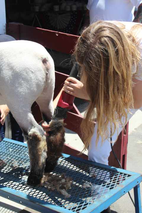
    and a brief interlude when Laura came to stay with Grandma while I went home and to the County Fair to see Julia show her market lamb —
    3856

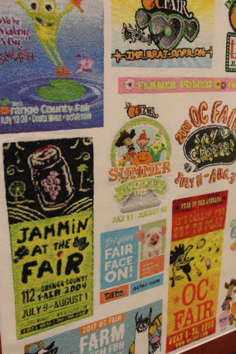
    Yes, she tied her hair back for the show ring!  It was a fun weekend, and I will share more pictures of the crafts competitions in another post.  The picture at very top here, by the way, is past Fair logos in cross-stitch!  Quite impressive — this was only part of the very large piece, and needless to say, it won some very big ribbons!

    And now I'm back at mom's, more dishes and laundry, more sunsets, more follow-up visits to doctors and physical therapists, a quick stop at the yarn shop …

    2881

    2889

    3947

  • Pony
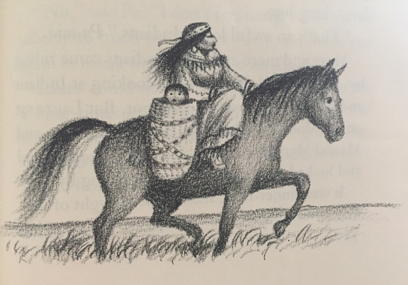
    Readers of this blog will probably be aware that I have a deep and lifelong love for the Little House books. And many will no doubt have heard of the Association for Library Services to Children's recent decision to rename their prestigious Laura Ingalls Wilder Award for substantial and lasting contributions by an author to children's literature, on the grounds of Wilder's "racist depictions of minorities," which decision I find deeply dismaying.  I appreciate that they considered for some time before making the decision — apparently the subject was broached in February — but it still seems to me a reaction to what is on the surface of the stories, not what lies deeper in them.  It is poor literary criticism to take the opinion of a character in a book and ascribe it to the author herself — although certainly it can be taken that way by a child — but that is actually not what dismays me so much about the ALSC's decision.

    Dr tann

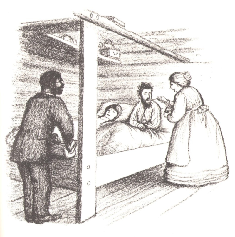
    I remember being a bit bemused by the minstrel show in Little Town on the Prairie, at the time I first read the books being unaware of the undertones of blackface (why is it funny?), but I also remember the black Dr. Tann and how he selflessly and cheerfully visited sick families in the malaria-stricken creek bottoms of Little House on the Prairie. I remember very well Ma's fear of Indians, her repeating that "the only good Indian is a dead one," but I also remember both Pa's pragmatic attitude towards the men who came into the cabin and demanded food and tobacco from Ma, that she had done the right thing by not resisting, and towards the Indian who nearly shot the dog Jack who was in his way — "It's his path.  An Indian trail long before we came" — and Pa's respect and admiration for Soldat du Chêne as a leader of his people.  And more importantly, I knew even as a child that it is Pa's attitude, not Ma's, that Laura takes away from the experience.  It was clear even to me that Ma was afraid of the Indians, and that was why she hated them, that Pa was not afraid so much as wary and yet still fascinated, and that he was willing to learn more about them — that is why he takes the girls to the abandoned camp, of course, for one.  Saying, as the ALSC has done, that the books are "racist and culturally insensitive" is a shockingly shallow reading of the Little House books as a whole. You cannot teach a lesson without showing the wrong answer — how does a child know what is "right" if she doesn't know what is "wrong"?  Likewise, you cannot show a growing change in cultural attitude by not showing the original one.  Laura respects and loves Ma, of course, but it is Pa who is her hero throughout the books, and it is Pa's lessons that Laura learns here, and though Pa's lessons are in themselves problematic on this subject, he at least could see more than one perspective.

    Clearly, Wilder was a product of her time, but I think that one of the reasons I loved these books so much is that there was a depth and complexity to them that made me think, that she presented characters with the cultural attitude of her time but she was also able to show another viewpoint, the beginnings at least of a more tolerant, open-minded one.

  • Secretary
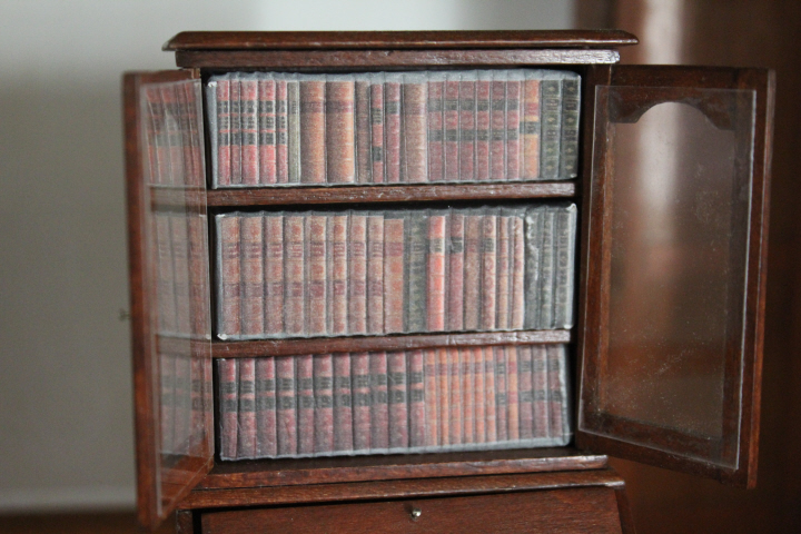
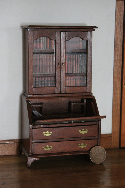
    Here is the "S" for my ABChallenge — a miniature fall-front secretary.  Somebody was giving this away at my miniatures group a while back — "it needs a bit of TLC," she admitted, as the lid was broken where the pin hinges were, but I managed to get enough wood-filler in that I could make it hold together again.  It doesn't really want to lie flat when open, but maybe I can either weight it down with something or just leave it closed.  Susan D and I had been exchanging e-mails around that time about making miniature books, so I did these blocks —

    3591

    They are a bit wobbly along the tops and bottoms, but I put the best one in the middle, so that with the doors closed, most of the wobbliness is hidden!

    3588

    And the rest of my "10th of the month" miniatures update —

    3557

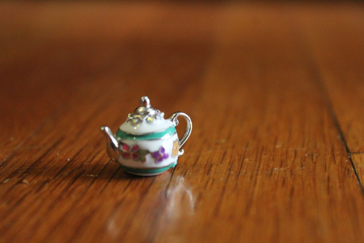
    A very sweet enameled tea pot that was originally a bracelet charm, but surely is meant to be on a tea tray somewhere!

    3053

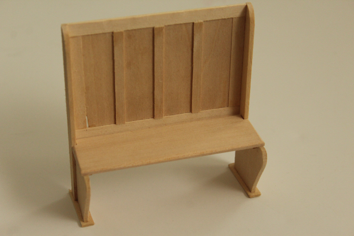
    Someone was giving this away, too, at another minis meeting a few months ago — I could hardly resist "Railroad Depot Bench," could I!

    3054

    It went together fairly easily, though the back piece was slightly chipped on one corner — I wanted it to look old anyway, so that was no problem.  The only worrisome moment was when the back piece, which is a very thin piece that you glue the battens on, apparently sucked out all of the moisture from the glue, and because it is so thin it didn't have much surface area along the bottom edge to stick to the cross-piece at the bottom, and promptly warped out to the back so much that I could easily have stuck my finger into the gap.  But I found some pieces of scrap wood in the garage that fit almost exactly on either side of the back, and clamped them together and left them to sit overnight, and luckily it was almost as good as new in the morning.

    3565

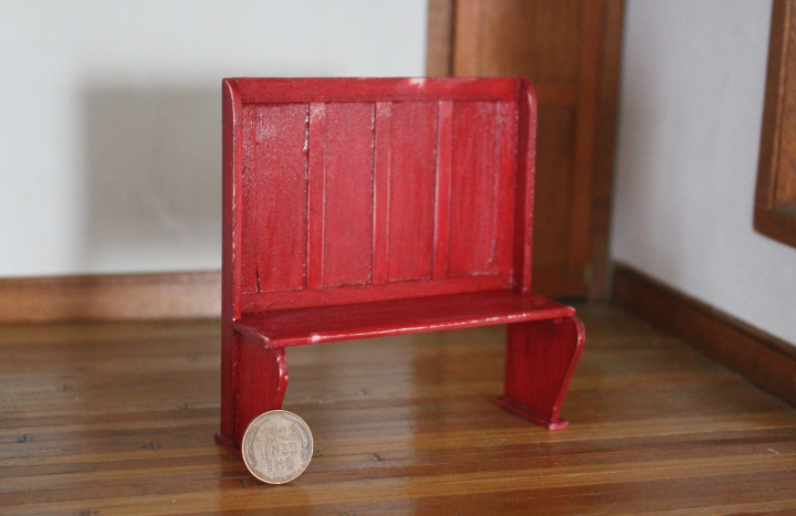
    The instructions said that maroon was the traditional color, but I didn't really like the rather orangey look of the one craft paint I found actually called "Maroon," and so I used "Red Barn" instead.  I obviously need some practice getting a smooth coat of the clear finish on.

    It's now roughed up a bit, with some scratches and wearing-off of paint — even, I'm sorry to say —

    3567

    some graffiti. 

    3576
    But of course it will make an interesting and amusing bit of "junk" in the attic!

    2989

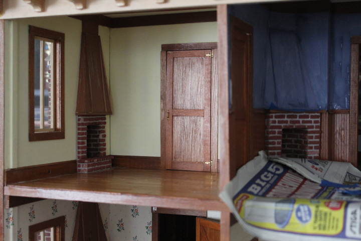
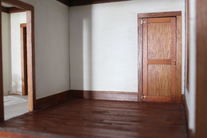
    I have also been slowly painting the dollhouse itself.  The room on the left is going to be mother's sewing room, and I've removed the wallpaper — which I liked but was peeling off a little too much — and painted it with FolkArt's Milk Paint in a really charming "Churned Butter" palest yellow.  The library in this picture had just had the first coat of Milk Paint in "Jamestown Blue," which here looks alarmingly seedy but after a second coat is extremely pretty.  To be honest, I really hate the copper-colored fireplace hoods, and as I was priming this room — two coats, to try and cover up that very 70s-looking kelly green — I thought, "oh, the heck with it" and painted over the hood as well.  We'll see.  It looks kind of truncated now, but maybe I can disguise that with a mirror or something!

    3558

    The breakfast room downstairs, after removing the faux wallpaper and sanding off the remnants of glue — glue stick, I suspect, and not easy to get off, as the paper fuzz was very recalcitrant.

    3562

    It's funny, in my callow youth I probably wouldn't have given this color a second glance, thinking most neutrals a waste of time, but now I find this one really beautiful — it's Martha Stewart's "Lake Fog," a sort of beige or sand with a hint of grey in it.

    (No, I'm not masking off the woodwork.  It's really hard at 1:12 scale, trying to get a piece of masking tape to stick on the edge of a piece of baseboard that's protruding only 3/32 of an inch.  I found that it was actually less stressful to just do without, and run a fine brush along the edge very slowly.  There certainly are some wobbles, but on the whole it is working pretty well.)

  • ,

    “R”

    Red2

  • 3553

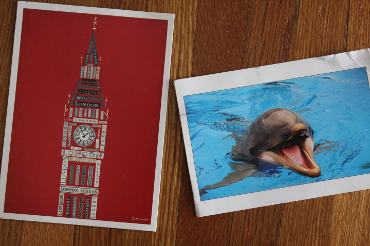
    How nice it was to find these in my box this afternoon, at the end of a rather stressful week.  The one on the left needs no explanation of why I like it so very much, surely! and come to think of it, neither does the other one!  As it happens, the dolphin is the very first card sent by that Postcrosser, who is a young boy in Eastern Europe, "nearly four years old" — his mother writes the cards for him, but he signed his name very neatly.

    It's the little things, sometimes!

  • 3035
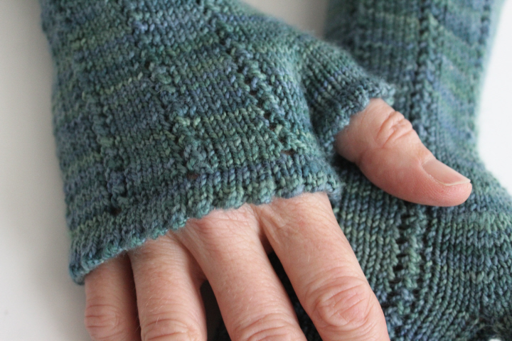
    The Bluestocking still knits!  I've had two finished projects sitting around waiting to be photographed and blogged for months, I'm sorry to say — well, not even "sitting around" because I've worn the shawl a couple of times already.

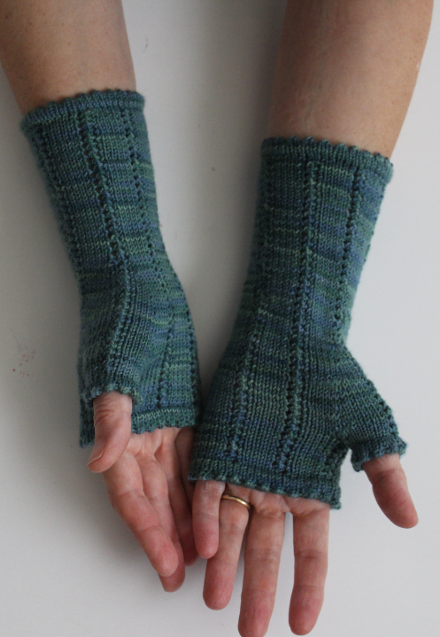
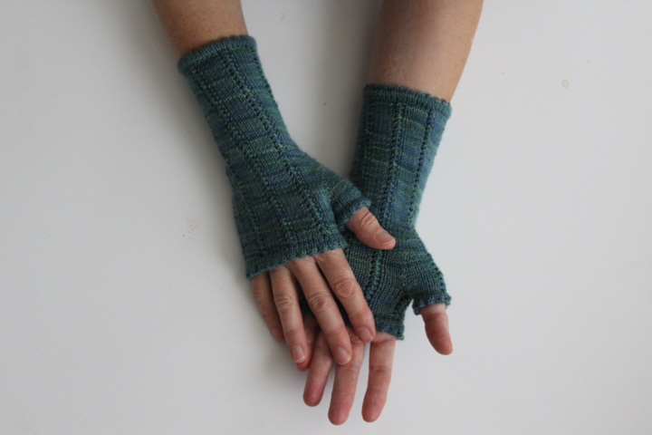
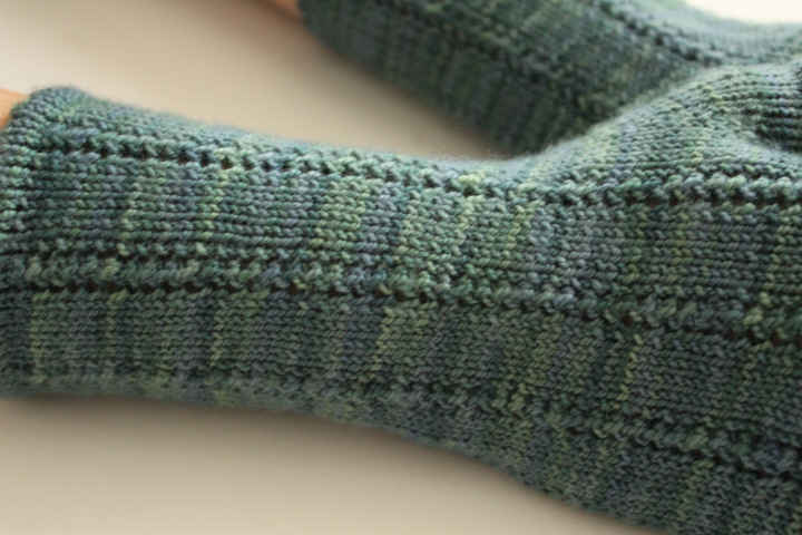
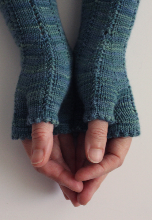
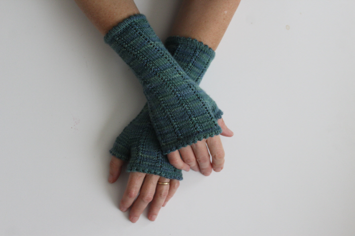
    First is the Ghislaine mitts by Sara Varty, here in a long-awaited skein of Cherry Tree Hill Supersock in "Water" (blueish greens/greenish blues).  I've had this yarn in my drawer for at least ten years — I think I had some fancy of knitting a pattern that had a watery name, but nothing ever appealed quite enough, and so when I saw the Ghislaine mitts somewhere, I decided that elegance would suit the subtle sophistication of the yarn's colors and delicate sheen perhaps even better than a name would.

    3036

    3041

    The top hems are sewn down per the new-to-me method in The Knowledgeable Knitter, which is a kind of duplicate stitch.  It's a lot more bother than simply knitting the front and the hem stitches together as you go, but much smoother and quite soft, so especially pleasing on a pair of mitts.

    3042

    This pattern probably would have been quite easy if I had paid a little more attention — it's possible that it is too easy, as I kept making little mistakes like repeating Round 2 three or four times (!) in a row, or … or — somehow — picking up an extra loop somewhere and ending up with too many stitches (!!) at the end of the gusset.  Well — I think I noticed all of these before it was too late, and the resulting mitts are quite elegant.
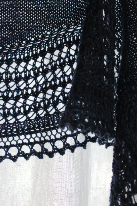
    There is something about certain faggoting combinations that tend, on my needles at least, to sort of scooch to one side — and I think usually on the left edge, though I will have to take note the next time it happens — thus obscuring the faggoting.  This one did as well, so I came up with a little trick that worked pretty well.  The stitch pattern has you yo, SSK on the first patt round and K2tog, yo on the second, and since it was the left edge of the column that pulled in a little too much, on the second patt round I did a YO twice, and simply dropped the extra yo on the next round, thereby giving it a little more wool so that it could spread a little better.

    3042

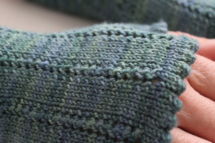
    For the first mitt, I did as the pattern suggested and decreased around the top edge before working the picot hem, but — possibly since I shortened the top length a bit — this made the hem too tight on my hand, so I picked it out and reworked it with the full number of original stitches.  It does flare out a bit, but this is an acceptable compromise for me, since I prefer the shorter length.

    3033

    The next time that I use this picot hem, I might work one round less on the turning (the inside), as mine usually seem a little concave where they should be either flat or convex — I'm assuming that having the turning ever-so-slightly shorter would pull the edge of the hem towards the inside just enough to solve that for me.  It might also be that the hemming method adds just a smidge of length, so that's something to keep in mind.

    3037

    I really like them — classic and elegant, with a lovely smooth line and fit.  Full marks!

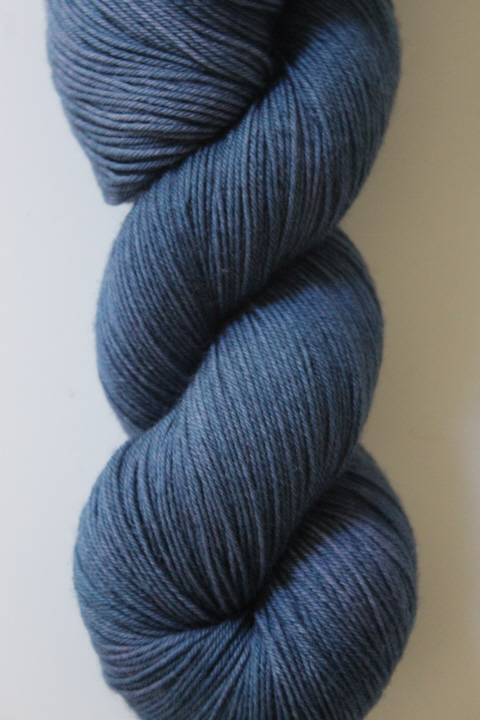
    And then a skein of Seven Sisters Arts' Meridian merino/nylon blend in "Havran" —

    1819

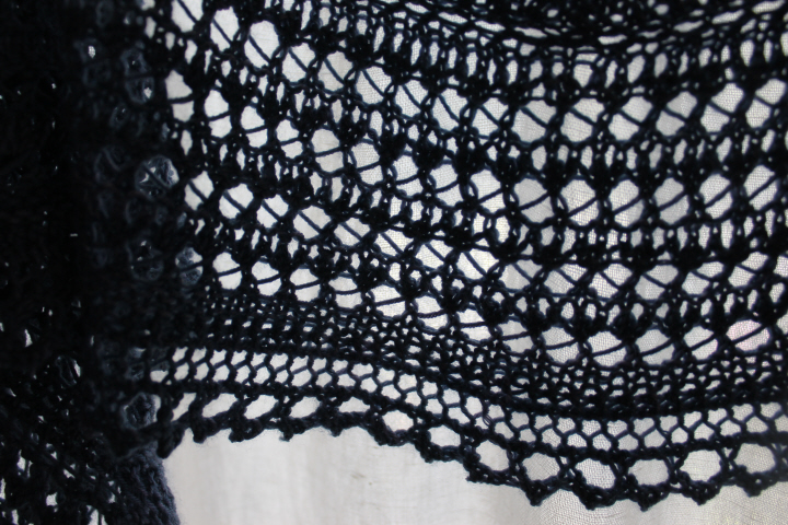
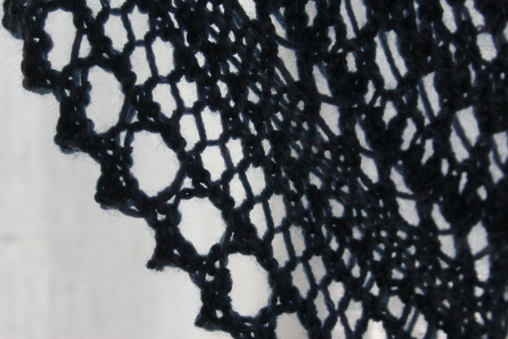
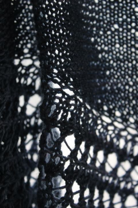
    became the "Henslowe" shoulder shawl by Beth Kling.  This is one of those charmers that is much easier than it looks, for the lace is a fairly simple one, and the interesting effect of the alternating diagonals is accomplished simply by working one repeat from the RS, then one from the WS, and so on.  And there is minimal finishing to be done, as the sections are joined as you go, with no hemming necessary.

    2825
    2825
    2825

    The wool looks rather purplish in these photos, but the one of the skein is for the most part more accurate — it is a sort of RAF blue, but changeable — very handsome.

    2825
    2825

  • 3007

    This is the Turkoman carpet, designed by Sue Bakker, from Venus Dodge's Dolls' House Needlecrafts. It is is a rather frustrating book, with hundreds of projects in all different kinds of needlecraft, from knitting and crochet to sewing to needlepoint and embroidery, but with pictures far enough away from the particular instructions that flipping back and forth from one to the other is inevitable, and in particular the needlepoint carpets are all photographed in a room setting, i.e. under furniture or dolly feet so that you don't necessarily have a particularly clear idea of what a piece is going to look like — a fairly major flaw in a needlecrafts book.  The ultimate frustration (so far) for me has been that the very charming Arts & Crafts carpet in the cover photo — which I would stitch in a heartbeat — isn't even in the book at all.

    3024

    3024

    I've already given my theory on the Problem Chart for this carpet, so I will only say here that although the instructions imply differently, the chart itself is meant to be flipped — that is, it is only one-quarter of the finished carpet — otherwise you will have to drastically alter the border as charted to fit the much-smaller main field.  I worked my version as the full ten-gul carpet, as it looks much better that way to my eye, and I like Bakker's designs. On my 28-count Monaco canvas, the finished piece turned out to be 5 3/4 x 7 3/4 in. (14.6 x 19.7 cm), less the fringe.

    3006

    I also decided to try "fading" the colors this time, to make the carpet look older.  Instead of using two strands of the given colors, I used one of the original and one of a shade lighter — this not only "fades" it a bit, but gives the colors a bit of depth, I think.  This is what I used, original shade first and the lighter one second —

    • dark brown 3371 + 938
    • blue 3750 + 930
    • cream/ecru 3033 + 3866
    • gold 3045 + 422
    • red 355 + 3830

    The fringe is 3866.  Since I was going for an older-carpet look, I decided when I was beginning to fill in the red ground, that I would also give it some "abrash", which is the word for the color variation you sometimes see in oriental carpets, as when a slightly different dye lot has been used in one section, or one dye lot has faded at a different rate than the rest, or simply due to natural variations —

    Abrash

    (I've taken these details from carpets in the Wikipedia article.)  In a woven carpet, abrash often appears as a "stripe" across the width of the carpet — to mimic this, I just used two strands of the lighter red for a few inches, then two rows of the blended, one more of the lighter red again, then back to the blended red for the rest.  I'm really pleased with the way this turned out!

    3023

    Turkoman carpets — now usually called Turkmen — were produced by the Turkmen tribes in what is now Turkmenistan, as well as Afghanistan and Iran.  The deep red background is a distinguishing characteristic, as is this "Tekke Bokhara" design of symmetrical repeated guls, here the oval motifs, separated by stars or diamonds.  (More information here, and some examples from past auctions here.)  Bakker's version looks like it might date from the early or mid-Victorian period to somewhat later, so is ideal for either a Victorian setting or, like mine, as a family heirloom!

    3006

  • 2866
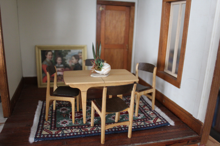
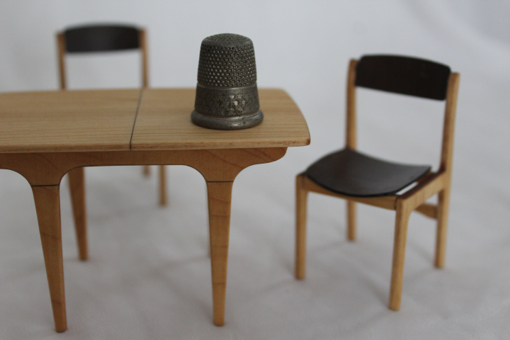
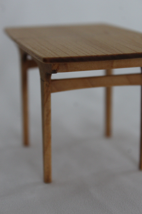
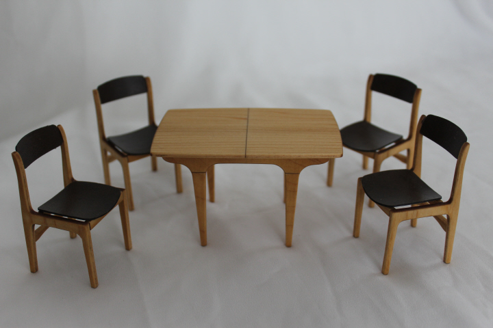
    When I saw the "Retro" dining table kit on Jane Harrop's website, I couldn't resist it, so I counted up the money from my Christmas stocking and splurged.  I really liked the set anyway, but when I found out that the table is only 4"/10cm long, I knew it would probably be perfect — you can see how small the room is!

    2864

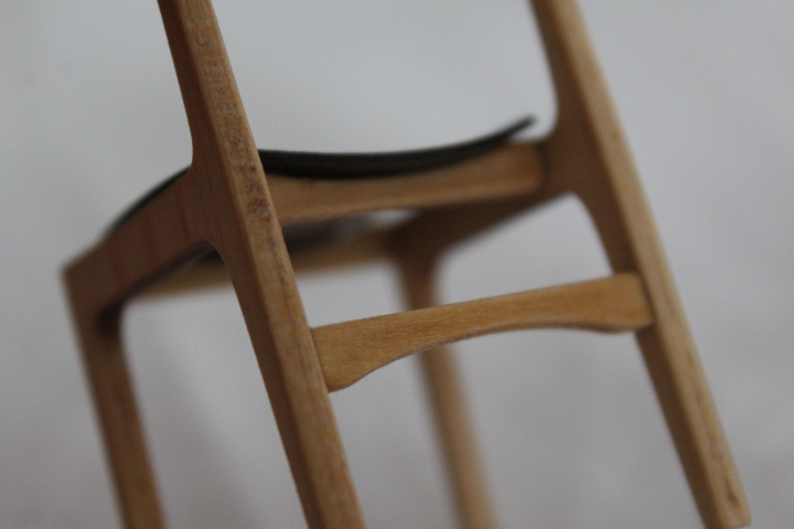
    Now that it is all a month or so behind me, I am beginning to forget how much of a bother the chairs were to put together, and instead to just appreciate their ingenuity and beauty.  The kit pieces are laser-cut, so you must sand off the scorch marks, and despite heeding Harrop's warning to be especially careful with the side pieces — because the horizontal part goes across the grain and is therefore very vulnerable — I managed to snap two of the eight before I even got to the gluing stage.  One went back together almost invisibly, at least! 

    There are also very few points where the pieces actually come into contact with each other — just at the ends of the three stretchers — so the glued joints are also vulnerable.  I was using Aleene's Tacky Glue, so maybe it would have been a different matter with something else, I don't know.  They were definitely more sturdy the more stretchers were in place, which was helpful, but I even managed to knock one apart while finishing it — I wanted to use the Tried & True I have, which was so successful on the Arts & Crafts bed, but requires that you finish it after assembly.

    The cushions are some glossy papery stuff I'm not familiar with — you glue one piece to the top and one on the underside of a piece of heavy card cut to shape (all provided in the kit) and then shape them to the required curve while the glue is still damp, to fit the stretchers in the seat.  I found that this worked perfectly to shape them! —

    1886

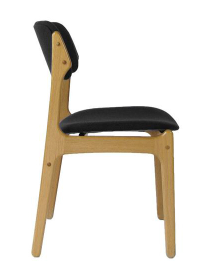
    I learned along the way that these particular chairs are based on Erik Buch's "49" design from the 1950s — I guess a minor Danish-modern designer, as he doesn't even have an article in the Danish Wikipedia, let alone the English one.  Here is a photo of the 49 chair from the Erik Buch company —

    ErikBuch49Black_grande

    There are some interesting pictures here of a 49 chair with the seat removed, so that you can see how the seat "floats" — other photos of restored chairs are here and here.

    2861

    Harrop's 1:12 version is ingenious in miniaturizing the essence of the chair and table, just with the caveat above that the kits (certainly the chairs, the table is much easier) are probably best for someone with some kit-building experience.  I do wish that the seats were a tiny bit bigger, so that you could get more of the "floating" effect, but it's certainly good the way it is!  I did put the back rest up a little higher than in the instructions, which looked to me more like the originals.

    2859

    (I used Loctite gel glue for the cushions, by the way, as the back is held on essentially by friction, since you can't use much glue or it will show.  By this point my chairs had a linseed/beeswax finish, and regular glue probably wouldn't have held.) 

    The table was a breeze after the chairs!

    2863

    2859

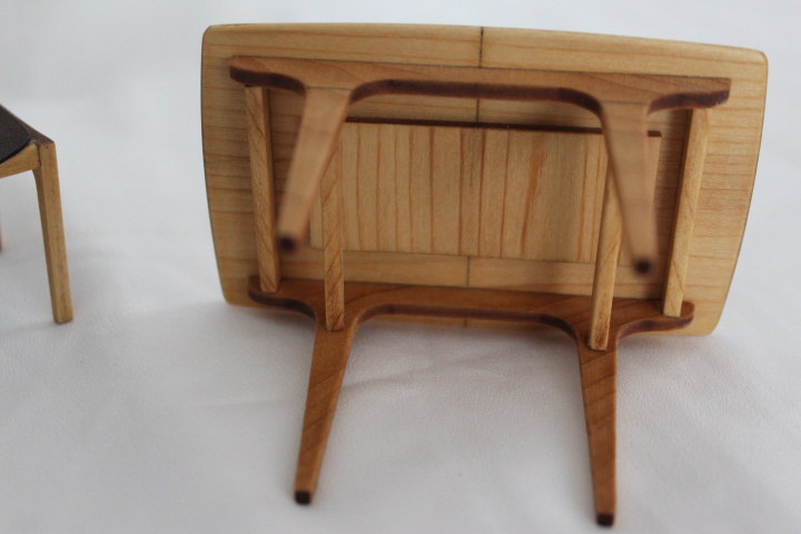
    The piece underneath can actually be a table leaf if you like.  I was sorely tempted to do so, but trying it out before gluing, the larger size would have been just a little too impractical in the small room, and so that piece is now a reinforcement, its original purpose anyway.  The grain lines look a little darker in the above photo than they are in real life, where they are quite beautiful.

    It's funny because usually the things I like best are really old, but Danish Modern does get my heart pounding! and so I'm delighted to have found these kits.  I didn't plan it, but they also look really good on the Karagashli carpet I worked a few years ago — I really like the golden wood against the green, and the styles, despite being both a century and a continent apart, are unexpectedly harmonious!

    2856