• 7163

    I haven't done anything with my carpet shop for nearly a month, after clearing off my "work space" — which is the dining-room table — for Julia's apparently-annual birthday tea.  (Not that I'm complaining about that, mind you.  I had the tea part all organized with a prep schedule, everything made ahead except the scones, so didn't feel at all overwhelmed and in fact quite enjoyed it, and the guests did too.  The only part that wasn't organized, to my annoyance at myself, was tidying up beforehand.)  Anyway, I've pulled out much of the shop from its various storage/hiding places, and realize that I'm quite far along towards completing it.

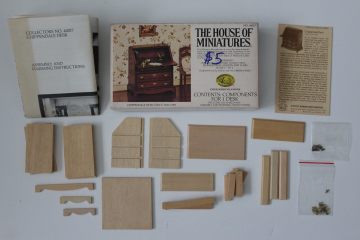
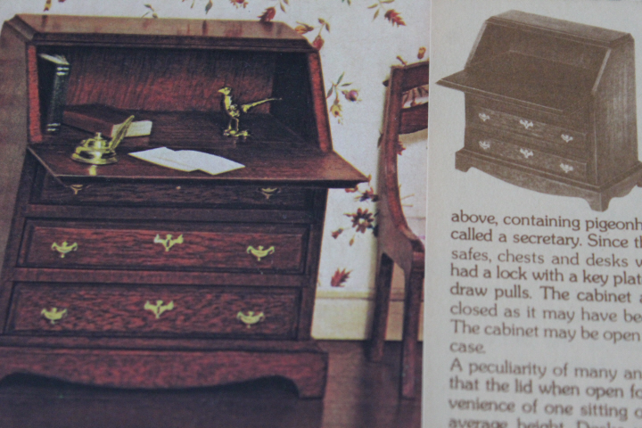
    This is the House of Miniatures Chippendale Desk ("ca.1750-1790"), kit no.40017, which despite the "$5" written on the box was on the giveaway table at one of my miniatures group's meetings some time ago.  I knew that I wanted a desk for the carpet shop, so I was delighted to see it there.

    But this little piece proved to be puzzle upon puzzle upon puzzle, in both its background and the putting-together.
    5230

    Wait a minute, two bags of hinges?  After some pondering, and an unrelated inspection of the parts list, I realized that the second bag in fact does not belong here, as the screws on the parts list illustration are clearly round-headed, where these are flat. It is possible that a previous owner decided that the round-headed screws were too bulky-looking and hoped to substitute a spare set with flat-headed screws — quite likely, in fact, as I thought the same thing when trying to decide which to use! — or they just migrated inadvertently into another box — also quite likely, as I have seen the workrooms of dedicated miniaturists, tidy but very full.
    5231

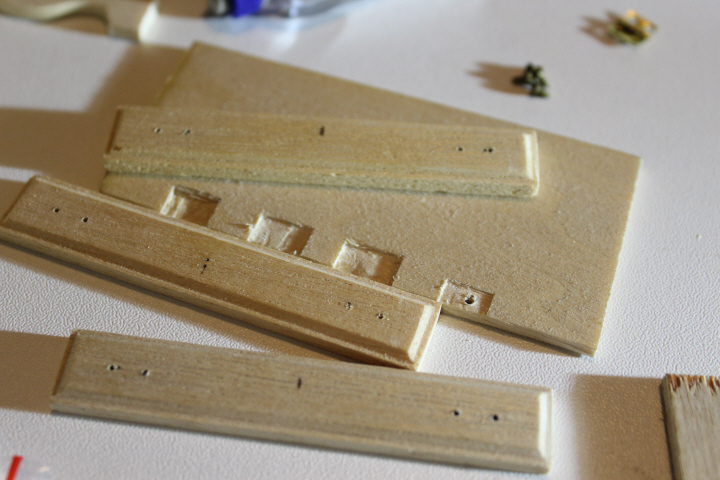
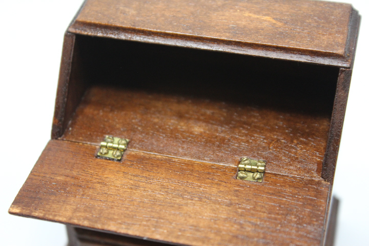
    Wait a minute — again — in the photo on the box the slant front is attached coving-side out, and on the little "historical fact" note, the slant front is attached coving-side in.  The writing surface in both of these illustrations also clearly has no galumphing hinges on it either.  But the instructions tell you to start off by carving out (yourself) tiny notches for the hinges….

    By the time I got this far, I had seen Maria Nikolajeva's post on the desk, and then I found a post about one that Brae had done, and after reading the post a couple of times thought "wait a minute — hers has pins instead of hinges!"  The page for this kit at the (unofficial) House of Miniatures webpage says that there were two versions of the slant-front desk, one 1976-1979ish without pigeon-holes inside and a few years later one from 1979 on with them, but it seems that there were two versions of the earlier one as well, one with hinges and one with pins.  It looks like the pinned version of the earlier desk has no coving on the slant-front, either.

    Well, this research was all very curious and interesting, but much of it was, really, my putting off doing the hinges, about which I had no choice because there they were.  So I just dove in.

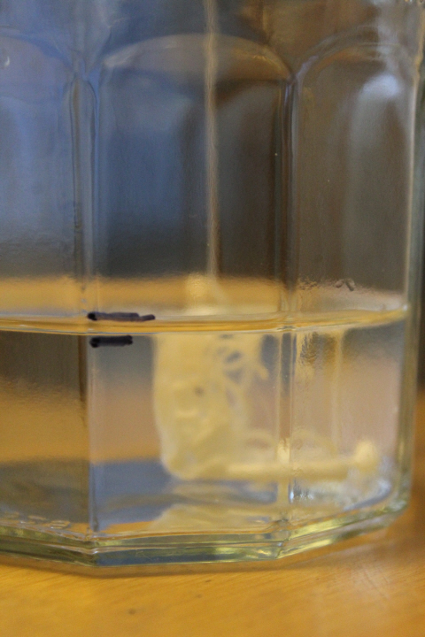
    There was not any end-grain sealer to be had at the local hardware store, and I didn't want to keep running around to different stores (as I had just done looking for stencils …), so on the advice of a number of woodworking sites, I made my own, out of 9 parts water to 1 part white glue, in an old jam jar.
    5326

    (Which provided me with a bonus "V" for the ABChallenge —
    Vermiculate

    "adj. 1. another term for vermicular [like a worm in form or movement; vermiform]."  Which leads me, word geek that I am, to wonder, in both admiration and mystification, why on earth we need three words in the same language for "like a worm in form or movement"?!)

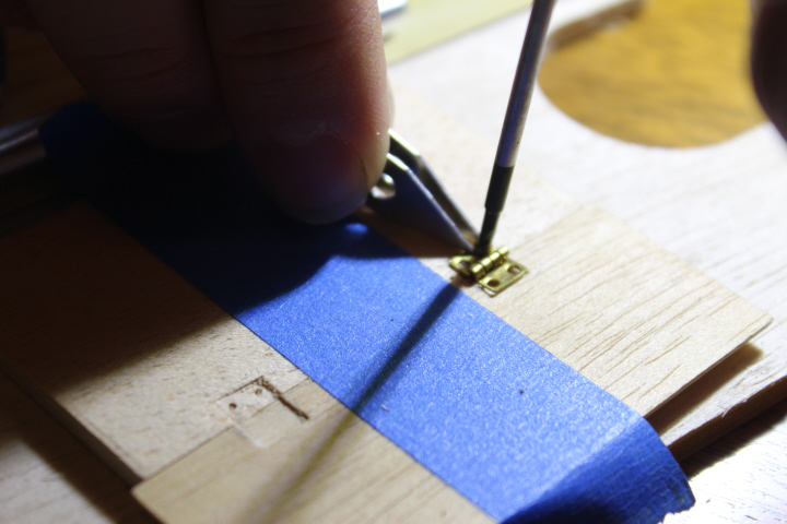
    I cut the hinge slots myself, with David's direction, after practicing on a piece of scrap wood.  The person who had the kit before me had penciled in two of the four placement marks and stopped there, 20+ years ago — fair enough, it was a pain.
    5297

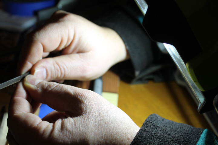
    To give you an idea of scale, those are David's fingers (casting a shadow) at upper left!  He is making the pilot holes here — you attach the hinges before anything else, then take them off again and put the desk together and finish it, then reattach the hinges in the established locations.
    5298

    He carefully filed off the tips of the screws, so that they would be short enough not to poke through the desk front.
    5299

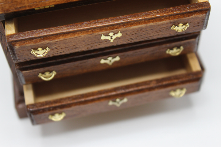
    After that, it was a walk in the park, really.  I did everything myself except trim the screws and make the pilot holes — I did the holes in these drawer fronts with a pin vise! — so I'm rather pleased with myself.
    7154

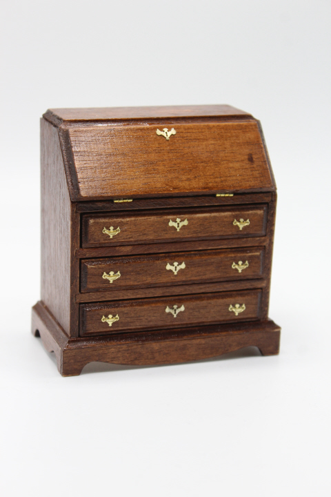
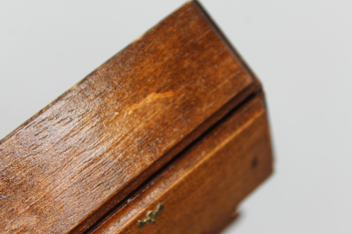
    The piece is stained with one coat of General Finishes Black Cherry, and finished with two coats of Ceramcoat gloss varnish.  I added in some aging along the way, smearing a bit of glue that was on my finger onto the top of the desk as a sort of water stain, and lightly sanding off some of the stain along the top edges of the drawers where there would be more wear over time.  I also used the metal ferrule from an old pencil to stamp some glue on the desk top, just beyond the right-hand hinge, hoping that it would look like some careless person had left a coffee mug on it, but unfortunately (!) maybe it wasn't enough glue, as the stain seeped underneath, nearly disguising it entirely.  (Ironic, of course, that when you want to leave a cup ring on a piece of furniture, it doesn't work!)
    7158

    7159

    So now that the rather nerve-wracking bit of doing the hinges is long over, I'm very pleased with this, and happy to see that the chair I wanted looks just as good as I had hoped, an antique desk with a modern office-type chair!  Later, I will make some IKEA-era cubbies/organizers for the paperwork that I'm sure will have accumulated in an old carpet shop ….


    7160

  • Spring Fling

    7095

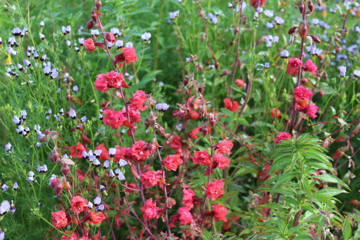
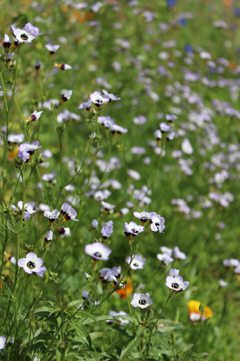
    A few months ago, Julia and I tossed around in our front yard a packet of "Payne's #1: Rainbow Mix" from the Theodore Payne Foundation, and for the past few weeks already, have been enjoying the wonders of a yard-full of California wildflowers in bloom. The mountain garland has been the last to come out, but now we have the full complement of colors, and a large patch of our once-sadly-drought-stricken former lawn is now a charming riot of colors and textures.

    7085

    Arroyo lupine (Lupinus succulentus).

    7095

    7085

    Lacy phacelia (Phacelia tanacetifolia).

    7085

    7085

    7085

    One of the biggest delights, I think, is finding different "bouquets" in the photographs, like the blues and oranges above, or the pinks and blues and yellows below.

    7095

    7127

    Globe gilia (Gilia capitata), with a painted lady butterfly, though I don't know if it is the American one (Vanessa virginiensis) or the West coast one (Vanessa annabella).

    7085

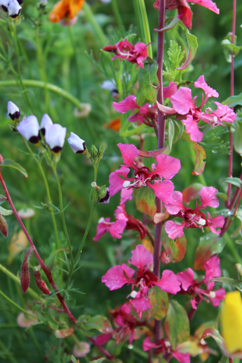
    Mountain garland (Clarkia unguiculata), also known as elegant clarkia.  These come in a wide range of pink shades, from magenta to salmon, and there are even a couple of white ones here.

    7109

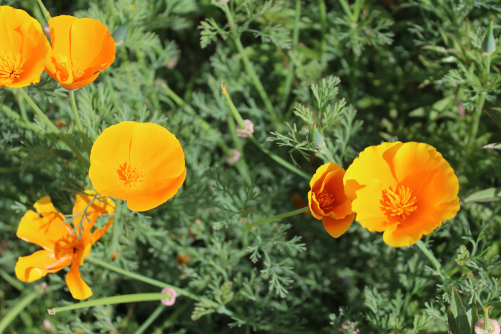
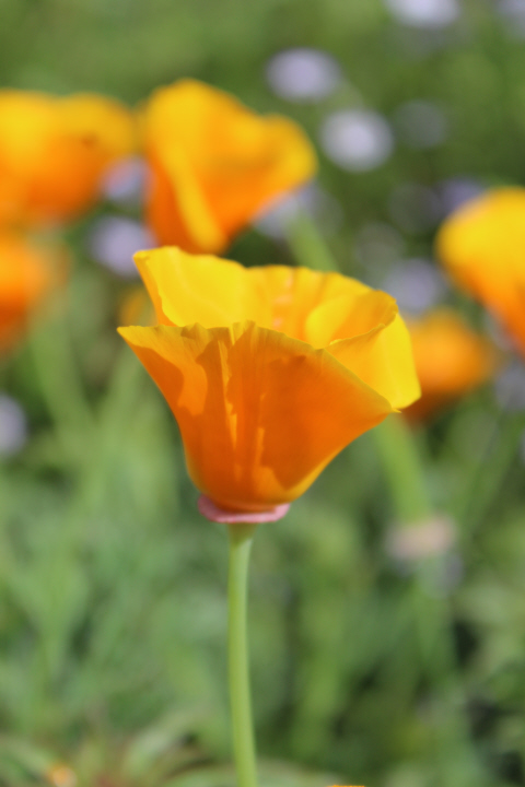
    California poppy (Eschscholzia californica).

    7095

    Only one arroyo lupine emerged, but it is clearly setting seed!  Later, I will gather these to spread further next year, Miss-Rumphius-like.

    7095

    7132

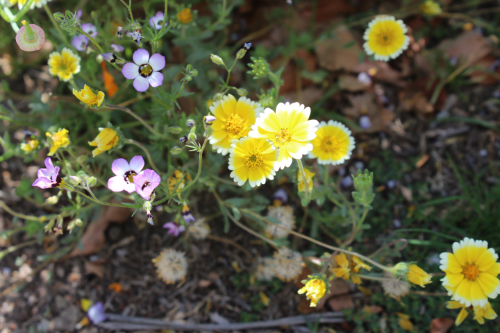
    Tidytips (Layia platyglossa).  I know there were California goldfields (Lasthenia californica) in here too, but I can't seem to find any now!

    7095

    7109

    Coast poppy (Eschscholzia californica var. maritima), also called maritime poppy.  Instead of the California poppy's pure orange, the coastal one has orange in the center, lightening towards near-yellow at the edges of the petals.

    7085

    Desert Canterbury bells (Phacelia campanularia), also known as bell-flowered phacelia. The photo doesn't actually do justice to the intense cobalt blue.

    7109

    Bird's eye gilia (Gilia tricolor).

    7109

    7109

    Happy spring!

    7109

  • 7043

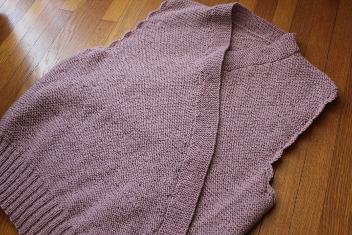
    I have in fact finished the No.467 wrap-front vest I've been plugging away at since January, but despite the numerous re-workings I did of the angles for the front edges, which in the end turned out pretty well, the vest as a whole is unfortunately just too big for me.  Clearly, I should have tried it on and considered it for a while before I worked the crocheted armhole edging.  It's possible that at a previous point in my life I would have worn it anyway, but now, well, I want it to look good, I want it to be close-fitting like the original would, and although it was an awful lot of rather dull garter stitch, I'm prepared to rip it out — after some careful measuring and note-taking, of course — and re-knit it, but I think I might have to change its name to the Penelope vest, for patiently ripping it out so very many times.

    6935

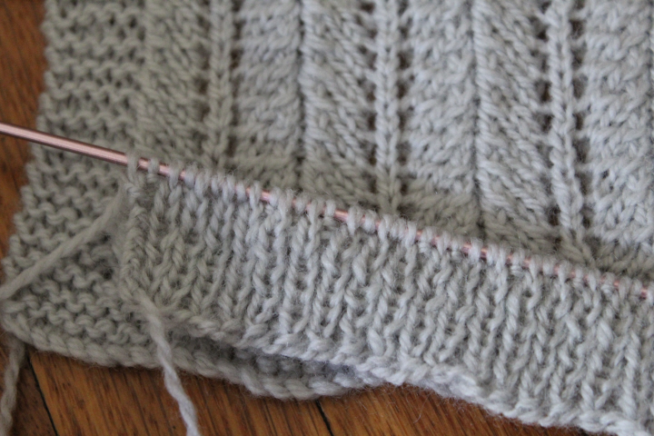
    Even weeks after writing about the Victory jumper as my choice for the D.E. Stevenson knitalong while reading Spring Magic, I found myself still thinking about it, wondering if the Knitpicks Palette I had somewhere in my stash would work ….  I think it will, but the larger gauge (!) and the single relatively-tiny size of the original will require a number of adjustments to accommodate the Palette, and of course a rather reserved color like this (which is "Mist") would alone make it unlike the original jumper, whose most salient characteristic is probably its distinctive and celebratory scallopy stripes.  So perhaps a "Spring Magic" jumper?!
  • Notre_Dame_en_feu

    When something beautiful is lost, we lose a part of ourselves.  May Notre Dame de Paris rise from the ashes through the generosity of all of us, no matter our race or nationality or creed, who are all her people.


  • Bairnswear1235a

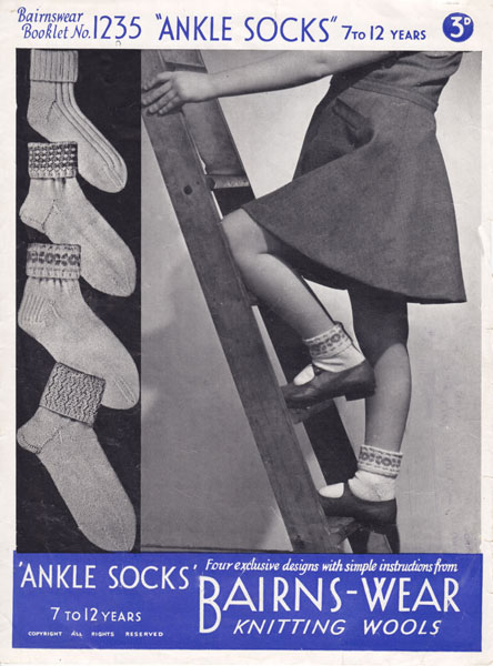
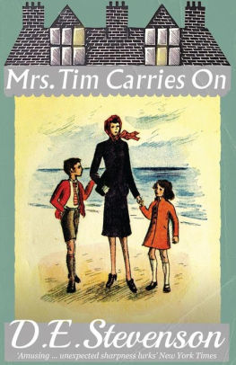
    The D.E. Stevenson group is reading the "Mrs. Tim" series, interspersed with related DES titles, and we have just finished Mrs. Tim Carries On (1941) and started Spring Magic (1942).  Being wartime, of course there is knitting for one's menfolk and others in the armed forces sprinkled throughout, especially in Mrs. Tim Carries On, but since there are so very many patterns available for "soldiers' comforts" and really, how many variations can there be on plain, dark socks, I chose for my virtual "Knitting with D.E. Stevenson" project the girl's socks in this late-1930s/early-1940s Bairnswear leaflet available in reproduction from The Vintage Knitting Lady. The photo reminds me not a little of Hester's young daughter Betty who likes dolls and girlish things, to be sure, but doesn't stick at climbing trees as well.  As a knitter, I like how these particular socks have different kinds of heels, too — I know it's comfortable to knit something that one is familiar with, but it's also pleasing to have different options.

    Mrs tim carries on

    Thanks to the wonderful folks at Dean Street Press — especially Scott of Furrowed Middlebrow, whose Furrowed Middlebrow colophon debuted there a few years ago and specializes in "works by lesser-known British women novelists and memoirists" — three of the four Mrs. Tim books are now available in e-book format (the first was reprinted some years ago by the Bloomsbury Group), as well as Spring Magic and 1935's Smouldering Fire, of which more in another post.  I have been very much looking forward to the group read of Spring Magic, as it is one of my favorites.  We've only just started, and already have had interesting discussions about books a sheltered child might have read (a child such as Frances, though she is now at 25 not sheltered so much as trapped), the idiom "doing the messages" (which may or may not involve actual messages, depending on whether one is north or south of Hadrian's Wall …), horsehair mattresses (and sofas), the Pioneer Corps, and potential inspirations for the setting's Scottish fishing village — not to mention sidetracks like April Fool pranks and plagiarism.

    Spring

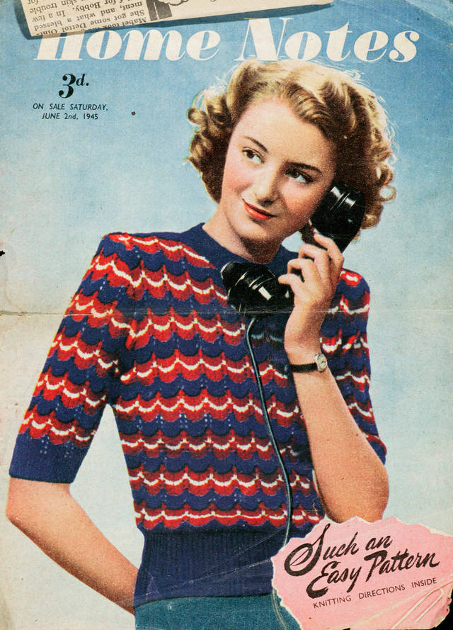
    But knitting, that's what I was talking about.  In one scene in the book, during a rather terrifying air raid — this isn't London, mind you, it's a fishing village on the west coast of Scotland — the ladies of the inn where Frances is staying are knitting — who could sleep? — and Annie offers to share a knitting pattern.  "It's quite an easy pattern," she says, "you slip one and knit one and pass the slipped stitch over.  I'll give you the pattern tomorrow if you would like it –"  In searching the internet hopefully for "lacy knitting pattern 1940s", I came across this one —

    Victory jumper V&A 2006AC6474-

    which is available free from the V&A (here's the Ravelry link) as part of a page about 1940s knitting patterns (huzzah!).  The lace stitch is a simple two-row one with a familiar "sl1, K1, psso" maneuver that combined with K2tog and judicious yarn-overs produces the pretty scallop effect, here in patriotic red, white, and blue — so it seems particularly appropriate for my Spring Magic choice!  I've used the Ravelry link instead of going straight to the pattern itself so that you can see some examples of how changing the colors or simply changing the number of rows of red, white, or blue can vary the effect of the jumper.

  • 6040
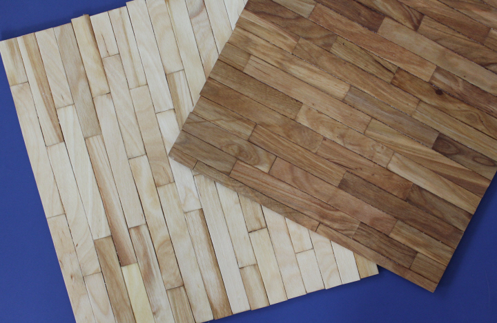
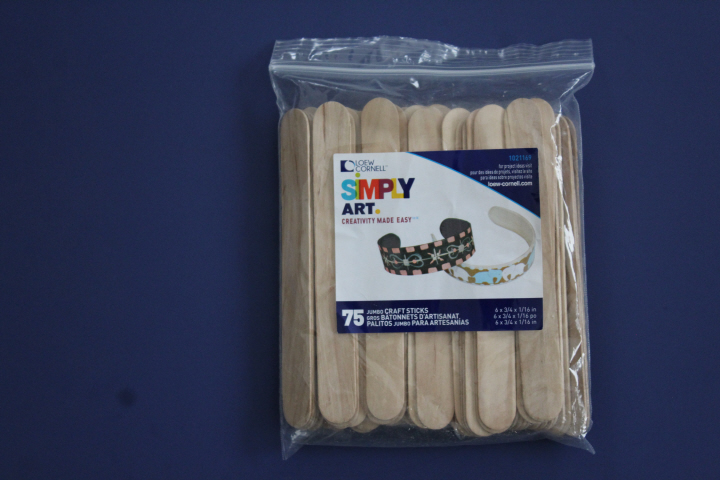
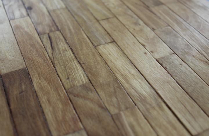
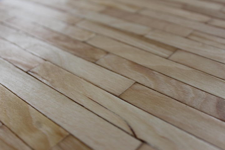
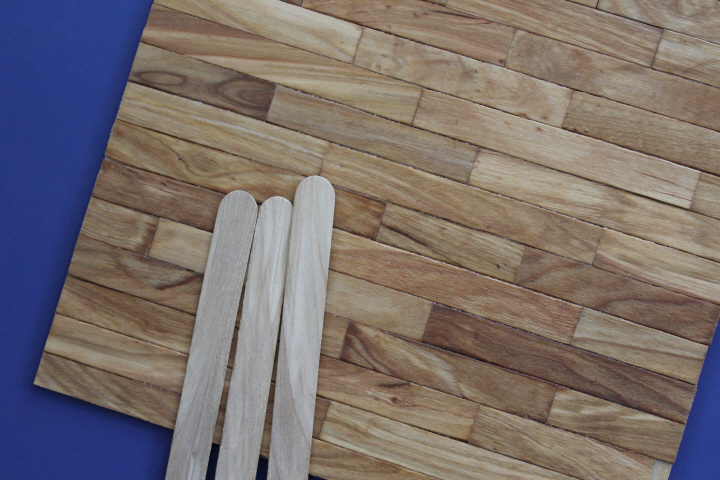
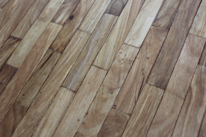
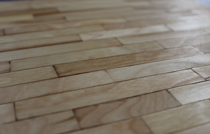
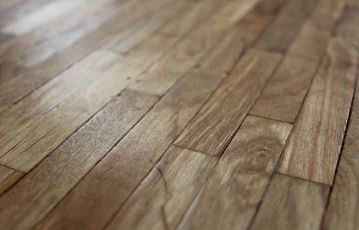
    I was on a bit of a roll, and so I put together both of these floors recently — the lighter one is for the tea-room-to-be and the darker one for the corner shop.  I had stained the floor I made for the carpet shop, and was delighted with the results, but for these I thought I'd just use the craft sticks in their natural state, with only the linseed and beeswax finish.  Since I'd wanted a dark floor for the carpet shop, I had chosen the bags of sticks by which had the most dark ones in it, and of course there were quite a lot left, so I decided to make one floor with the lightest sticks and the other with the darkest ones.

    5968

    6016

    Who would have thought there would be so much beauty in a humble craft stick!  The ones I chose seemed to me to have a bit of "character" to them — knots here or there, perhaps a warped edge, grains going this way or that and sometimes both at once, one in the tea shop even has something that looks just like a water stain!  I added a bit of "wear and tear" to the dark floor, repeatedly dropping David's work keys on it from my shoulder height, and a couple of scratches from some tool or other that I had on hand, but I didn't do anything to the light one at all.

    6033

    These two floors are made in the same way as the first one, with a piece of 1/8" plywood as a "subfloor" marked with lines 1 1/4" apart where the joists would be in reality.  I trimmed and dry-fitted all of the sticks at once, so that I could move any that seemed to "clash" — too much dark or light in one area, grain lines all going in the same direction, etc. — then glued them on a few courses at a time, clamping and letting them dry overnight before moving on to the next few courses.  Each floor has three coats of Tried & True finish, with a moderate amount of buffing with a dry cloth in between.  The recommendation on the label is two coats, but some of the sticks on the carpet shop floor seemed noticeably drier than others, or more absorbent, and so I did a third coat to get it looking more even, and did the same this time with the other two floors.  (There is a bit of gunk between many of the boards on all three floors, which might be dust from the preparatory sanding that didn't come off on the tack cloth, or might be bits of coagulated beeswax, or both.  It looked more unpleasant after I tried to pick it out, so I've just left it.)

    6011

    6010

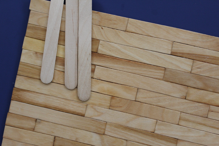
    Here are photos of the finished floors with some sticks in their natural state, so that you can see the effect of the finish.  Apparently, linseed oil adds a noticeably golden tone to wood — the lighter sticks originally were a very pale gold and now are a lovely sort of wheaty-gold, and the dark sticks, which were a rather ashy brown to start, now have a beautiful rich amber-gold color.  They are both rather changeable in different lights or from different angles, and the digital camera makes this even more apparent, as I'm sure you can tell from the variety in these photos!  It's rather like watching the sky on a breezy spring day, now bright, now cloudy, always changing.

    6020

    6030

    I know these particular sticks are a bit wide for 1:12 scale — the package says 3/4" but they are actually about 1/16" less than that, which would be 8 1/4" in real life, on the wider end of the Regency period's "between 18 and 23cm [7-9 in.]" — but, really, they are so very pretty that I for one certainly will acknowledge any quibbles about scale and then admit that I just couldn't help myself!

    The edges aren't trimmed yet, nor that diagonal section for the corner shop, which I will do when the room boxes are closer to final fitting.

    6047

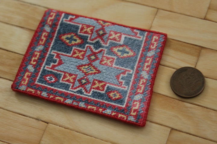
    The piece of petit point is an experiment — I wanted it to look as though it were a badly-damaged antique carpet or fragment thereof that has has the damaged bits trimmed off and a new binding put on the trimmed edges — there is even a jog on one edge where the rows are uneven.  Part of it, as you can see, was stitched with one thread of floss, while the rest is stitched with two, to simulate a worn area.  This is partly successful, I think — probably the line between worn and less-worn should have been blurred a bit, as it seems just a little too sharp to me.  I also worked it in a hoop instead of a frame, so that it would go ahead and skew if it wanted to!  I'm tempted to age it with a coffee bath, but haven't done that yet.  The original chart is the Kuba no.9 — converted from Appleton crewel wools to DMC floss, and worked on 28-count Monaco linen — from Making Miniature Oriental Rugs & Carpets by Meik and Ian McNaughton (in fact, the one at the top on the cover), which is said to be "an early design" from the Kuba region in Azerbaijan, ca.1800.

    6023

  • 5502

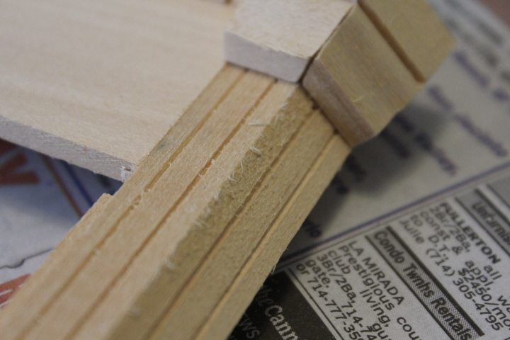
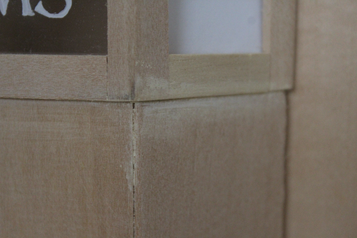
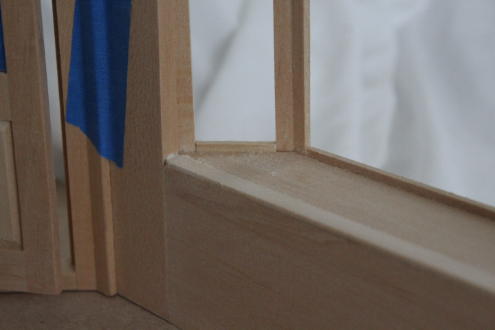
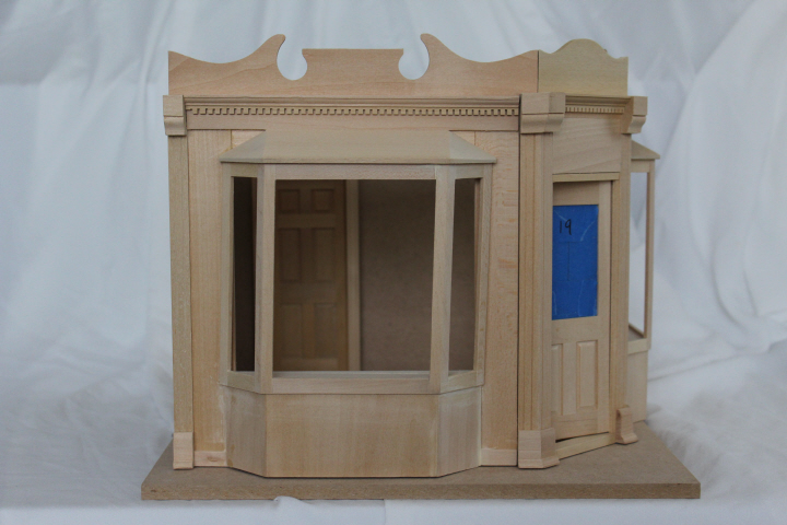
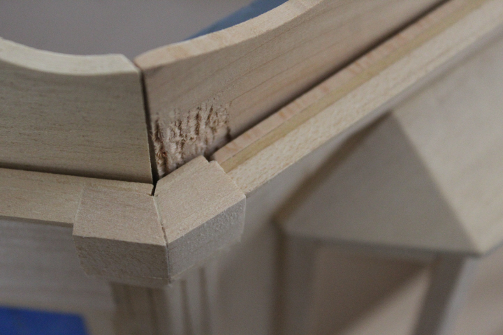
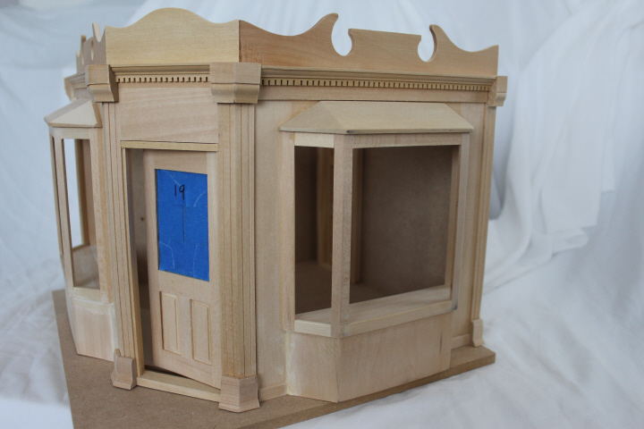
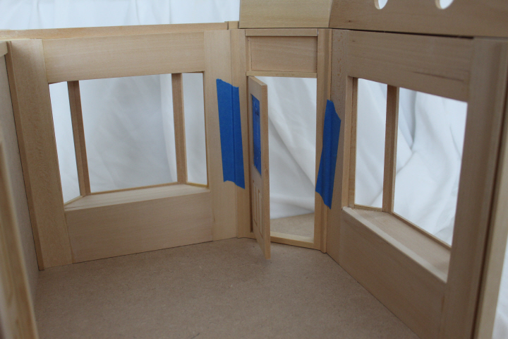
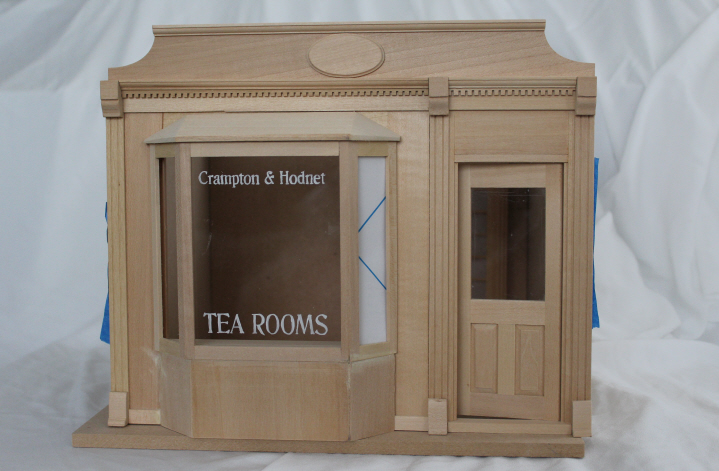
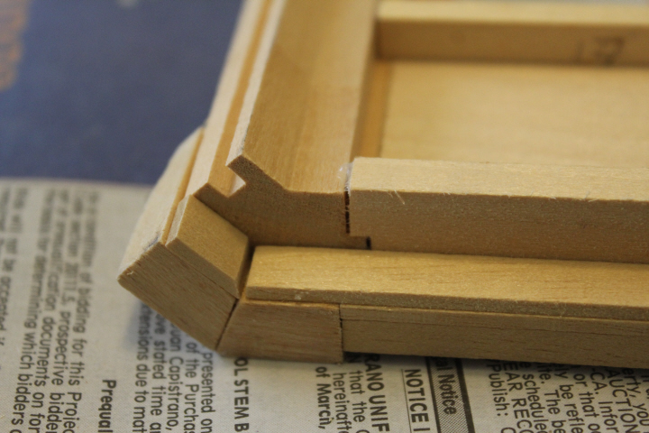
    While I'm waiting for other things to happen with the carpet shop, I decided to start prepping the other two, using odd moments here and there to sand or patch instead of knitting, or perhaps writing the dozen or so letters I owe.  Anyway, I was tempted to re-title this post "Fits and Starts" — I'm afraid that I'm not as impressed with these two Street of Shops kits as I was with the first one, as they are rather indifferently cut, and in places very sloppily put together.  It's clear, too, that these two either a much-later addition to the line or a different designer altogether, or perhaps both, as they are noticeably less finished-looking.  The fluting on the columns in the two-window shop are narrow and rounded, quite elegant, where these are wide and flat, simply grooves cut into the board, and in some cases not very well.

    5496

    5499

    Pieces that were glued on straight have come loose, while the kit languished in its box, and pieces that were glued poorly, alas, are immovable.

    5504

    So I have been doing a lot of filling and sanding, which would have annoyed me no end if I had actually shelled out money for this, but it was a hand-me-down — and a generous one, to be sure — so I'm calling it training for future scratch-builds and repairs, and (really) keeping my grumbling to a minimum.

    5506

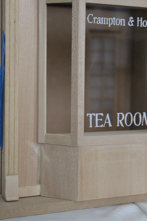
    The bay is on so crookedly that I glued a piece of strip wood in the gap to fill it.  The crookedness also means that the pre-cut Plexiglas doesn't fit — luckily, too big, not too small.  You can see from the shadow on the side window's protective cover how bowed it is in order to fit, and the other side is even tighter so I didn't even try, for fear of breaking it.

    5508

    5520

    The inside of this bay window also needed a piece of stripwood to cover up the very large jog between the lower wall and the flat shelf inside the window.  I still have a bit more sanding to do to get it smooth.

    5510

    We are already calling this "subsidence — from the bombing" in honor of Mrs. Wilberforce at the beginning of "The Ladykillers".  ("It's no use trying.  None of the pictures will hang straight …" she says, regretfully but resigned.)

    5514

    What on earth –? 

    5513

    5515

    But this will be a charming little shop — the windows are very appealing!  I love the generosity of the corner door.  And as you can see, I've already had a go at the other shop's window lettering — yes, as much as I resisted the cliché of a 1:12 tea room, it did not want to be anything else, so tea room it will be!  I like the font and the arrangement of the lettering, but the results are more than a bit wobbly in person, so I will probably wash it off and try again after a bit more practice.

    5517

  • Wipe Your Feet, Dear

    5491
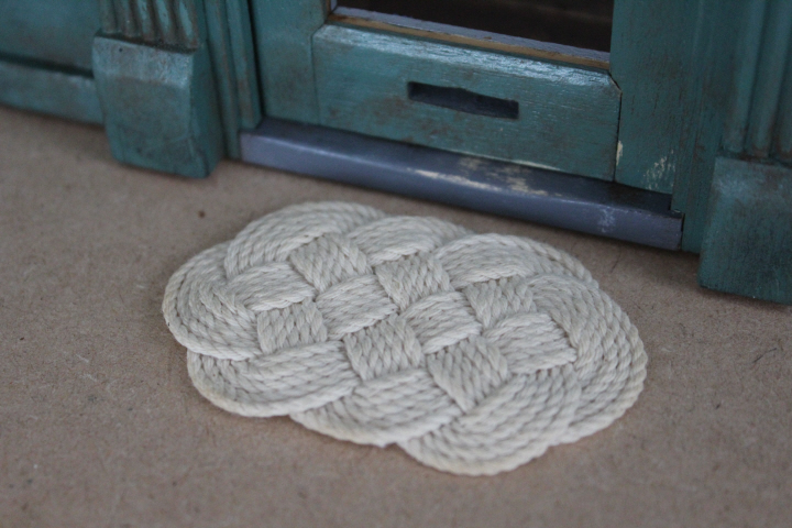
    My miniatures group is doing nautical-themed projects at the moment, so I made an ocean plait mat to take for my contribution to the meeting’s-end raffle this month.  I experimented with one of these some time ago using kitchen twine, but that doesn’t have much body, of course, and it looks like kitchen twine.  I found another brand of string at Hobby Lobby — simply called “Natural Cord” — that although as it turns out doesn’t have much body either, it does look more like rope, with more clearly-defined strands and twist.

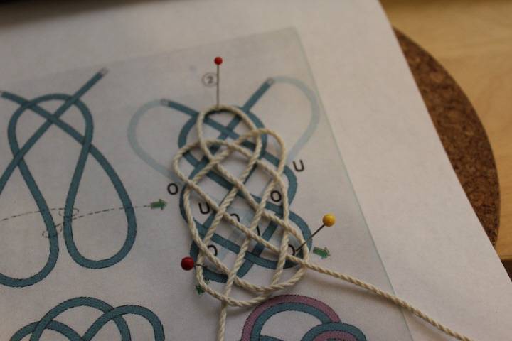
    I used Knotter’s tutorial, with a helpful video, as well as the accompanying diagram in a different post, which I printed out at roughly the size of the mat I wanted (3 in./7-8 cm) for 1:12 scale.  For me at least, it was helpful to actually pin the string onto the illustration with a slab of cork underneath — this makes it look more like bobbin lace than a sailor’s knot, but I am no sailor, so needs must.  Before long, I also threaded the working end onto a yarn needle, which made it much easier for me to pass the ends in and out.

    5488

    The process is about fifteen minutes of complete incomprehension and annoyance and recalcitrant loops (“under, over — no! over, under — wait, what’s that, oh, that goes there“), then when you look down and suddenly it all makes sense there is about five minutes of smooth sailing as you just run the working end happily alongside what is already there, and then two or three hours of snugging it up and primping and trying to get it to lie flat and/or straight.  Just when you think you’ve got it snug, you realize that two of the strands are crossed and you have to winkle them flat and follow one strand along for ages until it all comes right.

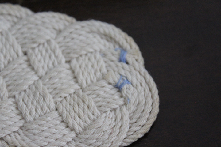
    You are supposed to side-splice the rope ends, apparently, but when I looked at a video for that, I just started laughing, in a slightly hysterical manner, and wrapped the two ends to their immediate neighbors with a needle and thread and trimmed them close, with a big dab of Fray Check.  The finished mat was surprisingly stable even with the string in its natural state, but I starched it a bit (1 part starch to 6 parts water, the “lightly starched” formula on the bottle, but it could have used more).  Actually, I dabbed at it first with a used tea-bag, as there happened to be one handy (!), but I thought it was too much — luckily, dipping it into the starchy water softened this.  The water also had the extra benefit — I think it started with the tea-bag, actually — of causing the cotton string to shrink, so it tightened up beautifully.

    5492

  • Miniatures Monday

    5460

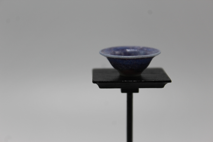
    A friend and I went to the Southern California miniatures show this weekend.  There were lots of very lovely, fascinating things, and I came home with some of them.  Above, a porcelain pot by Troy Schmidt of Red Dragon Pottery, exquisite in both its blueness and its delicate shape.

    5473

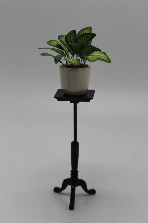
    A Dieffenbachia kit (no. 213) and white pot from Dragonfly Miniatures.  I assembled the leaves Saturday afternoon, and "potted" it up in a bit of real potting soil mixed with glue.  I wanted a plant for the carpet shop, and this meets my expectations and goes a little above!  (The stand is a hand-me-down House of Miniatures candle-stand kit, painted black to be modern.  Nobody seems to really want the candle-stand kit — I have another one — but I think it makes a good plant stand, actually.)

    5466

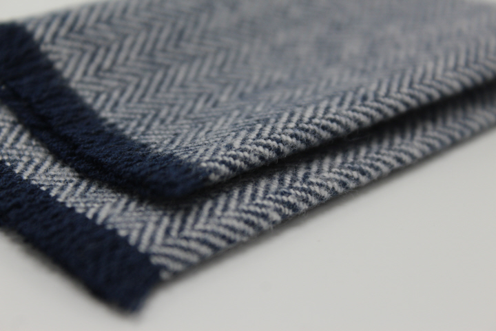
    A woollen throw from Designing Ways.  (Their mid-century furniture was pretty tempting, too …)

    5463

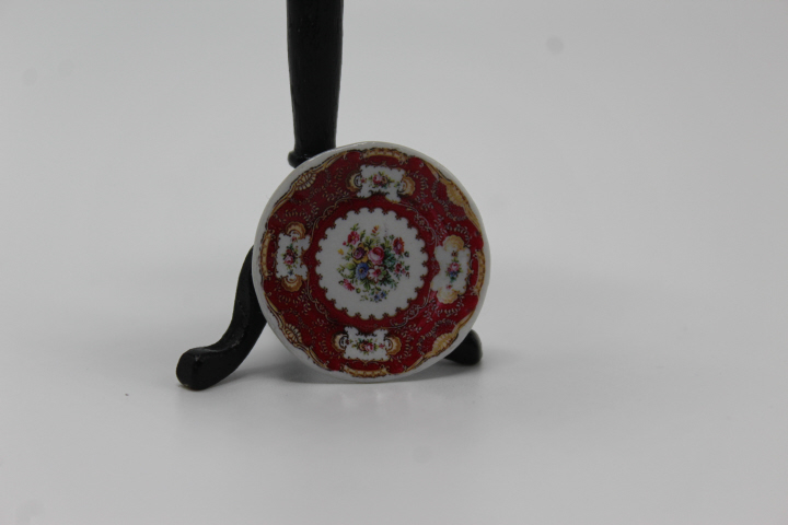
    A china plate from Hemy & Laura.

    5468

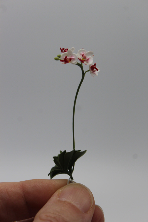
    A lovely white and pink Dendrobium orchid by Twin Heart.

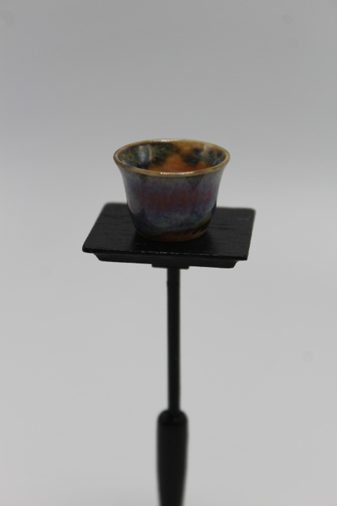
    And the first pot I chose from Troy Schmidt's collection — it has a wonderful blend of colors, almost like a sunset —

    5456

  • Whimsy 3
    Someone gave me a set of "Pride and Prejudice" page flags which I found irresistibly like paper dolls, so here is a bit of Whimsy for my ABChallenge W!

    The background image is an illustration of a ball at the Argyle Rooms in London, from "The English Spy" serial (1825).