• X

    I've left the last few letters of my ABChallenge rather long, I'm afraid, my excuses being that Nancy has been AWOL (bloggers are quiet / sometimes when life gets busy, / but they are still missed) and that X, Y, and Z are a lot harder to do than most of the previous ones!

    In fact, I was a bit stumped by "Y," wanting something a bit more unusual than, say, "yellow" or "yawn," so I perused the "List of Unusual Words that Start with Y" at The Phrontistery, as one does, and while there are in fact quite a lot of unusual and interesting words that start with Y, most of them are unphotographable, at least by me — yair, a tidal enclosure for catching fish (impractical), yang-chin, a Chinese hammered dulcimer (haven't got one, alas), yare, "marked by quickness and agility, nimble" (not impossible, perhaps, but not exactly on hand, either) — but then …

    Y

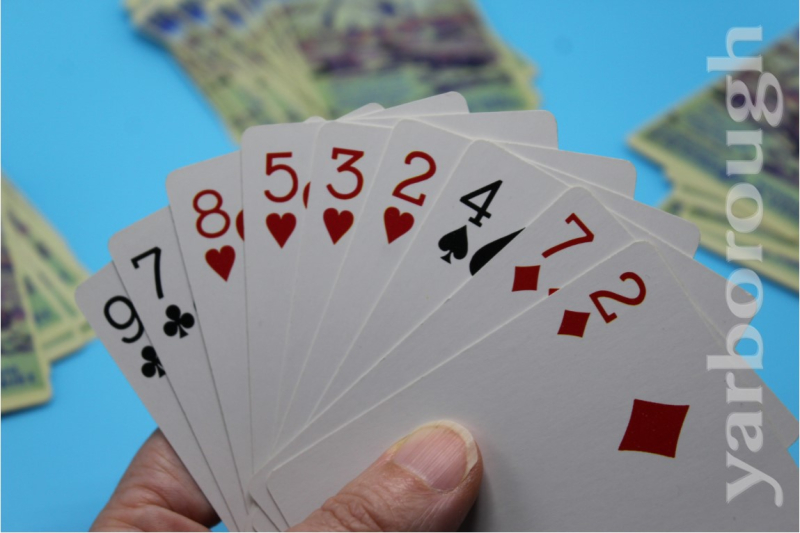
    "Yarborough, n., a hand in bridge or whist containing no ace and no card higher than a nine, named for Charles Anderson[-Pelham], second Earl of Yarborough, English nobleman said to have bet a thousand to one against the dealing of such a hand".  Who knew?!  I suppose I could have done yew or even yoga, but yarborough, well, even though I don't play whist or contract bridge, I can't pass that up.

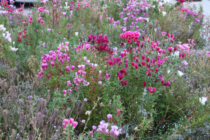
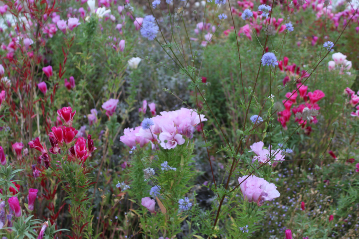
    These cuties bloomed the day before yesterday, just in time! —

    Z

  • 7343

    This was surprisingly nerve-wracking, and I put it off for ages, it seemed.

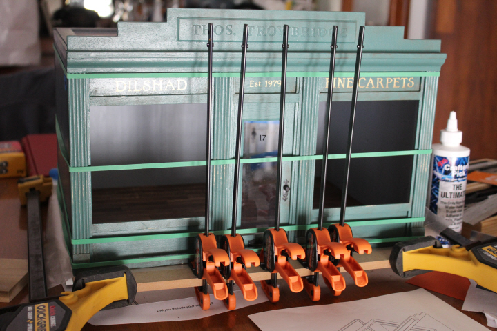
    The MDF base that came with the kit is here held in the right-angle of my big gluing jig by the two large yellow clamps, the four walls of the box are wrapped around the (now also glued-in-place) floor at the bottom and the removable "ceiling" at the top and held snugly with extra-large rubber bands while the whole box is also pushed into the right-angle of the jig, there is a piece of wax paper between the base and the underside of the shop box in case of glue overflow, and the five handy craft clamps aren't actually clamping anything (because they are too short to go around the box) but are pushed up snugly against the slightly-warped front piece in hopes that the glue will grab hold firmly enough to counteract the bowing — which they did!

    7148

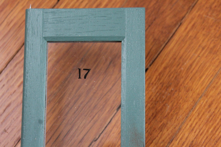
    I wasn't entirely delighted with this — which is regular acrylic craft paint on the Plexiglas, using a 10/0 spotter brush — but it took me so many attempts, hunched over it with my nose literally an inch from the Plexiglass, that I decided this is good enough.  It doesn't look quite like the lovely font I chose, though in all fairness, if you don't know what font it was supposed to be, you might not think anything is "wrong".  Part of the difficulty was that after I had come up with the idea of printing out the template in reverse and taping it to the outside of the window so that I could paint it on the inside, the relative thickness of the Plexiglas was actually distracting, in that I was painting on one side while looking at the template on the other side, which is kind of like trying to put on make-up in a funhouse mirror, where nothing is quite where you think it is!  Oh, well — by the time I did the version above, I had painted it and wiped it off so many times that I couldn't bear the thought of having to do it again.  "It'll never be noticed on a galloping horse," Laura told me comfortingly!

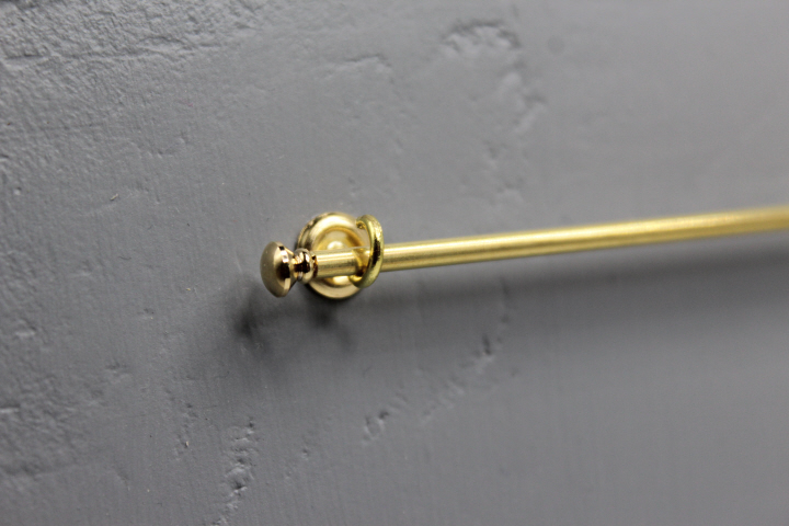
    I had long had the idea to have long rods around the top of the side and rear walls to display carpets on, like many real-life carpet shops do.  It is very difficult, though, to find ready-made 1:12 scale curtain rods that are longer than six inches or so, and I wanted mine at least seven, so in the end, I made some myself.

    7165

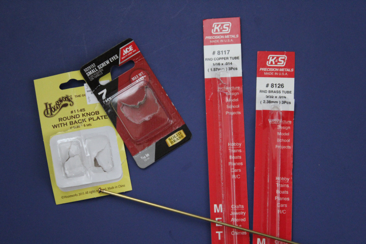
    These are actually 1:12 doorknobs, using the knob as the finial and the plate as a base for the "bracket," which is of course really just a brass eye from the hardware store, bent slightly to open it up — I want to be able to remove the rods easily, as I suspect that the only way to get a petit-point carpet to hang on a rod is to actually sew it on, and if I ever want to switch out the displayed carpets, which I doubtless will, I would need to be able to get the rod out and back in easily, from overhead.

    The doorknobs looked very neatly in-scale, but the problem was how to get them to stick to the end of the rod!  I had a solid 3/32" brass rod that was the perfect size visually — and then luckily, as I was poking through the display of "precision metals" at the hardware store, I found 3/32" tubing, and the shaft of the doorknob fit almost exactly into the tubing! so I also bought a package of 1/16" tubing (a rod would have been better, more solid, but they were out of stock).  The 1/16" tubing fit perfectly inside the 3/32" one — I cut the larger tubing to the size I wanted my display rod, and cut the smaller tubing to the same length less the length of the doorknob shaft that would fit on each end.  Running the smaller tubing inside the larger one not only gave the larger one more strength, but the just-short-enough length gave the super-glue more surface to grab on to, to hold the knob/finial in place.

    7174
    I was frugal and got three rods out of two lengths of tubing, using two pieces of the smaller inside one piece of the larger, and vice versa, for the two side rods.  The one in the photo actually has a seam in it — with an extra dab of super-glue on the seams inside the barrel, just in case — but it's barely visible, and once it has a carpet hanging from it, I suspect it won't be at all.

    Gluing in the trims at the tops and bottoms of the interior walls was also fraught with the possibility of mishap, as Jeeves would say, and I was both annoyed and relieved on occasion to find that the pieces I'd glued in crookedly popped off easily enough that I could just sand off the bits of dried glue on the trim and try again more firmly.  I was more than a little deflated to see that after all the care I thought I was taking on the umpteenth try, I still left a huge gap between the baseboard and the floor on one wall, now alas quite permanent.  Oh well, lesson learned.  Thanks to Brae's tutorial for filling in the cracks with paint, though, I managed to get fairly "seamless" connections between the mitered corners, and between the trim and the I-hope-charmingly wobbly walls.

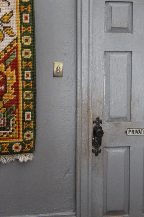
    I'm still experimenting with some last-minute fixtures — I really wanted a light switch and thought of making one in very thin balsa or bass, and then wondered how on earth I'd punch small-enough and neat-enough holes in it, and while I pondered this, I printed out some size tests, using an image of 1920s plates I found on Ebay, which I printed on good paper and glued to a slightly-smaller scrap of watercolor paper, and smooshed the edges down with a burnishing tool so that the cut edge wouldn't show.  When I stuck one on the wall, I thought, "well, that doesn't look half bad, actually" so I've left it there for the time being —

    7652

    (Except that it's a bit crooked, I see! but it's just museum putty, so I can fix that!)  It's completely flat, of course, as I haven't found anything tiny enough to use for the actual switches.  I really like the grotty-brass look, though, which is a complete illusion!

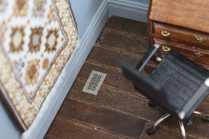
    While I was looking for antique switch plates, I also came across floor registers, so I did one of those as well — I used the smallest burnishing tool to push down the "empty" parts to make it look like there is space underneath.  I'm not quite sure that this works yet, but it's just a background detail, so I can leave it for a while (I do have a friend with a 3D printer, so that might be worth a try …!).

    IMG_7649

  • 7634
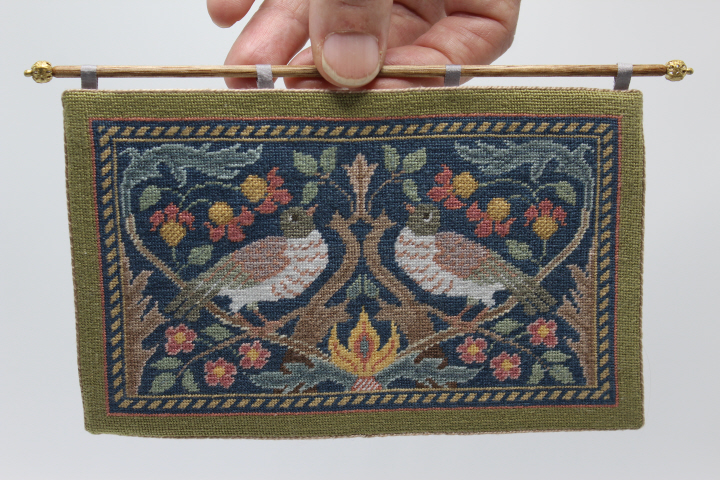
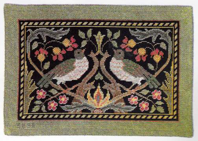
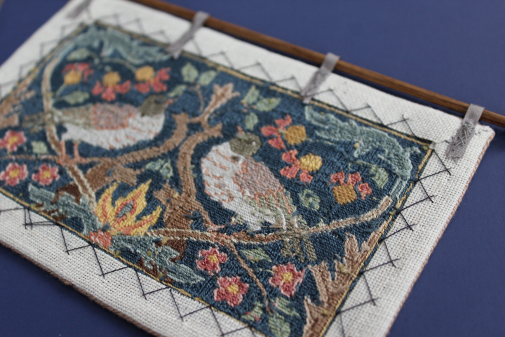
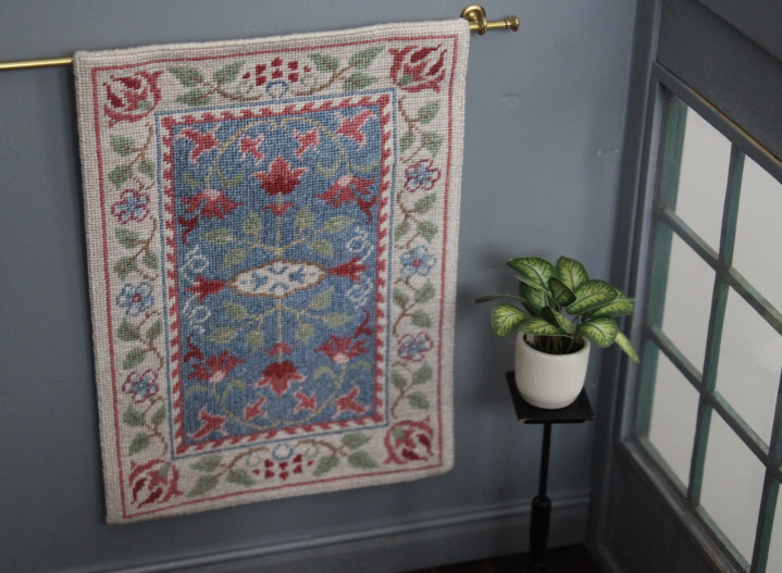
    The moment I saw this Sue Bakker petitpoint chart, I wanted to stitch it.  I love its Arts & Crafts naïveté, the profusion of flowers and leaves against the simple rope border, the softly-faded colors — it just speaks to me.  Bakker says it can be a wall-hanging or a carpet, but it didn't seem quite right to me to put it on the floor — not so much the idea of walking on it, I think, but that you just get a different perspective when a piece is on the floor than when it is on the wall — so wall-hanging it would be.

    For me, Bakker's charts have become a matter not of "are there going to be challenges?" but "what are the challenges going to be, and where the dickens are they?"  The Anchor 676 on the chart does not appear on current Anchor color cards, and it was only by happenstance that I came across a website that offered the substitution "A676 = DMC 452".  But Bakker calls it "green" — it appears on the birds' wings — whereas what I found in my hand was this —

    7642

    which takes a very considerable leap of the imagination to call "green" — oh, well.  I tweaked a few things here and there, rearranging the colors on the birds and using a lighter shade of the dark blue for the background.  I like the really deep border on the original, but didn't do quite as many rows on mine, as it's already a bit larger-than-life for 1:12 scale and I didn't want to push my luck.

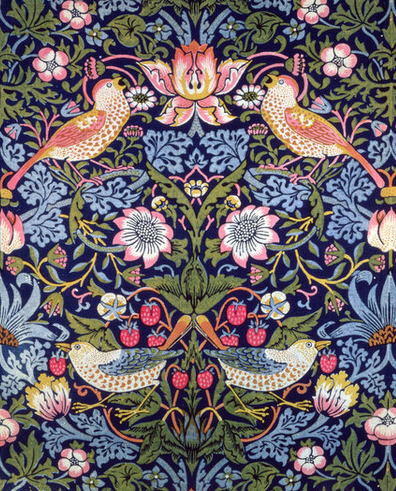
    Bakker arts and crafts hangingNever mind — I love the design, and those swirly leaves in the top corners give me a thrill every time I look at them.  Morris used birds quite often in his designs.  Here is a detail from the popular "Strawberry Thief" pattern —

    Strawberry thief

    which is certainly a cousin of Bakker's design.

    7637

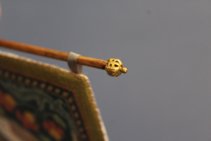
    I made the hanging rod from a slender dowel that came in a package from the crafts store — it isn't bass wood, that I can tell, but something with a lovely color and grain, which came out beautifully with a bit of beeswax and linseed oil finish.  The finial is a filigree bead attached with a sewing pin that has an unusually ovoid head — they come in the shirts that David likes from Penney's! — and once assembled, I painted the finials with gold paint to tone the bead down a little and make the silvery pin match.  The hanging loops are silk ribbon.

    7639

    7641

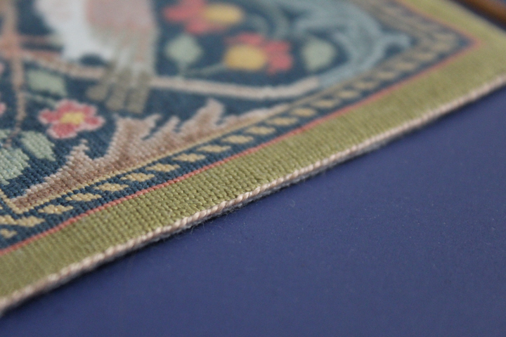
    I actually finished the stitching on this quite some months ago, and dithered for a very long time about how to finish the edges, as my usual carpet edgings seemed just … carpet-y.  I was tempted to just fold the edges over and tack them down at the back, and then impulsively decided to do the same thing I did with my first petit-point cushion, and couch a length of perle cotton around the edge.  The color doesn't "match," but sort of "co-ordinates," and it was on hand.  Despite that, I'm very pleased with the way it all turned out.

    The title of this post is the first line of a song from 1530 or thereabouts — I know the poem from Benjamin Britten's "Ceremony of Carols" and it seemed quite appropriate here, with all of the little birdies!

    My hope for the 1:12 carpet shop was to attach the carpets to the display rods in such a way that they would hang as realistically as possible but still be removable if I later wanted to use a particular carpet in another setting.  (Because of course when you want a miniature carpet, you get one from the miniature carpet shop ….)  Luckily for me, what I had thought would probably work did, and on the first try.

    7607
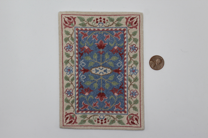
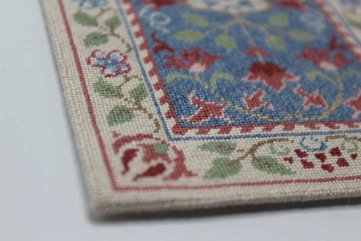
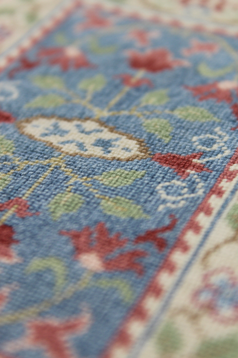
    One of the members on the Petitpointers list proposed a Sue Bakker Challenge recently, to work a design by her, since there is such an abundance published in miniatures magazines and so fairly readily available — and they are charming! — so it is really more of a Celebration or Appreciation than a Challenge, but there it is!  I chose this one since it was new to me.  Bakker clearly has an affection for William Morris's style, as it is one of her many Morris or Morris-esque designs.  This chart is from a long-ago Miniature Needlework Society newsletter, based on a carpet by John Henry Dearle who designed for Morris & Co., and is called "Carnation".  I worked mine on 28-count Monaco linen with two strands of DMC floss, some blended, and I lightened one strand of each color except for the mid-pink to get a slightly "faded" look (the contrast between 523 "Shell Pink Light" and the next-lighter shade was a little too much for the effect I wanted).

    7608

    7610

    7611

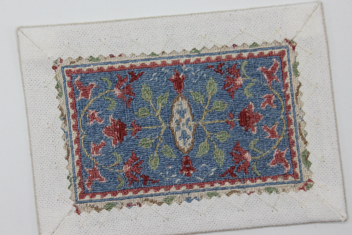
    Despite Bakker's repeated admonitions to work petit point carpets in half-cross stitch to prevent distortion of the canvas from the tension of the stitches, I've come to suspect that — for me, at any rate — I have pretty much the same amount of tweak (that is, the finished-but-unblocked piece being a parallelogram instead of a rectangle) whether I use half-cross or continental stitch, and so here I used continental.  It takes more thread, certainly, because of the longer, diagonal leg of each continental stitch on the back of the work as compared to the straight leg of half-cross, but on this kind of canvas at least, I find it so much easier to secure the beginnings and ends of threads under continental stitch that I feel more pleased with my work both while I'm stitching and afterwards, and that is all the persuasion I need.  Different fibers and different canvases may require different stitches, though, certainly!

    IMG_7614

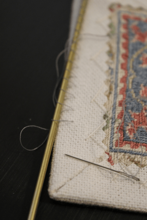
    And so to hang this carpet on its display rod, I just whip-stitched around the rod and through a few rows of canvas on the back of the carpet.  I had thought that I would use invisible thread, and I actually went to my thread box to get it, but I dislike hand-sewing with the stuff so much that I came away with a neutral grey thread instead.  It took less securing to hold together than I expected, which is good news!  I cut a much-longer length of thread than I would need, so that I could leave the loops loose enough to move the rod out of the way in order to see what I was doing, which was very helpful.  I also made the stitches into the canvas fairly short, so that with luck the carpet wouldn't droop or sag — here the stitches in the canvas are two strands tall, where the rod covers about twice that.  Since this particular rod is on a side wall of the room box, I started and stopped the whip stitches about 1/2" (15mm) from the edge so that they wouldn't show when viewed end-on.

    The main uncertainties were that the carpet would be too heavy for the rod (which is fairly flexible), and/or that its weight would cause the whip stitches to slip towards the underside of the rod and make an unrealistic-looking inwards "dent" at the top of the carpet.  But neither has proved to be the case, and the carpet is hanging fairly successfully, I think!

    7626

  • 7603

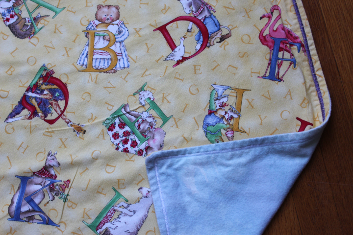
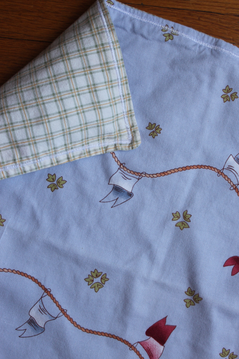
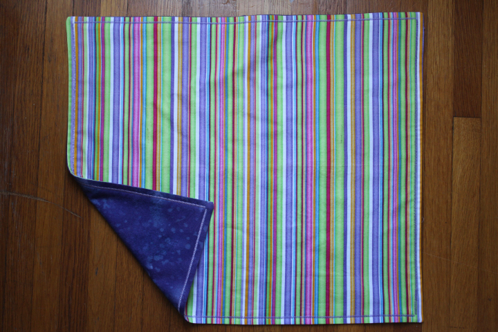
    I’ve been doing a lot of re-organizing lately, and during one of my KonMari sessions found these in the dresser where I keep a large portion of my knitting stash — I sewed the first two literally years ago, at least ten and maybe even fifteen, from a free pattern handed out at a long-gone and much-lamented independent crafts store not far away.  While my girls were even then too old for burp cloths, it was a clever idea and the store had so many delightful fat quarters that I bought these just to celebrate the fact that I was making things again, and to have on hand as potential gifts for new parents.  As it happened, every time we needed a gift, sometimes we bought a different one, sometimes the cloths seemed a little too quirky for the particular new parents, and sometimes to be honest I just forgot that they were there.  But I pulled these out the other day and realized that I hadn’t actually sewn up the last one (!), and after I did so and laid it out freshly pressed, David asked me about them, and said, “Hey, can I give them to C?” a friend he went skiing with a number of times last winter.  “Absolutely!” I said, delighted that they would finally be used!

    (So far, I’ve only used Marie Kondo’s methods for folding clothes, but I’m really impressed with them!  I can find things much easier in the drawers I’ve done over!)

    This kind of burp cloth can probably be found in any number of tutorials on the internet as it is so simple and so effective at the same time, but here it is again:  Use a pair of fat quarters, one flannel and one cotton.  Pre-shrink them thoroughly.  Pin them with right sides together, then stitch around the edge, using 1/2 to 5/8″ seam allowance, and leaving a small gap for turning.  You can grade or pink the allowances if your flannel is thick.  Clip the corners and turn right-side out, and press.  Top-stitch with a decorative stitch about 1/2″ from the edge, and press again to set the stitches.  That’s it!

    7604

    7605

  • Dear mrs bird

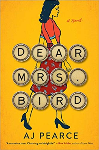
    I went to the public library a while back to pick up the audio-book of The Clock-Maker's Daughter I'd put on reserve after reading a review, and of course I cast an eye over the new-books shelf (as one does), and picked up Dear Mrs. Bird by AJ Pearce.  The premise sounded fun — an aspiring journalist in 1940 London get a job that she thinks will be her first step to becoming a Lady War Correspondent but turns out is mostly just typing up letters for the agony aunt of a second-rate women's magazine.  From the beginning, the book feels like a screwball comedy, with Emmy's tendency to speak in capital letters, her light-hearted dialogue with her best friend and flatmate, her larger-than-life boss (who would doubtless Take Umbrage at the term "agony aunt"), and the increasingly-sticky situations she finds herself in when she begins to secretly reply to the desperate letters that Mrs. Bird refuses to even consider.  But because Emmy's sympathy for the unfortunate letter-writers is genuine, the serious turns that the plot takes once she is deeply embroiled are wholly believable.  Pearce's writing is deft and intelligent, and aside from a very few slips ("on Such-and-such Street" or "called me on the phone") has a real 1940s ring to it, which surely is much of the book's strength, that despite it tottering at times on the brink of farce, it feels, like Emmy, very genuine.

    (I have bemoaned a number of times before about the inexplicable tendency of a number of historical novelists to set their books in a period about which they seem to have done little research, about which they seem not even to care very much.  Why do they bother, if they don't know, or care, why people did the things they did, behaved the way they behaved, talked the way they talked in a given period of history?  Pearce, though, clearly does care about this late 1930s/early 1940s period, and it shows in her novel and in its characters, who are both believably 1940s Britons and people that we understand ninety-some years later, because they too have to deal with love and loss and friendship and uncertainties.  If there is a period about which a novelist feels compelled to write, then the story needs be thoroughly rooted in that period, however universal its themes, or it makes no sense to set it there and then.  This can be done with manners and behavior, with clothing — the much-vaunted attention to detail in "Downtown Abbey" comes to mind, even though it is film and not a book — but language is also an important part of this.  (It is also one of the things that "Downtown Abbey" fell strangely short on.)  As I said above, Pearce's diction in Dear Mrs. Bird had a few anachronisms that leapt out at me,

    but on the whole succeeded very well.  I applaud, for example, Pearce's deliberate use of the word "gay," as in "the conversation became gay," which would doubtless cause many a snicker now among schoolchildren, but was an entirely appropriate, even ordinary, thing for someone to say in 1940, probably even the first word they would think of in that context.)

    (Google n-grams — how cool is that?)

    I also picked up no less than three of Alexander McCall Smith's novels — A Distant View of Everything, My Italian Bulldozer, and The Good Pilot Peter Woodhouse, all of which I enjoyed.  The composer Vivaldi has been accused of "writing the same concerto five hundred times," which could be said also of McCall Smith and his books, but it would be doing both an injustice.  There is much about his books that is "predictable," for want of a better word — in the the Isabel Dalhousie series, she meets someone, either again or for the first time, she thinks of something which reminds her of something else, she talks with Jamie, she thinks of something else that reminds her of something else, she has dinner, and this one was pretty much just that, but I found it all charming and endlessly absorbing.  The second book is one of his "farcical" stand-alones, with an absurd situation — here, while on holiday in Italy, a rental-car snafu lands the main character driving not a Fiat but a bulldozer to his Tuscan destination — gradually turning almost surreal, yet in McCall Smith's gentle hands it is still somehow not quite unbelievable.  And the third is one of his "serious" stand-alones, still with all of his hallmarks — interesting characters, intelligent and thoughtful writing, some plot twists, and an ending that is if not entirely happy still utterly right.

    And last but not least was The Clockmaker's Daughter by Kate Morton, in an audio version read by Joanne Froggatt, who I think was pretty much perfectly suited to this novel.  The story uses multiple viewpoints and historical periods to tell the story of what happens after a small circle of artists centered around the young Edward Radcliffe (who is not unlike the Pre-Raphaelites in his passion to reinvent art and design) spend the summer of 1862 at Radcliffe's country house on the idyllic upper reaches of the Thames — his fiancée is murdered, ostensibly during a break-in, and someone else is missing, and afterwards the broken-hearted Edward never paints again.  Pieces of the story gradually emerge through the voice of Edward's younger sister, who grows up to inherit the house and turns it into a girls' school, through the voice of Edward's model and muse and lover, a girl from the London slums, and the voice of a young archivist in the present day who discovers an old leather satchel containing an artist's sketch-book with a drawing of a house by a river, and an old photograph of a strikingly beautiful young woman.  There are other voices as well, other storylines, and I think the fact that I never lost hold of the different threads was in part due to Joanne Froggatt's excellent reading — she used, even more literally, different voices for each, sometimes varying only the timbre of her voice, sometimes her accent as well — from upper- and lower-class English to American to Australian, always beautifully judged. 

    7399

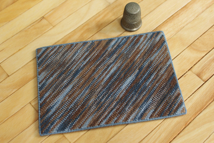
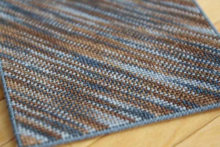
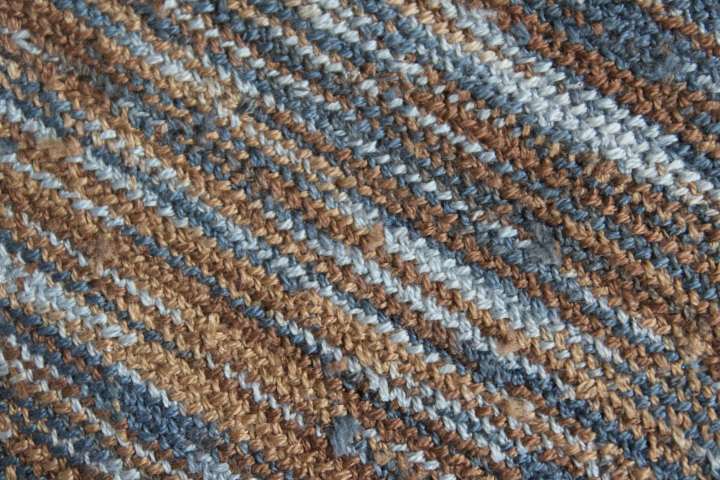
    During the listening of this, I finished up a miniature carpet that I had started some time ago, playing around with a skein of new-to-me DMC Coloris, the familiar six-stranded embroidery floss but in variegated colors.  This one is 4515, also known for some reason as "Paris" — some of the colorways are rather vivid, but this one is beautifully subtle.  I decided to make a sort of "rag rug" just to see how the colors worked on a large field, so this is simply basketweave stitch, which is said to be good for covering large areas of canvas since it distorts less than continental or tent stitches.  (Basketweave, and even more so basketweave-plus-Coloris, is also, not coincidentally, a great choice for listening to a suspenseful audio-book, as you don't need to pay much attention to the stitching! no changing colors or counting!)  I'm not entirely sure about the "good coverage" part as there were frequently strange diagonal streaks of canvas visible across multiple rows, but in this case it worked out all right as the canvas (as many of the cotton ones do) shrank a bit in the blocking, thereby tightening the stitches.  I used shade 931 to edge the carpet with long-legged cross-stitch — according to the chart Mary Corbet gives at Needle 'n Thread, the component blues are 930 and 932, but 930 seemed a bit too dark to edge this, and 932 too light, so I used the one in between.  You can see that it's ever-so-slightly darker than the light blue in the Coloris, but it's a good compromise between the darker and the lighter ones.

    7405

    One of these days, I might try working the wrong side of the basketweave stitch on the right side — it has a fascinating "woven" texture that I'd like to see without all of the worked-in thread ends!

    7404

    Bestway Knitting 1946 A Fair Isle to Use Up Your Small Scraps of Yarn - Vintage Knitting Pattern Archive - 1 of 3

    And last but not least, though not actually from the library as it is on my Kindle, the D.E. Stevenson list is currently reading Mrs. Tim Gets a Job, the 1947 continuation of Hester Christie's diary.  Here, with Tim off with the Army in Egypt and their children heading to boarding school, Hester finds herself unexpectedly accepting a job offer as the assistant to a woman who has turned her Scottish country home into a small hotel.  Hester is a thoroughly engaging character, like many diary-keepers rather reserved in public but with so much to say in her diary that you quickly warm to her, even though if you thought about it, she would be one of those people in the corner of the train carriage of whom you are often vaguely aware but don't really notice.  The diary format is unique among Stevenson's novels to Mrs. Tim, but like all of Stevenson's books, it is full of her quiet intelligence, humor, and philosophy that everything works out pretty much all right in the end.

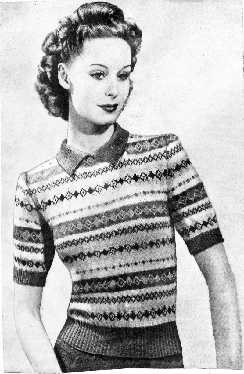
    I usually try to make at least some effort in choosing a pattern for my D.E. Stevenson virtual knitalong, not wanting to just take the first old thing that pops up, but this was the very first one and suited in at least three ways.  It's charming, obviously, that is certainly a plus!  But the story is set in Scotland in the very early spring, and while the weather is glorious, and gloriously described, often enough for us to feel Stevenson's love for her native land, it cannot be denied that Scotland in March and April, even southern Scotland, can be somewhat, well, let's say bracing — according to a chart of average temperatures, perhaps only towards the end of the latter month does it get up to a high in the mid-50s F (10 C).  One would be glad of a few jumpers, I expect!  And this one is immensely practical in the post-war time of continuing clothing rations too — the title is in fact "A Fair Isle to Use Up Your Small Scraps of Yarn".  The list of recommended colors of wool brings up an uncomfortable reminder of the casual usage of certain words in the 1940s that today make us shudder — curiously, but thank goodness, the abbreviation in the instructions is just B for brown. The first pattern of open and solid diamonds is brown on yellow; the second pattern of diamonds is saxe blue on white (I had to look it up); the third is red on turquoise (!); the fourth is green on white; then a bit more plain yellow ground, and the pattern repeats from there.  (I very much hope that that diamond just under the opening-point of the collar is centered ….)  Amusingly, Sirdar's "Super Shetland" is the same wool that the Victory Jumper uses, my choice for the previous Mrs. Tim book! 

    This pattern is available free courtesy The Sunny Stitcher at the Vintage Knitting Pattern Archive.

    Talking of libraries, I very much enjoyed the short piece "From Bag End to Babel: Top 10 Libraries in Fiction" in "The Guardian" —

  • Farewell-to-Spring

    7387
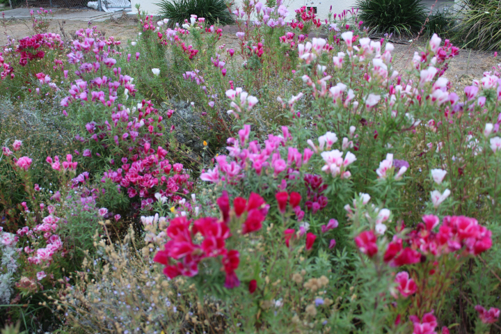
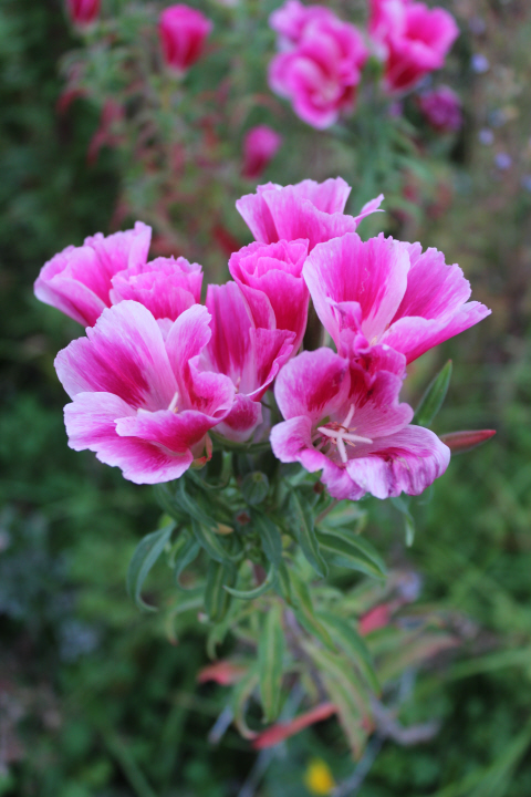
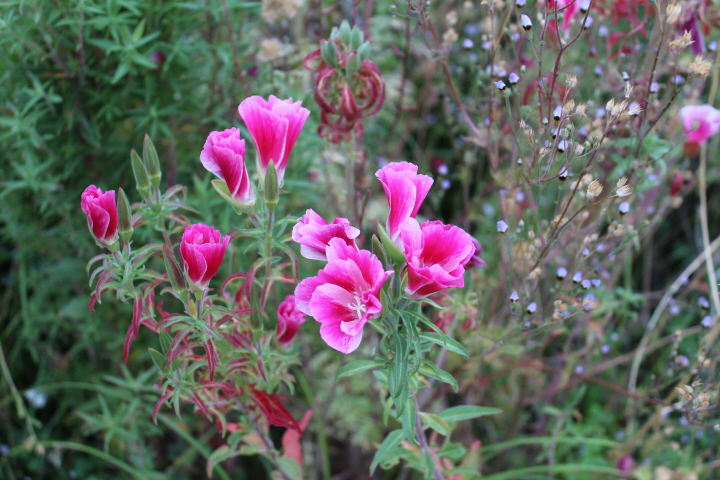
    Despite their being on the list of contents in the "Payne's No.1 Rainbow Mix" that Julia and I scattered in February, I didn't realize that these too had come up in our front yard — Clarkia amoena (also known as Godetia amoena), or farewell-to-spring.  They had sprouted along with the others, but I thought that they were just mountain garland (C. unguiculata) that hadn't bloomed yet.  Then, when most of the other flowers had started to fade, these burst forth, in a veritable plethora of pinks, from pink-throated white to palest purple to soft pink to unbelievably-vivid magenta.  The flowers remind me of azaleas, with a similar shape and slightly-ruffly-edged petals, and with the sheer volume of blooms, crowded together in masses of pink.

    They give the front yard quite a different character from six weeks ago — it's like two wildflower gardens in one packet!

    7394
    7394
    7394
    7394
    7394
    7394
    7394
    7394
    7394
    7394

  • ,

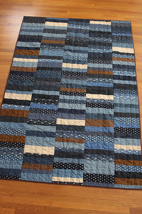
    Blue Coins for Baby

    7379

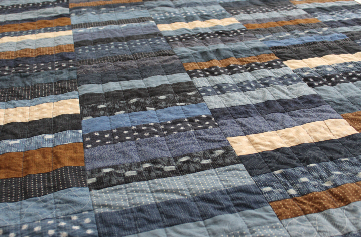
    This went together with a very satisfying quickness — not error-free, mind you, but well in time for the gift-giving next week.  The colors are very pleasing to my eye. 

    7381

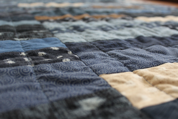
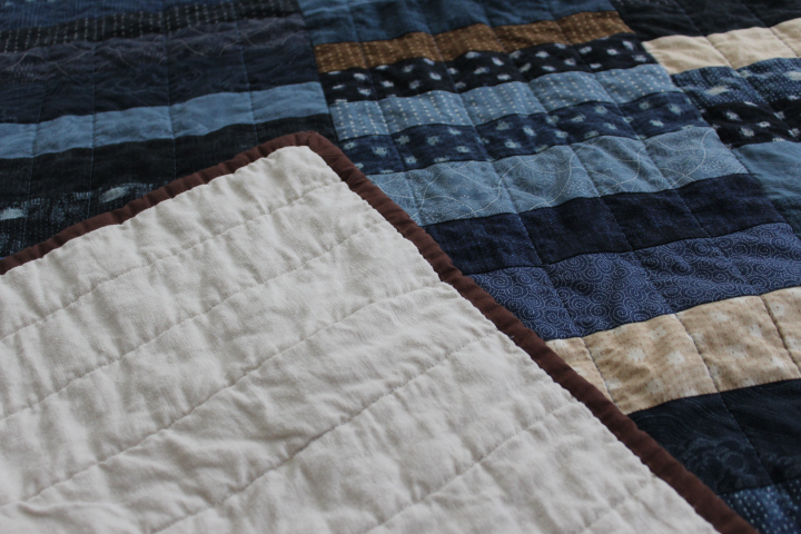
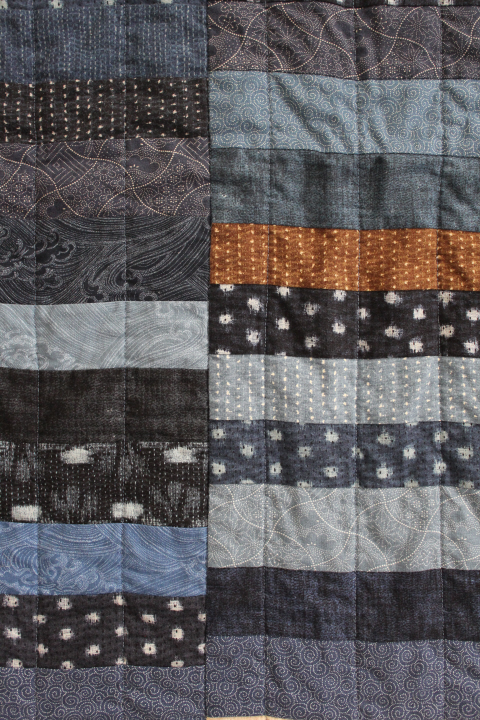
    I still have my old 1980s Kenmore sewing machine, which doesn't extend to anything so grand as a walking foot, so the quilting is only widely-spaced straight lines down the "stacks", but the wideness gives the quilt a pleasing fluffiness, I think.

    I wasn't very impressed with my ability to cut a straight edge — my tendency to try to be frugal and not waste any fabric tipped over the edge into skimping, and the backing fabric actually came up short on one side, so that I had to trim off a bit more than I really wanted to, which led to a series of snips here and there that seemed to make things worse, not unlike trying to cut your three-year-old's hair, snipping a bit here which makes that bit crooked which necessitates another snip there, &c. &c. &c.  And in another instance, although I was taught by my mother and grandmother to always, always, cut off the selvages, I have begun to absorb the much-earlier practice of using as much of the fabric as possible — maybe selvages don't pucker as much as they used to in Grandma's day, I wonder to myself, I've usually been all right — I thought I had measured carefully enough that these would be just inside the seam allowances, but one slipped somehow, so that my shame is there for all to see.

    7366

    I thought, rather desperately in a dark moment at the end of a long day of making edging strips and laboriously pinning and re-pinning and hand-sewing the first long edge and a corner, that I have enough fabric left to make another quilt, I could use this one for day-camp and make another one, with straighter edges and no parsimonious white selvages, one that I wouldn't have to make excuses for — "sorry about that wobbly bit there."

    And then when I woke up the next morning, I knew that this isn't mean to be a showpiece or a prize-winner, it's meant to be used, for the baby to nap on, or the new mom to nap under, to take to the park on a sunny day and not mind if it gets dirty or spat-up on.  It's okay.

    7371

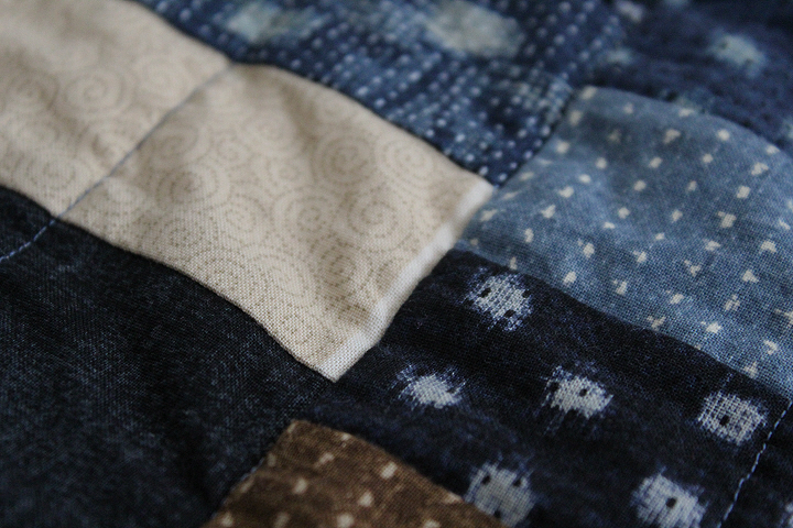
    And I really do love the colors, the different shades of indigo and brown, the little flecks of lighter shades here and there that give it both a liveliness and a kind of serenity.

    7380

    I had thought of piecing a quirky back, but this is just plain, a big piece of Linen Look, the sturdiness of which I have been very happy with in other projects, and comes already wide enough to need only a single cut.  The edging is a lovely coffee-brown Kona Cotton.

    So there wasn't really much "process" involved here, and it does look a bit more "homemade" than I quite wanted it to, but there it is — I will embrace its imperfections along with its beauties —

    7384

  • 7351
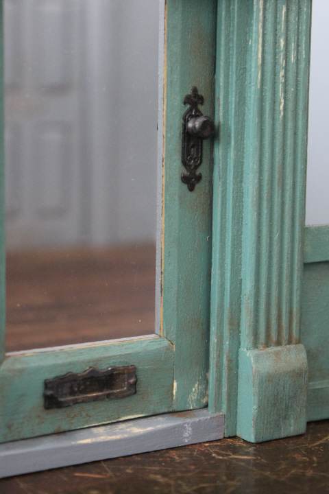
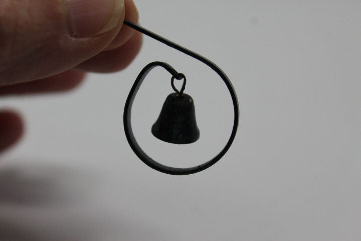
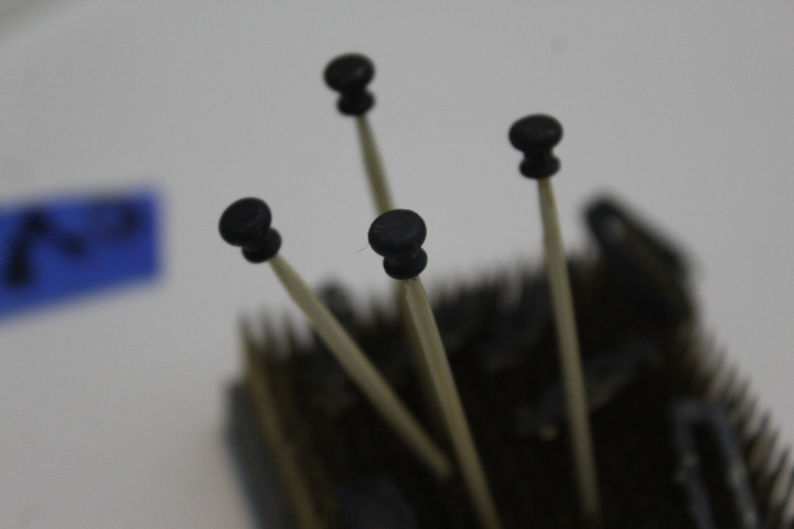
    The hardware I chose for the carpet shop doors is one of the rather-standard knob-and-plate sets and sort-of-matching two-sided letter slot available from most miniatures sources, under various brand names but clearly the same.  They weren't really ideal, looking late-Victorian where I was hoping for something more Georgian, or at least early-Victorian, but there it is, needs must — it was more efficient to order all from one place, and I was certainly happier with the rounder knobs, which are more in keeping with the period of the shop than the far more common modern-looking ones with sharp angles.  I did manage to find a shop bell that I liked! 

    They were, however, all very clean and shiny straight out of the box, so then I had to go about aging them.  It will probably be clear to experts that I don't have much idea of what I'm doing here, but after reading their blogs, I knew in theory what needed to be done!  I am lucky enough to have a real vintage bell to use as a model —

    5315

    so I painted all of my hardware black, then dabbed on a bit of green and a bit of brown, until it looked about right.
    7355

    5310

    (Like traitors' heads on spikes!)

    I've also finished the permanent signage.  I had the dickens of a time with the shop name, not trusting my skills at this scale to free-hand letters — though in my more desperate moments I did consider it.  I find it difficult to believe that there aren't 5/8 inch stencils to be had, but there aren't, unless you want to pay for custom stencils, which are far beyond my budget.  I couldn't even find stick-on letters.  I tried cutting some out of paper, which sort of worked but usually ended up with my snipping off a serif here and there, etc.  Print-your-own waterslide decals were, alas, a dismal failure, with only the number on the door being worth keeping and I'm not even delighted with that.  The "FINE CARPETS" one actually stretched as it was coming out from underneath the backing — too much water? not enough water?  I don't know.  These decals are repositionable for a few moments after you lay them, which is very helpful, believe me, but I discovered to my dismay that if you touch the image while you are doing this (despite the sealer applied after printing), some of it will most likely come off on your finger.  As the decal dries, the ink sets, but the door number decal especially was so small that I couldn't reposition it without touching the ink.  And even if they had worked, I wanted the shop name sign to be gold, and I would have had to paint over them.

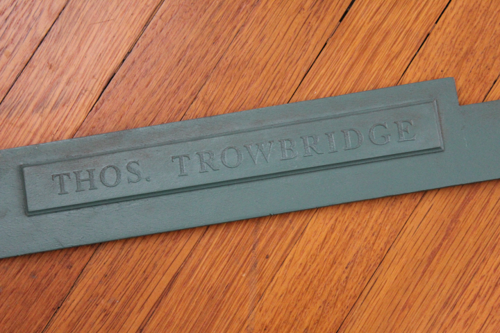
    While I was dithering and experimenting with the carpet-shop sign, I had the idea to do this on the upper façade —
    7168

    — in the manner of old shops that have permanent signage painted over when a new business moves in — which was actually pretty successful.
    5294

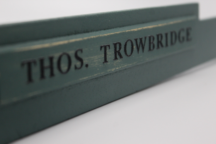
    I was hoping to superscript the S in "Thos." the 18th-century way, but I couldn't find the same font in two different sizes, nor even, to my astonishment, upper-case and lower, so this was what I ended up with.  These are stickers from the scrapbook aisle at Michaels.  The letters are textured, which wasn't ideal — painted, they remind me of the no-slip texture on ladder steps and shower floors — but they are a good size, and they add a certain whatsit to that rather boring façade.  I just made up the name, but it sounds charmingly old-fashioned!  (You can see that I got the idea to do this after I'd aged the piece a bit, which I had to do over again after painting over the letters!  More practice, I guess.)

    The shop name has had a long journey, full of wrong turns and potholes, but like many such journeys, arrived at its destination happily.
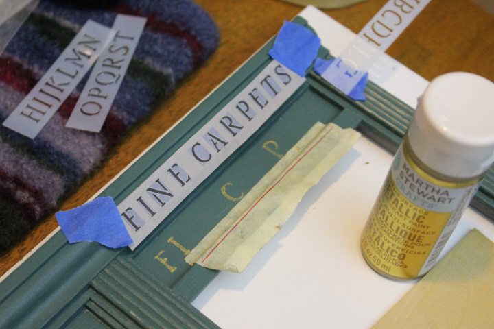
    5312

    This is the Folkart 59796 alphabet stencil, painted with Martha Stewart Craft Paint in Metallic Gold — a handsome alphabet, to be sure, if smaller than I wanted.  (I noticed after this photo that the F was clearly below the line, so I painted it out and re-did it.)  I scanned the stencil then cropped the letters I needed and spaced them out in a rectangle the same size as the shop-front inset, so that I wouldn't have to do it on the fly — a bit of a bother, but worth it to save the stress!  I was not successful in merely dabbing paint over the stencil, so I painted through the stencil, as it were, onto the surface.  I had to do one letter at a time, then let it dry, then do the next one, since I didn't want to cut the letters completely separate.  The result wasn't what I'd pictured in my imagination — which was certainly bigger letters, as well as neater — but the sign was "up," at least.  It's possible that some of the clumsiness of execution was due to the brush I used.  It's a poor workman who blames his tools, of course, but this was my brush —
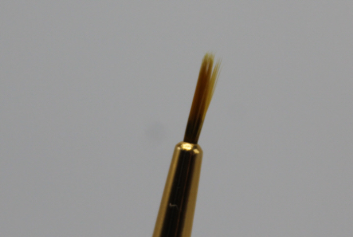
    5314

    and no amount of wetting and coaxing would get the tip any finer, so I vowed that if I ever did this again (wh. at the moment was doubtful, but I said the same thing about childbirth the first time) I would buy a better brush from an artists' supply store.
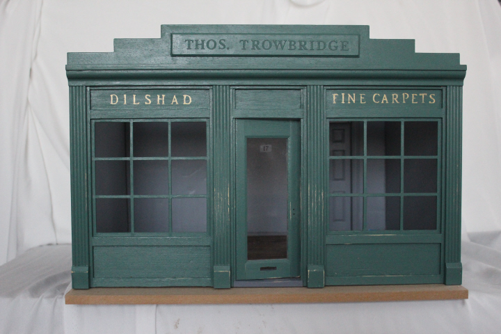
    5319

    This was just not what I had in my mind's eye, though, and so after a few days of thinking about it, I painted it over and tried something different — first, pricking around the edges of a printed letter, through the paper and slightly into the painted wood, and then filling in the outline with a very-fine-tipped gold pen, which I tried out on a piece of scrap wood I'd been using to practice weathering techniques.  This worked fairly well — the pinpricks are still visible from close-up, but not so much at a distance — but then I remembered the old elementary-school trick of homemade "carbon paper" — I printed out the letters I wanted, rubbed a no.2 pencil thoroughly over the back, then traced around the letters with a fine-tip ballpoint pen, which left a faint imprint of the graphite on the wood.
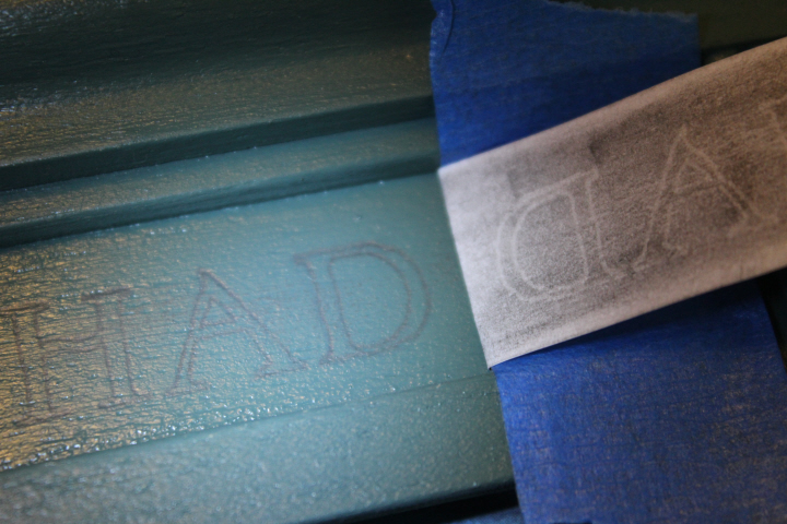
    5385

    I then carefully painted inside the lines — with a new 10/0 spotter brush, the smallest I could find — and voilà! a very pleasing shop sign.

    5389

    Even with an unstaged and badly-lit photo, this was miles better!

    As for the interior walls, my use of Paperclay to make faux plaster interior walls was, unfortunately, a pretty dismal failure.  I don't think it's the Paperclay's fault, as lots of miniaturists use it, and some very expert ones too — perhaps it was the age, flexibility, and/or utter dryness of the MDF walls, as they either absorbed the moisture from the drying clay or, as the clay shrank — which I knew it was going to do — it pulled the MDF along with it.  Regardless of the reasons, the effect was obvious —
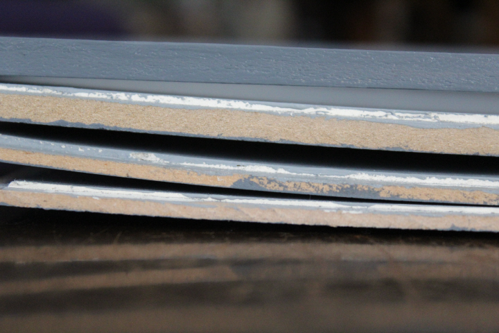
    5390
    At the top is the Plexiglas "ceiling" which is still straight — the next one down is the thicker back wall, then the two side walls at the bottom.  Even the thicker rear wall wasn't sturdy enough to resist the warping.  No end of resting under weights had any permanent effect — after I saw how the first one bowed, I even clamped the freshly-Paperclayed ones to a very firm surface to keep them from warping in the first place, but the warping was actually very gradual, and was clearly worse after a week.  (They have also warped even more since I took this photo.)  Very dismayed, I left the whole thing alone for quite a long time — David busily coming up with ideas such as bracing the walls outside with brass rods — but eventually we both came to the inescapable conclusion that, since the rear and side walls were plain as plain could be bar the glued-on corner brackets on the back wall, the most logical thing to do was to simply cut some new walls out of plywood and start again.  It was actually ridiculously easy to pry off the brackets, and I simply re-glued them to the new rear wall.
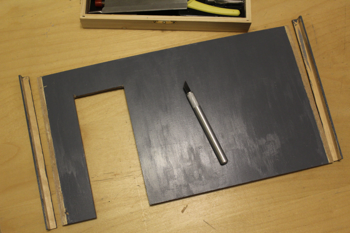
    5494

    I really wanted the plaster effect, so I used spackling compound on the new ones, partly because I was now wary of the Paperclay and partly because David had a nearly-new tub of the stuff so I didn't have to buy anything.

    Despite all of these grandmother's-footsteps accomplishments and setbacks, what made me most nervous was the painted "aging".  The members of the Greenleaf miniatures forum were gently encouraging and helpful, though, so I did some practicing on a piece of scrap wood, then just dove in.  ("You can always paint it over and start again," said a number of people, which, though the prospect was daunting, was certainly true in my case, as I had used only a fraction of the lovely green Behr Marquee sample pot — "Chelsea Green" — I got from Home Depot!)

    The technique I ended up using was basically dry-brushing, starting with a "faded" bit of the base color (mixed with white craft paint), then some black and some brown, just sort of "dusted" on where it seemed there would be the most aged and/or dirty places on a real wall.  I did rub it off in some places and do it over.  There are also some spots that I sanded lightly with an emery board to look chipped or flaked off — there are some wonderful tutorials, especially from model railroaders, for simulating flaking paint, but the sanding worked well enough for a "slightly run-down but not dilapidated shop".
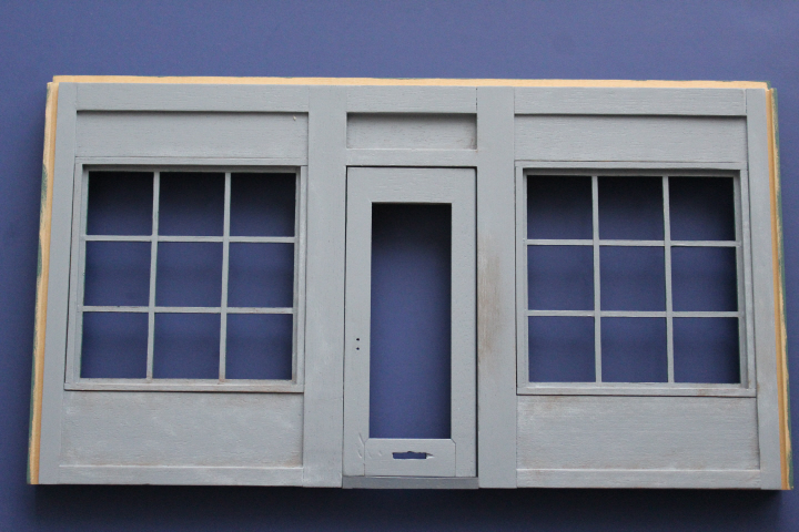
    5435

    What Not to Do: If you change the orientation of a door, don't forget to age the door jamb on the new opening side, not the old one!  Duh!

    5439

    The "Private" sign is a faux-enameled one from a selection of Victorian sign images that I found online, printed on watercolor paper and loaded with artists' medium, in the same way that I made tiles for the No.16 kitchen.  I made it slightly bigger than the real sign, as it just looked better that way on my door.

    I will try next time to get the lower parts of the walls a bit more uniformly grungy — now, how often do you get to say that, really?! — as it looks a bit spotty to me, but I'm satisfied enough with this to move on to the next step!
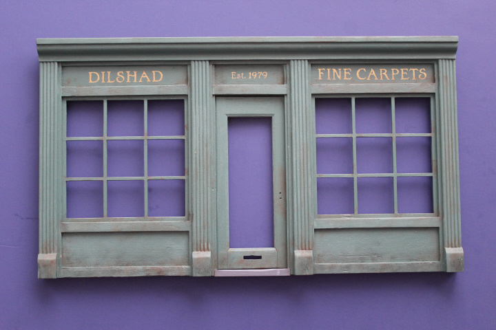
    5447

    The windows aren't glued in yet, as I've found that they fit in the frames very snugly just by friction and I suspect that I might want to have the access for a while longer! but I have since this photo glued in the Plexiglas.

    And, after all of this, it was time for …
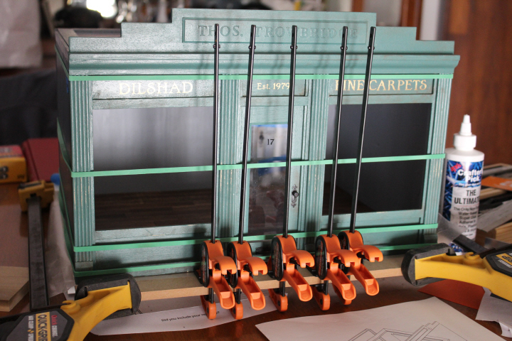
    7343

    This was surprisingly nerve-wracking, and I put it off for ages, but the Time Has Come.  The base that came with the kit is here held in the right-angle of the big gluing jig by the two large clamps, the four walls of the box are wrapped around the (now also glued in place) floor at the bottom and the removable "ceiling" at the top and held snugly with extra-large rubber bands (which I had bought for a catapult experiment at day camp a few weeks ago, and worked perfectly for this as well!) and the whole box is also pushed into the right-angle of the jig, there is a piece of wax paper between the base and the underside of the shop box in case of glue overflow, and the five handy craft clamps aren't actually clamping anything (because they are too short to go around the box) but are pushed up snugly against the slightly-warped front piece in hopes that the glue will grab hold firmly enough to counteract the bowing.
  • ,

    Baby Steps in Boro

    7190
    Being a novice quilter, and being me in researching options and methods etc. etc. etc. sometimes quite a lot before actually starting a project, I've been looking around the internet (as one does) and have come across any number of Chinese Coins/Stacked Coins quilts, lighting fairly early in my explorations on Ann's blog at Fret Not Yourself, which I like very much, not least because she's going through a bit of a phase with Chinese Coins lately (she started numbering them, I think she's up to fourteen! — not in a row, mind).  Of course, there are any number of charming quilt patterns — I must make this large-scale Ohio Star pattern! — but somehow my Japanese fabrics seem to me to want the neatness and order of straight lines, and the Chinese Coins pattern gives that sense of simplicity and busy-ness at the same time that both fits the fabrics and speaks to me.  I did manage to find my original inspiration quilt, which had been pinned and re-pinned on Pinterest so many times that I thought the source would be lost to me forever, but then there it was at A Quilter's Table, the third one in the post.  I really like the gentle colors, gentle but far from dull, and the sort of regular irregularity of the stacks, chaos and order together if you will.  I am also really taken with this one, Ann's Chinese Coins V, which is more improvised than usual even for her, and I love the effect.

    These led me eventually to a post at Rossie Crafts, a bit of a digression from my own planning, but an interesting one, talking about not so much the finished product — in this case, quilts — but how the maker gets there, which of course is the part that as a novice I am least certain about.  Something one of the commenters said struck a chord of recognition in me, that "one of the most debilitating fears I had to overcome in my students was the ideas that they are not good enough and that they are not allowed to make mistakes." It's wonderful to look at a website or blog full of finished pieces — Hopewell, say — but for a novice like me, faced with a stack of fabrics and a lot of decisions, and then in the making itself any number of mistakes or uncertainties, it can be not a little daunting.  Simplicity is not always easy, ironically!
    This is not new to me, mind you.  I have a tendency to want things that I make to be tidy, to not look "homemade" in that derogatory sense we all know, ill-fitting, with crooked hems and wonky buttonholes — and so I rarely show the stages of a project, be it knitting or sewing, or the failures (and we all have those, to be sure).  Certainly for those new to a craft, knowing more about the process from start to finish, from an expert or even that of someone with a similar level of experience, can give the confidence that leads to a willingness to experiment, or even just to feel more positive about the process as well as the result.Process pledge small

    Perhaps there is a risk of being excessively meticulous about the process of making — even if not on the level of "I cast on 114 sts, using the long-tailed method. I worked Row 1. I worked Row 2," ad infinitum — but the very practical prompts that Rossie gives at the end of her post are often the kind of things I find myself thinking about in the planning stages of a project, and sometimes the kind of things I worry about ("What are you hating about this quilt at this stage? What do you love?"), but that I don't always talk about here.  And, you know, it can only help oneself, as well as the result itself, to be more meditative, more thoughtful as it were, throughout the various stages of a project. 

    And so, with no further ado —

    7185

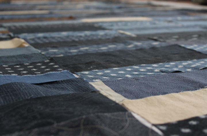
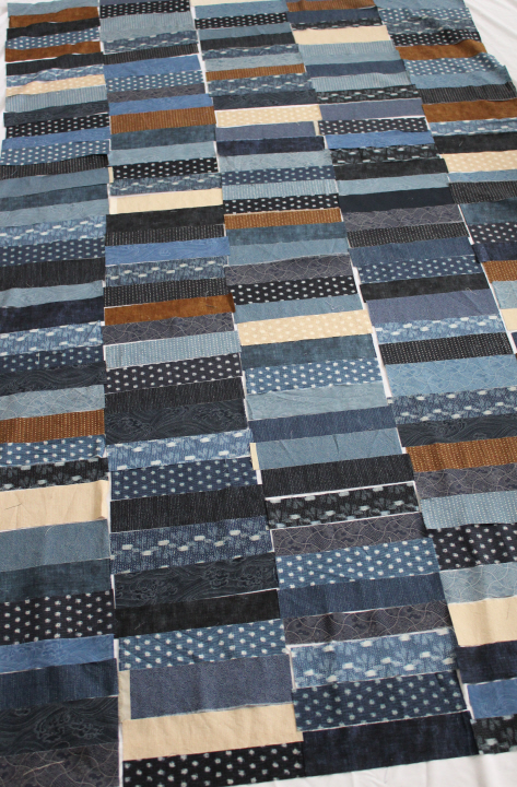
    Not long after the previous post, I cut my fabrics, slashing each fat quarter in half up the middle, then each half into faux-random widths.  I say "faux" because I was using my relatively-new rotary cutter and quilting ruler, and so in order to have strips of even widths I did have to line up the ruler first — and so the strips are wider or narrower mostly in 1/4" increments (!). 

    I then tossed all of the strips into the air (yes, literally) to mix them up, spread out a white sheet on the living room floor, and began laying out the strips as they came to my hands, only moving them when there were two of the same fabric next to each other, and in a mild attempt at not having two horizontal joins side-by-side.  My first pass at cutting strips went through maybe two-thirds of the fat quarters, but at one point I decided that there wasn't enough of the browns and tans, and so I just blithely cut all thirty of them — this might have been somewhat foolish, but there it is, and I realized when I had finished laying out enough of these to make a good-sized baby/toddler quilt, that I had used only just a little over half of the fabrics, so there is enough for a second, maybe larger, quilt if I add some sashing.  (This is not a bad thing at all, as I was just thinking that these fabrics would also make a very good picnic/camp quilt, with their dark but far-from-somber colors.)

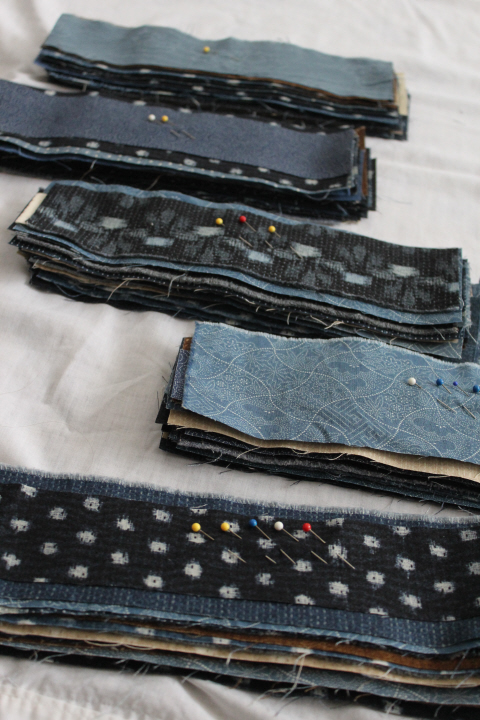
    I didn't actually do that much "tweaking" with this first layout — just enough to spread the browns and tans fairly evenly around among the blues, and squinting at it now and then to make sure that it wasn't too visually heavy with a lot of dark or light strips in one spot.  I'm fairly pleased with the result, and at this rate it will turn out much bigger than I had originally planned.  I've since stacked up each column in order, with pins in the top of each stack so that I know where it goes in the sequence.  And now, the sewing!
    7188

  • I Need Another Project!

    7142

    The end of the school year is rapidly approaching — less than two weeks left of classes!  I have been volunteered, nominated, and elected, from a pool of exactly none, to be in charge of uniforms for the marching band next year, requiring not a little bit of prep now, and David offered my services as librarian to the director to re-catalog the instrumental music library (which, to be honest, although is time-consuming is the kind of thing that I really enjoy!).  And Girl Scout day camp is not long after the last day of school, and since I somehow ended up (see "pool of none") as the assistant director of the day camp, I have been busy helping to sort out kerfuffles small and very large indeed ("What do you mean, somebody else has booked the park that week??").  On the bright side, I get to be a unit leader again this year, my favorite part! after having to sit it out last year and administrate.

    So, ha-ha, I need another project kind of like I need a hole in the head, really, but there it is — I want to make something for an upcoming baby gift, and I remember how useful a smallish quilt was for my girls, so I've decided to make a quilt.  I was thinking of something rather spare and architectural, a riff on a Hopewell quilt, perhaps, then saw one that was more-or-less the Chinese Coins (also known as Stacked Coins) pattern but without any sashing between the "stacks" and with the "coins" of irregular sizes.  Almost at the same moment, I saw Moda's "Boro" collection fat quarter bundle, which is no less than thirty fat quarters, most in various shades of beautiful indigo, with some browns and tans for a bit of contrast.  I think this will make an interesting quilt that is not only handsome it itself but also isn't the traditional "baby" look.

    My idea is to trim the fat quarters to a uniform width (the long way) and then cut each into thirds, which would result in pieces roughly 6-7 in. wide (depending on shrinkage) and cut those into varying heights between, say 1 1/2 and 3 in., then "stack" them into 5 strips each 5 1/2-6 1/2 in. wide.  These five stacks sewn together would make a quilt roughly "baby size," which is about 30 x 40 in.  Or, if I want to end up with a larger quilt — closer to, say, 52 x 36 in., the "standard" toddler/crib size — I could cut the fat quarters in half instead of thirds.  I am not even a mildly experienced quilter, mind, so if anyone reading this spots right off that it won't work, please speak up!