• 0236

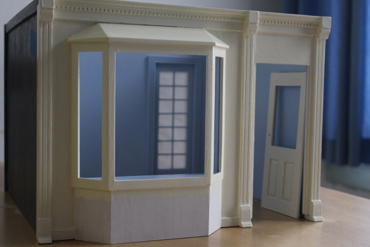
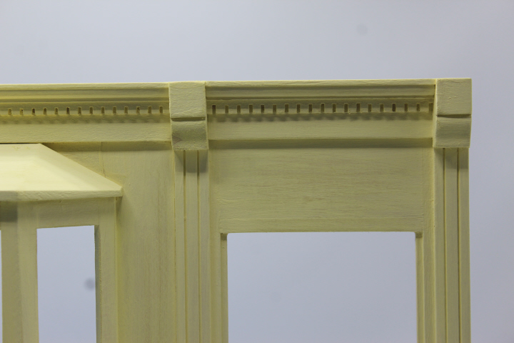
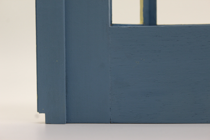
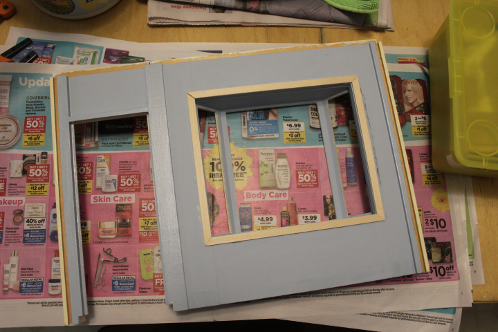
    This is the tea-room-to-be, almost ready to glue together.  I painted it with milk paints in a previous life, which I had tested on a little bedside table I made and really liked (the paint I mean, the table was an object lesson in using a right-angle jig for gluing!) —
    6064

    6065

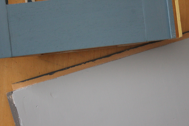
    but I painted a first coat on the shop and wasn't happy, then painted a second coat and was even less happy — the blue is pretty but far too dark, but the yellow while lovely on my sample (and in the upstairs room in Hardy House) was dismayingly blotchy on the shop front — so I put it away in despair and felt sad about it for I'm afraid almost a full year.  I had bought some more paint samples from Home Depot around Christmas, I think, but only put a coat of primer on, which looked awful, to be honest, and I didn't touch it again until … well, until I had some extra time on my hands.  You know.  Anyway, I gave myself a mental smack and took all four walls out to the garage and went at them with the palm sander and other bits of sand paper in various grades until I felt better.
    0189

    The new paints are "English Hollyhock" (the blue) and "Candlewick" (the pale yellow), both from Behr.  The yellow isn't as Farrow-&-Ball as I had pictured in my mind, but there it is — it is quite pretty in itself.
    0204

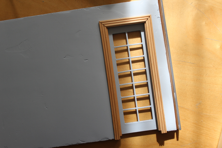
    In the boxes of stuff that my benefactress gave me (how nice, to think of having a benefactress!) was this Houseworks "French door" which I thought would be perfect for a tea shop, as the most convenient route to the kitchen would surely be a swinging door!  The frame was glued together rather crookedly, so after a previous successful experiment with a hair dryer, warming the glue and gently prying the joins apart with the thin blade of a craft knife, I took it apart and sanded it a bit and glued it more straightly.  When I dry-fitted it, though, I thought the door looked a bit stingy somehow, with no room for a push plate, so David helped me to trim off the innermost section of the jamb.  I will play around with cutting a push plate from a model-maker's brass strip that I've got.
    0207

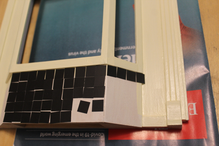
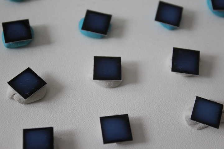
    After looking at innumerable shop fronts, both English and American colonial-esque, for design ideas, I thought I'd like to try tiling the bottom part of this bay window.  I had such fun with my previous faux tiles that that method was high on my list, and I had accumulated quite a lot of paint chips in various colors by that time, so I tested it out and decided to go for it.  These are cut in 1cm squares, slightly smaller than the more-obvious half-inch because I felt that an odd number of rows would look better.  At first, I simply marked the rows on the back of the paint chip with a ruler and pencil, but quickly realized that as good as I thought my measuring eye was, in 1:12 scale being only slightly off makes a huge difference!  So I printed out a piece of 1cm graph paper, stuck it on to the back of the paint chips, and got them cut much more accurately.
    0208

    0212

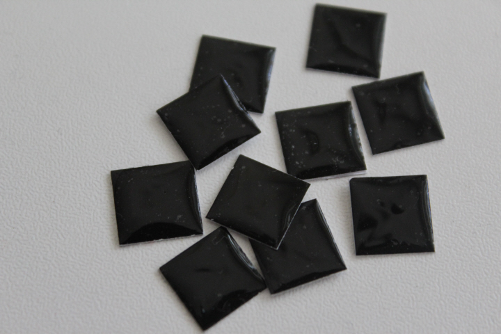
    Alas, this gorgeous blue and black is only the artists medium still in its opaque wet stage, and the faux tiles have since dried quite black — which is what I wanted, after all.  This would have been a happy accident, indeed.

    The paint-chip base gave somewhat different results from the watercolor paper I've used previously — for some reason, the gloss medium didn't level off as much, but more importantly, either I didn't notice that there were more bubbles in the bottle (or perhaps from the brush I was using) or the black underneath made them much more apparent, but the first batch I did was unusable.  I had wild thoughts of dashing in to Home Depot, corona-virus be damned, grabbing some paint chips, and dashing back out again, but of course that wasn't very sensible since I have family at home, and so I resigned myself to the challenge of eking out enough squares from the wonky batch I'd cut by eye from the first chip.  I think I have enough, though I may have to use some of the slightly-bubbled ones.
    0266

    (My shops, by the way, are set in a vaguely contemporary time, which to me means that one could have a chip credit-card reader and another a rotary phone.  And even though the possible inspiration for the designs is American, the 1:12 shops look thoroughly English to my Southern-California eye, so it's difficult not to lean pretty far in that direction, though I'm actually trying to be ambiguous.  A friend asked me not long ago, "Are they English or American?" so I said, "Yes.")
    0216

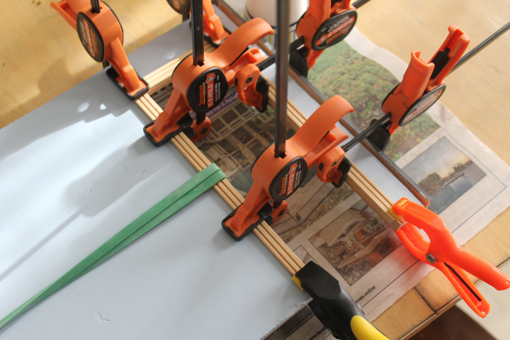
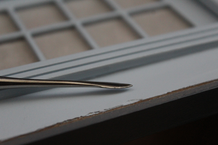
    Even after re-gluing the inner-door frame, the warping was was so much, after who-knows-how-long sitting in its box (it wouldn't surprise me if it was ten or twenty years), that it promptly snapped back into pieces when I set it into the opening, twice, and so the only thing to do was glue it into place in sections, first the top and then the two sides!  It was a bit of a puzzle figuring out how to clamp it, but luckily that giant rubber band came in handy again!  I did have to spackle a relatively huge bow, but with one of the teeny-tiny tools in the stash I now have, this went surprisingly well.  If the warp had been sideways, I probably would have simply chucked the whole assembly, but since it is outwards, you can't see it from most of the angles that will be visible when the room-box is put together.  (More "subsidence — from the bombing"!)
    0268

    0225

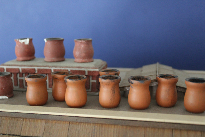
    I took the time to paint new chimney pots for Hardy House, since every single one is chipped or broken, the old clay (maybe plaster of Paris?) being dry and brittle after forty years.  The new ones are of course those little wooden "candle holders" that are in I think every single craft store's "woodworking" aisle.  (Candle holders?  Well, I can see how they would fit, but who would actually use them for holding candles?  They look like they'd fall right over and set your tablecloth on fire.)  They barely needed sanding, so after a cursory rub I gave them two undercoats of black, then two top coats of terra cotta paint, dry-brushed a bit of black and gray "soot" around the rims, and finished with a coat of matte varnish.
    0229

    I had decided to save a bit of money and get only a matte pot of the blue for the inside of the shop, and use the gloss varnish that I already have to put a shine on the trim.  This is fairly successful, though it does take a bit of sanding between coats to get both the paint and the gloss looking smooth enough to create the illusion.  It occurred to me about halfway through this that there really ought to be a frame around the inside of the bay window, so I dug out some plain pieces and glued them in place.  It will rarely be visible, but I'll know it's there.

    Finishing this part will now start overlapping with the interior decoration! —
  • 3431

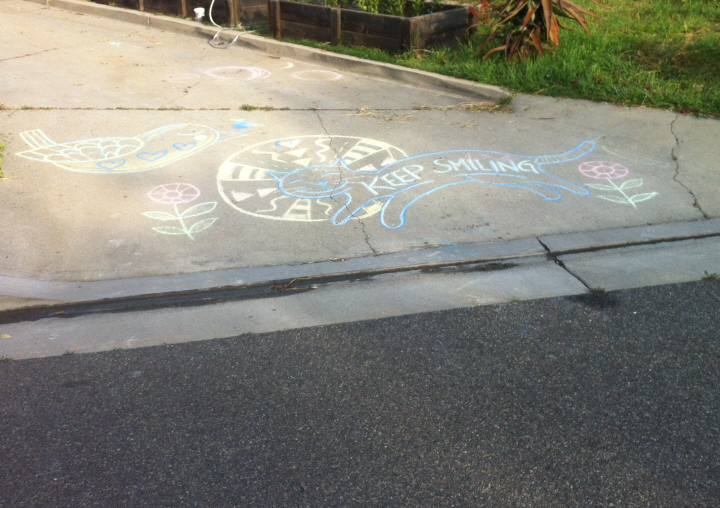
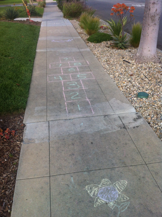
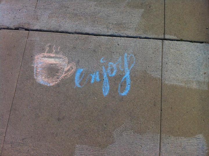
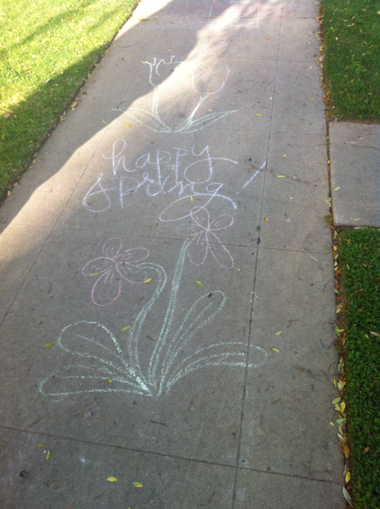
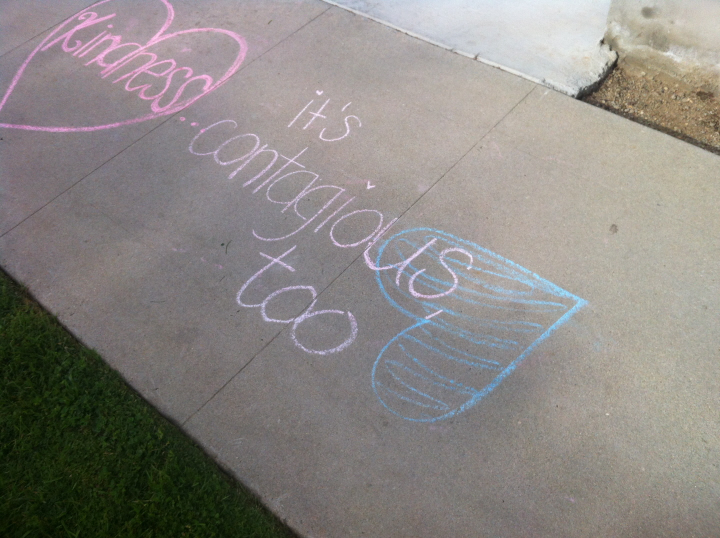
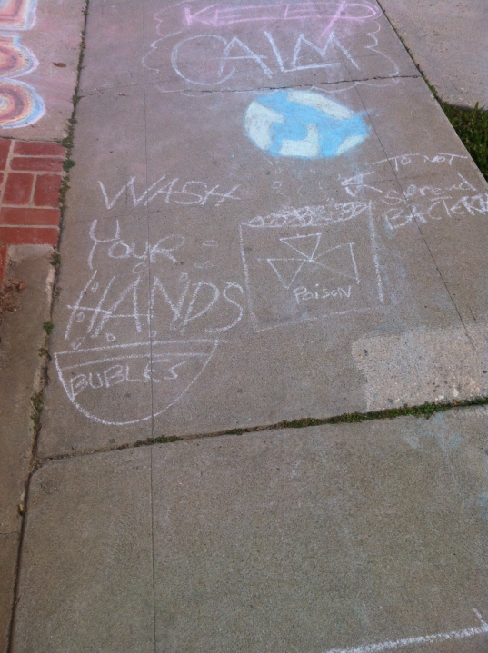
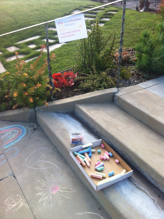
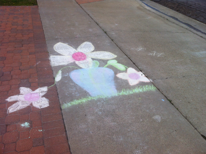
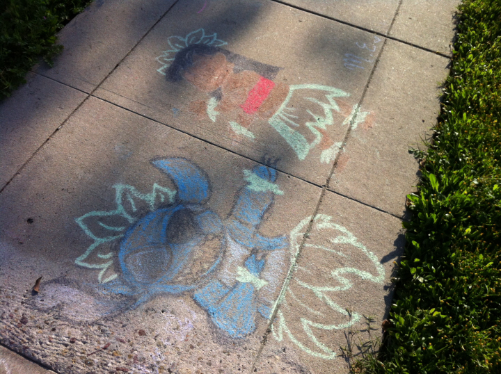
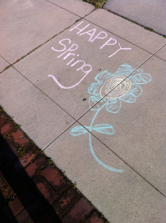
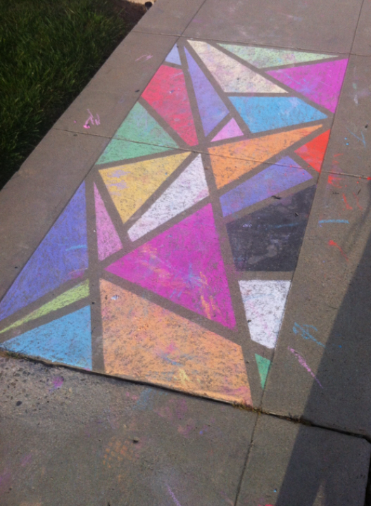
    Some of the sidewalk cheer that folks young and old have been bringing to our neighborhood —

    3439

    3441

    3443

    3444

    3445

    3446 2

    3448

    3449

    3451

    3442

    3475

    3499

    3501

  • Keep Calm!

    0191

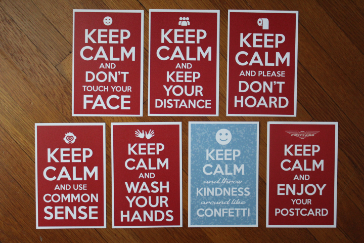
    A selection of "Keep Calm" postcards from Christopher Arndt, to put a bit of humor in someone's mailbox —

  • 0219
    There really are some extra hours in the day lately.  (Be careful what you ask for …)  I'm still in charge of cooking, cleaning, and laundry — I have teenagers, not to mention teenagers who are trying to adapt to online schooling, so despite having extra hands around the house, "in charge" frequently means only occasionally roping the girls in to help and instead doing much of it myself.  I reckon it takes about 90 minutes for a weekly grocery-store trip in ordinary days, not counting the unplanned I'm-out-of-baking-powder trips one makes, and so right there I have an additional hour and a half in the week. 

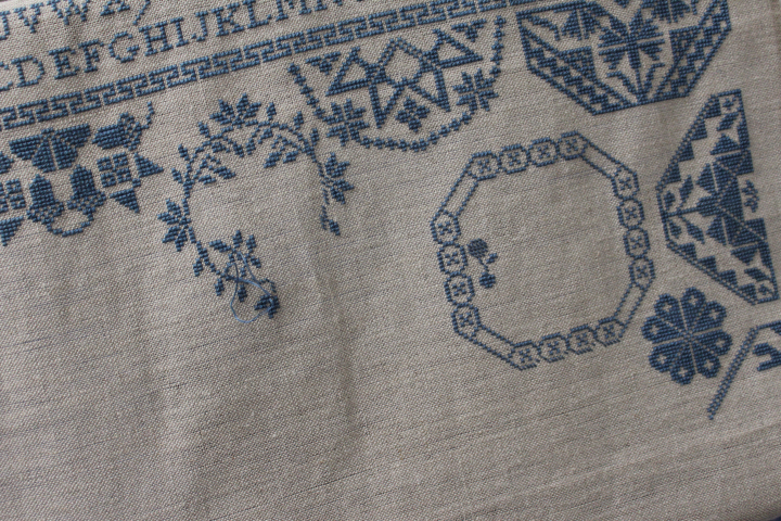
    But the "Friend" sampler is as a result coming along nicely as I approach the half-way mark, and I'm appreciating its peacefulness (though I'm not sure yet whether I was right in shifting that leafy circle to the right by one stitch…).

    0220
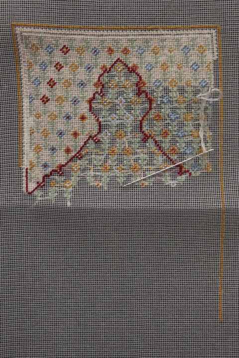
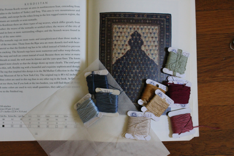
    Very pleased with this so far, the 1:12 scale Kurdistan prayer rug.  I was choosing the floss colors — converted from Paternayan wool so that I could reduce it from 19-count canvas to 30-count gauze — right at the time when stores were starting to close down, and although I love both of the two shades of garnet in my box, I felt that the lighter one would be better.  Unfortunately, I have only a very small amount of the lighter 815 and almost a full skein of the next-darker shade 814!  I ordered a skein from Michaels when our local one was still doing curbside pick-up, but they shut literally the night I placed my order, Joann offers only a very limited number of colors online, and my "local" needlework shop is two cities away.  I was going to just accept the inevitable, as one must sometimes, and use the darker one — it isn't that much darker, really, I guess — and then when it came time that I had to thread the needle I went for the lighter 815, and am hoping for the best.  One of the good things about small-gauge petit point is that you use surprisingly small amounts of thread.  I think I'll just work the parts that I really need to — there isn't a lot of it in the center field, just this outline and some petals and flower centers — and see how far I can stretch what I have.

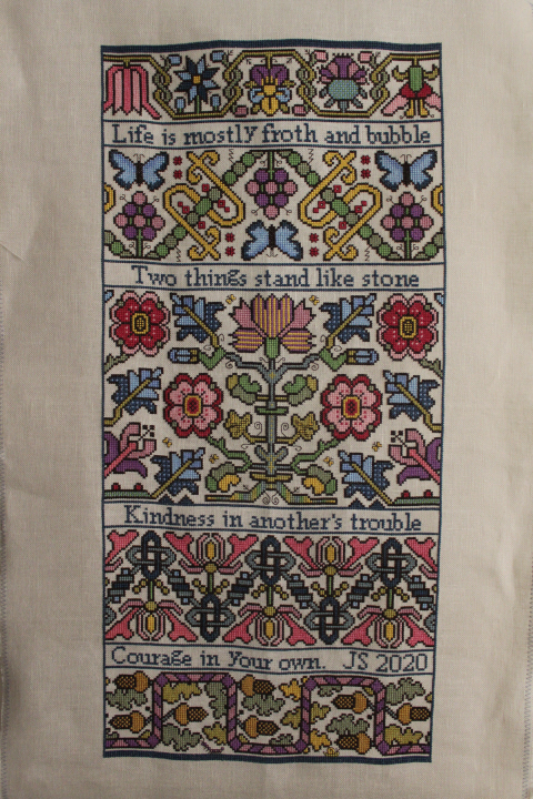
    The full-sized "Froth and Bubble" sampler was finished some time ago, but is still hanging unblocked on a door, just being admired since I don't have the wherewithal at the moment to frame it.  I enjoyed stitching every minute of this, and am as charmed by the result as I was by the first photo I saw of the chart —

    0217


  • 0182
    A few weeks ago I dug out my Street of Shops box, with all of the little bits and bobs I swept off of the dining room table last November in preparation for our Thanksgiving family dinner and haven't touched since — prescient, perhaps, knowing that soon we would be staying home for a very long time.

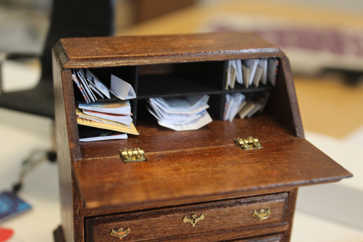
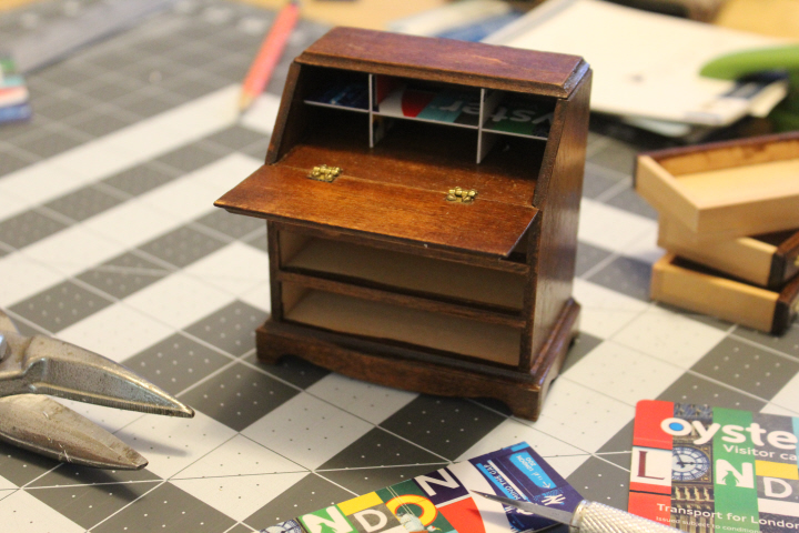
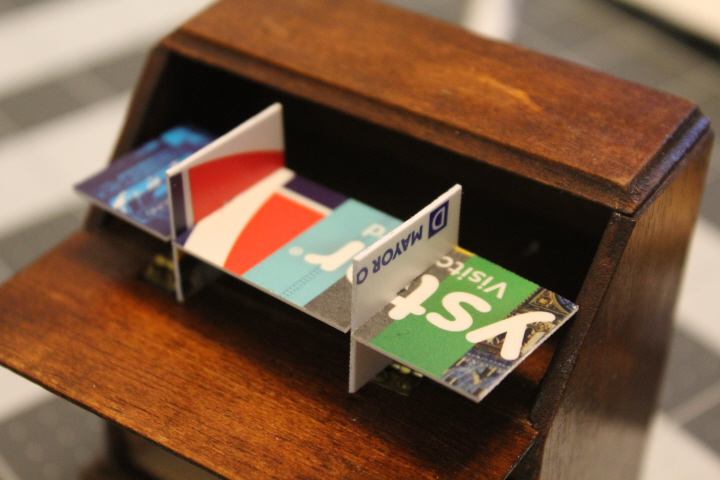
    Of course the desk in a carpet shop would be full of correspondence, receipts, journals, and whatnot, but the House of Miniatures kit that I had (no.40017) was the one without any pigeon-holes, so that certainly it would quickly become a mess.  Being set in the present day, I figured that the owner of the shop would most likely go to IKEA and find some organizer that would fit.  I have a stash of old gift cards which are not only excellent scrapers as-is and templates when cut, but are perfect for something like this, since they can be shaped and sanded, and don't split like thin wood might (does — I tried that first), and are thin but strong.  I asked David for some help in figuring out the best way to do it —

    9787

    and his prototype was so good that I just used that, and all I had to do was give it a light sanding, glue it together, and paint it!

    Of course I had to give it an IKEA name, so it is Ostron, which is the Swedish word for "oyster" — for obvious reasons.

    9790

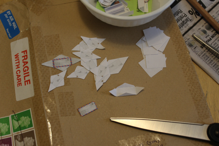
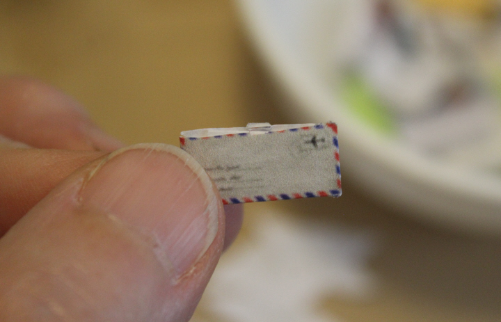
    Now to fill it with the business side of a shop.  I found a number of printable 1:12 envelopes online, but wasn't completely pleased with them as on many the folding lines are dark enough to see easily but show quite a lot on the finished envelope.  I edited some of the printables, and made some of my own — including airmail letters with the line of "flags" around the edges and proper postmarks — and got busy.  I like the manila ones, but alas they don't actually fit standing on edge in any of the cubbies, so I may just have to stack them, the way they are in the first photo above. 

    (Also in the photo are a variety of business letters that I reduced and printed, but I'm not sure how many I will leave lying around and how many will end up in the cubbies mixed in with the envelopes!)

    0178

    Envelopes just by themselves would probably be fine, but of course it seemed to me that in cubbies full of business correspondence most if not all of the letters would have been opened already, and so I folded small scraps of paper into "letters" and set one or two in the middle of the pre-folded envelope-to-be, glued the side flaps down, then the bottom and top flaps, and then slit each one open with a craft knife.  I made a a few dozen, then realized that if I want the desk crammed full and a bit untidy (which I do!), I will need possibly 250 or more.

    I'm pleased with the opened envelopes, though — especially when the knife slipped a bit or the paper was still a bit damp with glue and feathered instead of cutting cleanly, it has a pleasingly realistic look.  Who among us hasn't had a letter opener tear an envelope instead of slitting it?!

    0181
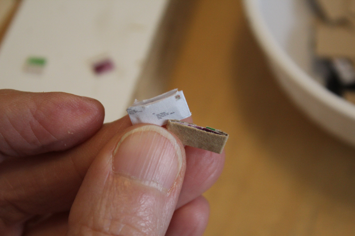
    But 250+! that's a lot of tiny envelopes to cut, fold, and glue.  I decided this afternoon to experiment, and I used a brown mailer that had come from the UK with some lace-making bobbins I splurged on with my Christmas money.  I was already a bit tempted to be daring and omit folding lines entirely, since even fine ones are visible, especially when you don't get the fold quite straight (!), and so I came up with a sort of wide T-shape that with the bottom and sides folded over make good edges — which is all that will be seen once the cubbies are full — and don't even need to be slit open at the top.  These are a bit fatter than the first day's efforts because of course the brown envelope is thicker paper, and because I decided to use even the parts with stamps and stickers, which help with the illusion that the letter has been opened and has something inside — the bonus is that thicker ones will also take up more space, hurrah!  The next batch I do will be the same "template" but thinner white paper, which does look a bit more realistic.

    0183

    0185

    Now I am going to go outside for a while!  We've been having splendid weather lately, as though Nature is consoling us that life is still good — cold, rainy days interspersed with bright, fresh ones.  These are some cirrus clouds on Sunday afternoon —

    0164

    0167

  • NGS_NGS_PG_1841-001

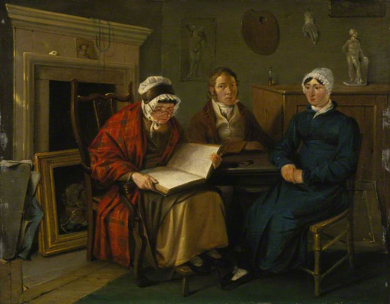
    Alexander Carse (c.1770–1843), "Self-Portrait with Two Women (Presumed to be the Artist's Mother and Sister)" (1795), National Galleries of Scotland, Scottish National Portrait Gallery.

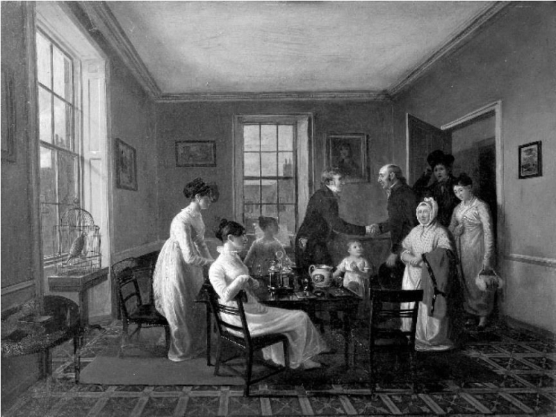
    I received a postcard yesterday that was the cover of the Penguin edition of Persuasion, with a detail of a very Austenian painting which the caption informed me was Alexander Carse's "The Visit of the Country Relations".  Little seems to be known about this earlyish Scottish genre painter, whose Wikipedia article is a decent length but manages to say not very much except a few details such as that he may have painted the earliest-known depictions of football (!) and that the "Country Relations" painting is regarded as his best work. 

    Carse Alexander - The Arrival of the Country Relations

    It is like a little novel in itself, so I'm very interested to see it in better detail and in color.  Curiously for it being regarded as his best work, I can find only one single black-and-white image of it, with no indication of its whereabouts — but I did appreciate finding another painting of someone reading, so I will have to be satisfied with that for the time being!

  • IMG_0057

    In the interests of not overdoing any one craft for the next few months — the recent episode of repetitive-stress strain took me by surprise, I must admit — I'm giving myself a free pass on multiple projects while we're homebound.  We are all still well, but I'm sure that not being bored will help at least a little with not getting on each other's nerves!

    Emily's Mudjar carpet from Frank Cooper's book — Oriental Carpets in Miniature — drew me back to my shortlist of Cooper's charts, and realizing that I have only a smallish piece of gauze left, I decided on the Kurdistan prayer rug.  Here is the original of Cooper's miniature, from the late 18th-early 19th century, in the McMullan Collection at the Metropolitan Museum of Art in New York (accession no.1970.302.8) —

    DP166864

    Wb-1970.302.8c

    Wb-1970.302.8m

    The Met writes, "This tapestry-woven prayer rug is an example of the fine production of Sanandaj, a center in the province of Kurdistan in northwestern Iran. The tapestry technique (kilim) makes it lighter and more fragile than a knotted pile rug, and such objects were often used as decorative wall hangings. The change of colors in the densely patterned rows of flowers enlivens the otherwise simple composition of an arched mihrab, or prayer niche, filled with flowers within and outside the niche."

    The original rug is 64 1/2 in.  long by 48 1/4 in. long (163.8 x 122.5cm), so that working it on 40-count gauze will come pretty close, at 5.5 x 4 in. (14 x 10cm), to 1:12 scale.  I actually like Cooper's colors better, so in addition to thinking that he did an admirable job of scaling down the design, I'm happy with his choices of colors, as well!  My translation of Cooper's Paternayan wool colors into DMC floss went a little further in the direction of cool dark blues and garnet than the warmer buff and orange-reds of the original, but that's okay too.  This one has been high on my list since I got the book some years ago, so I'm looking forward to it!

  • 0032

    “So it turns out now is a good time to spend more time at home. On the bright side, that means nobody will judge you for canceling plans and spending all day at your sewing machine! And there’s nothing like creative thoughts, beautiful things, and busy hands to bring peace to the stresses of life” — From the Missouri Star Quilt Co. newsletter for 14 March 2020

    I liked this quote, its calm lightheartedness and sensibility in these trying days of uncertainty and sometimes panic. It had already occurred to me that if we were required or even decided to hole up at home for a few weeks, or even a month, we might run out of milk or toilet paper but I would have quite enough things to keep me from being bored!  If nothing else, I've been steadily acquiring books faster than I can read them, so there is always a stack at hand.

    0033

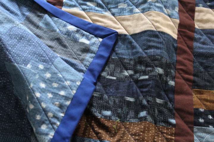
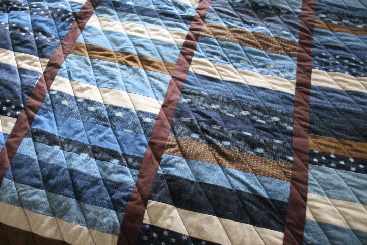
    I was going to do a quilting of criss-crossed diagonals on the New Boro quilt, but I stopped after one pass, and only partly because it was such a pain wrestling the thing into my sewing machine — I rather like the single diagonals against the strong horizontals and verticals of the stacks.  I am also pretty happy with the piecing on the back, its unstudied air.  The binding is purchased, I admit, and is more sapphire than navy blue, I would have said, but isn't usually as bright as it looks in the photo, and it was, frankly, easier at this point than making my own.  I've got it all sewn on and am about a third of the way along in tacking it down on the back by hand.

    0034

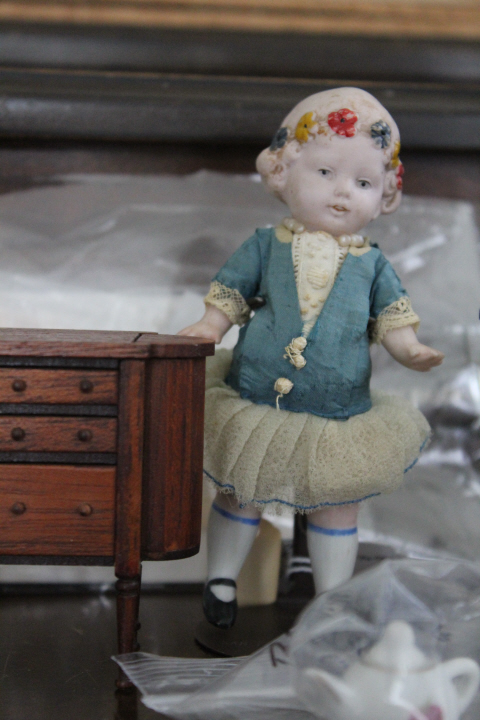
    I went to an estate sale of a member of a nearby miniatures group last week.  Estate sales are always bittersweet — sometimes you can find really wonderful things, but of course it's sad to think of going through someone's belongings after they've died.  More than one of the folks there was heard to murmur, "This will be what happens to my things after I'm gone." I hope the lady would have been glad to know that, for one, this charmer will be loved by me —

    0019
    not to mention the miniature Martha Washington cabinet just like my grandmother's full-sized one that I still have and use.  The seller's label on the doll says "Kewpie with flowers" but it's nothing like a Kewpie except in her little-girl tummy, so if anyone knows her maker I'd be very grateful to hear.  Her clothes appear to be stuck on pretty firmly, so I can't tell if there's a name underneath.  She has the look of some of the Hertwig Limbach dolls, to my untrained eye.

    0035

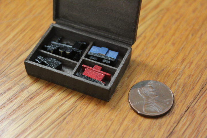
    I put together this kit for a toy train by Gary Handschug of Magic Touch Miniatures — maybe this was a souvenir at some NAME house-party, as it was clearly meant to be completely assembled by the purchaser, but everything was already glued together except the dividers and the silk-ribbon hinge on the box, with a note on the instructions saying that he'd already done the assembly.  All I had to do was sand it and paint.

    The cars don't actually link together, but the illusion is certainly there at this tiny scale, so I'm quite charmed regardless.  I roughed it up a bit to make it look like it has been played with!

    0039

    0040

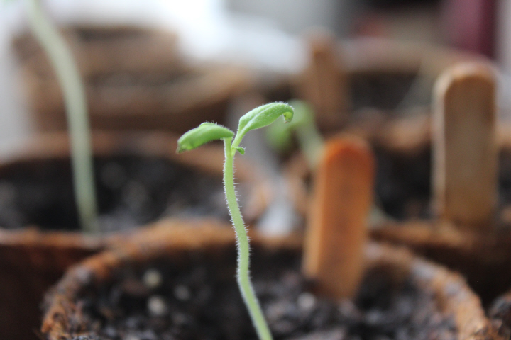
    Tomato seedlings getting a bit bigger indoors before I put them into the ground.

    0044

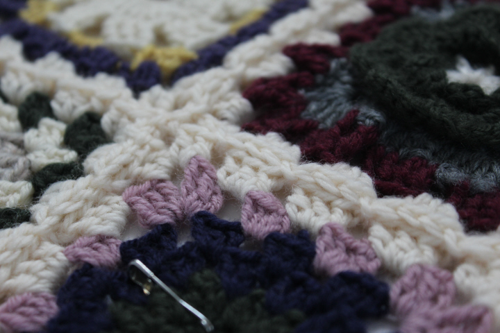
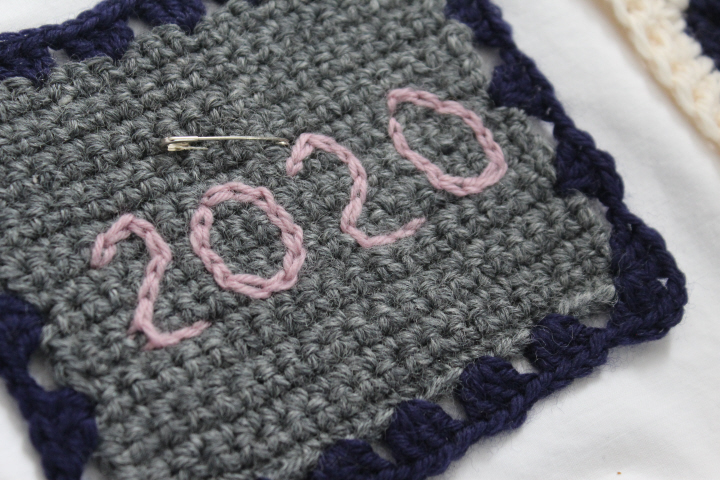
    And of course there's my Granny Square Sampler afghan still waiting.  I have to finish it this year, I've already made a date block! —
    0045

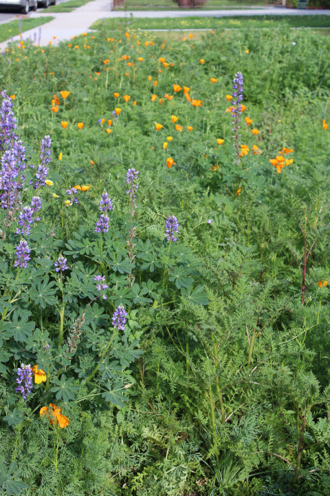
    It is a glorious day today after quite a lot of rain — very welcome rain, mind you!
    0047

    The wider photos don't convey the vivid blue-purples of the arroyo lupines and the orange of the poppies!

    0049

    Stay well, be nice!  We are all in this together!

  • 9798
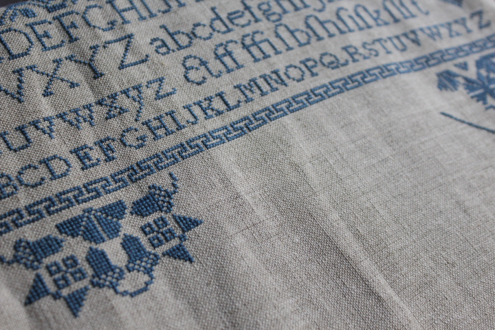
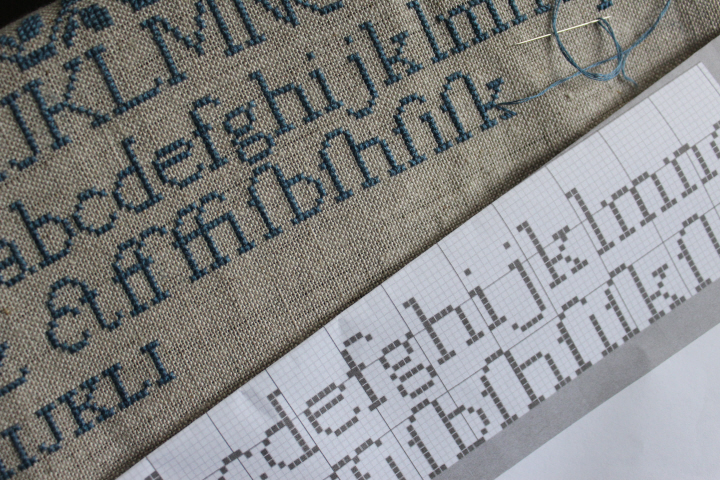
    One of the things that appealed to me about the "Peace to My Friend" sampler is the beautiful old-fashioned alphabet with its unusual inclusion of a selection of ligatures, something that is rarely seen in samplers, old or new.  As I approached it, though — working as I am from the top downwards — I thought, "Now, why aren't those ligatures in alphabetical order, I wonder."

    And of course, the closer I got to them, the more I wondered until, princess-and-the-pea-like, I realized that I would find it that tiny bit niggling forever — and more importantly, my friend would too, being of a similar turn of mind.  And looking at the chart, I began to see other little details that puzzled me — the missing dot of the i in the long-s-plus-i combination, the lack altogether of a bar of any size on two of the ligatures …

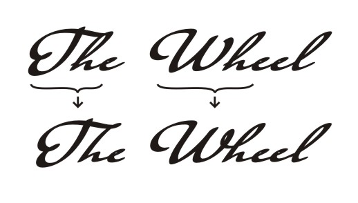
    Now, I am not as learned as it might sound from this, but I do know where to at least start researching, and in this case I chose Wikipedia, the article on ligatures.  Much of this article was lost on me, truth be told, but much I appreciated very much.  Isn't this a thing of beauty?! —

    Th_Taumfel

    Ligature "Th" in handwriting font Taumfel, illustration by Nikolai Sirotkin on Wikipedia

    Ordinarily, the lower-case h would have a loop for its ascender in this cursive-like font, but that looks a bit clumsy coming right after a capital T, so it has been adjusted to have a single-stroke ascender, with the addition of that delicate turn at the top that is like the difference between John Curry and, oh, even a second-place skater, really.The_Wheel_Taumfel
    Ligatures "Wh" and "Th" in handwriting font Taumfel by Nikolai Sirotkin on Wikipedia

    Not long after this, I also opened up a window with the article on the long s, and decided that, although I am told that the long-s is found with its "nub" or without, it seemed to me that consistency was called for in a single document, and I should choose one or the other.  Since it had already been established in the lower-case alphabet that the long-s has its nub, I went with that rather than have to go back and pick out the earlier instance (!).  (Further research seems to indicate that the barless long-s is in fact the italic version, so would presumably appear in its barless or uncrossed form only in an italic font….)

    I was concerned that the descender of the lower-case j in the line above would be obscured by the numerous ascenders in the line below, but as it happened, it all went together quite smoothly and the sometimes-impulsive changes that I made gave it a nearly-perfect amount of space to be enjoyed and appreciated for the small-but-graceful detail it is.  I changed my mind as I stitched, and re-inserted the space in the ff ligature as the white space wasn't as glaring as I thought it would be, after all, and that after some more research I made the crossbar in the fi ligature connect all of the way across as it should do, and does in the original ffi ligature.

    For further amusement, should you desire it, may I recommend "An Excellent Original Project Designed to Reduce Ignorance of the Long S" and, in case somehow you should think that librarians don't have a sense of humor, "fociety for the Reftoration of the Long f" ….