Well, it has been a while, and a lot has been happening, and I’ve blogged none of it — sigh. I even meant to post this yesterday! There are lots of reasons, most of them valid — we spent three weeks in New Zealand and Australia which was lovely (I’ll post some photos later), then the holidays were upon us, my laptop had some issues so that I couldn’t download the photos from my camera or my phone, &c. &c. &c.
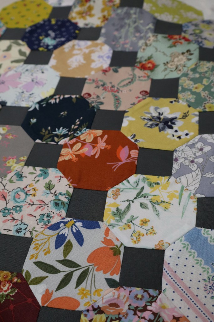
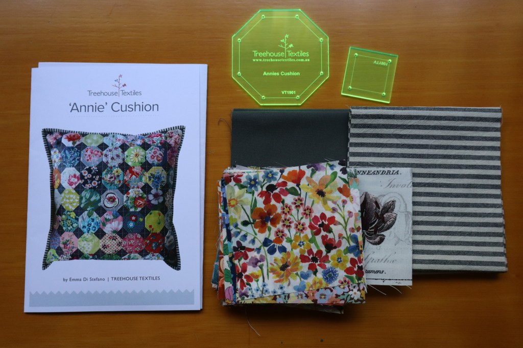
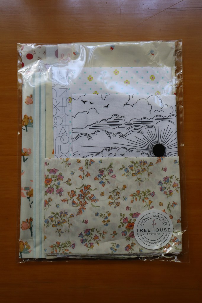
But — here is something I’ve been doing in the meantime, hand-stitching the top for an “Annie Cushion” from Treehouse Textiles. I was going to say “my first and last” hand-stitching project, as I didn’t really enjoy the process much, I confess, though after pressing it and seeing that it turned out much tidier than I expected (!), I’m a bit more optimistic. (I didn’t get to visit the shop in person — alas — but had the cushion kit and a low-volumes bundle send to my friend’s house, “quite northwards” though still in Melbourne. The low-volumes fabrics are for a “Lucy Diamond” quilt-to-be …)
I’m still a bit at sea with WordPress — but I got a few things rearranged for the blog layout, at least got rid of that interloper’s “About Me” (for those of you who didn’t see it, this particular template came with an “About Me” that was about somebody else, some presumably-generic person, and perplexingly, that actually posted on this blog). Anyway —
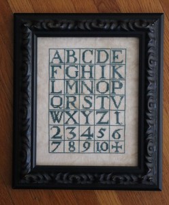
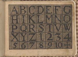
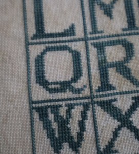
I have managed to finish a cross stitch project, an alphabet that was included in New Künstlichs Modelbuch, a small book of needlework charts published by Bernhard Jobin ca. 1600, and generously reproduced by the Met.
I re-charted mine to be oriented vertically and widened it a smidge, as I wanted it to fit this particular frame, but the letters themselves are as in the original. It’s worked on the piece of 36-count “Legacy” by Picture This Plus that I had left over from “Awake My Soul” — it’s a bit too mottled for my taste, and so I decided to use it for this as the letters covered up a lot of it (!). The thread is the lovely “Brethren Blue” from The Gentle Art. (And I’m happy to freely share my chart of the original version, but you’ll have to ask in a comment, as I have no idea yet how to post a PDF here ….)
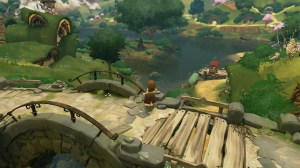
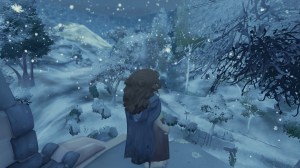
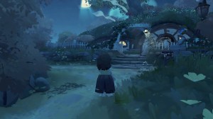
And in other worlds, well, when I first heard about the then-upcoming “be a hobbit” computer game from Wētā Workshop, I thought, “That’s for me!” I waited and waited, and the first reviews when the game was eventually released were not very complimentary, and I thought, “Hmm, I’ll give it a try anyway,” and I’m glad I did. I’m having a lot of fun with it, I have to say! Not being a gamer, I suppose I’m not the best judge of it as a game per se, and there are certainly odd little bugs and glitches here and there, and some things that just don’t make sense (how does a mixing bowl make foods go from tender to crisp, for heaven’s sake!), but you know, sometimes it’s nice just to stop and admire the scenery —
to watch the sun rise, or the snow falling —
to come home after a long day’s foraging or fishing, to a cosy little hobbit hole —
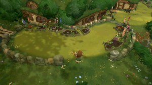
Actually, I’ve “finished” the main goal of the game, which is to make friends with all of the main character hobbits, and now I’m spending my “days” doing Club missions, little goals sort of like merit badges in Scouts — “Catch 5 Softmouth Trout” or “Harvest 3 2-Star Beans” or “Cook a 3-star meal with Eggplant,” which is pleasantly low-key and just the sort of thing I want these days. Even though one dashes by most of the time, I’m very pleased with how I’ve arranged my upper garden —
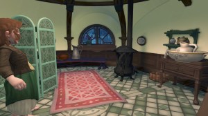
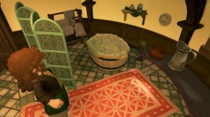
and I have to confess that after Fosco Burrows made me a present of a bath tub, I was so excited that I spent a good real-time hour or so yesterday afternoon turning the original little bedroom off the kitchen into a bath room! I re-tiled the floor and everything! —
(These last two “photos” — yes, there’s a Photo mode, because of course you want to take pictures of all the decorating you’ve done! — were on two different “days,” a rainy evening and a sunny morning, because I took so long trying to get good angles that I fell asleep right there!).
And another thing is that all of the cooking one does makes me very hungry. One of the first things I cooked in-game was Bundle of Sperage Rolled in Bacon — wild asparagus with a wodge of cheese all wrapped up in bacon, oh my goodness! Raised Cheese Bread! Mrs. Cotton’s Amazing Autumn Tart!
Welcome to WordPress! This is your first post. Edit or delete it to take the first step in your blogging journey.
That is the sample text in the “first” WordPress post that is there automatically when one starts a blog.
I feel rather awkward at the moment, like I’ve just moved to a new house and everything’s different and I don’t know where anything is. Unfortunately — continuing with this analogy — I didn’t want to move, and I resent it a bit, and so I’ve been putting things off (as one does), and now it’s getting down to the last minute. This sounds more than a bit whiny, I know — I just need to get past the point where the theme template that I chose still has the theme’s “About” blurb on it — and a “Sign up for a free recipe e-book →” link across the top! and although I paid for a domain name — which you apparently have to do, although this isn’t really clear at the beginning — the address still appears to be something like “33f04f0542-qitrl”. Sigh.
Maybe it’s time to go and watch the rest of the instructional videos …
TypePad is shutting down, effective September 30 — four weeks away. I got an e-mail from them just yesterday. We've been with them since 2005, when we started a private blog to keep in touch with our families while we were in Hong Kong, and it was while we were there that I started "A Bluestocking Knits" — that's twenty years! it's kind of hard to believe. It's a lot of knitting history for me, and of course reading and quilting and, since 2020, counted-stitch and samplers, plus all of the little family details and whatnot that came into it along the way.
I don't know yet what I'm going to do — move to Blogger for free, to WordPress (less expensive than TypePad but with fewer amenities)? The knitting community seems to have pretty much abandoned the blog format since Ravelry came onto the scene, which is disappointing to say the least, though in a way I sort of understand, since long-format posting not only takes more effort and doesn't have the near-immediate gratification that Instagram et al. do. I don't and won't do FaceBook, and I don't really think it serves the crafts community very well anyway — too brief, too transitory — so that's not even under consideration.
Ooof, it has been a long time! I finished my "red work" piece not very long after the previous post, am very happy with it. This is a virtual frame before I blocked it and had it mounted, but I wasn't sure that I could photograph it well once the glass was in. I would be happy to share the chart if anyone is interested.
TypePad is giving me grief again about uploading photos, and so this is will be a bit random, I'm afraid, depending on which photos actually show up (grrr) — this has been written over a couple of days, because it's too frustrating trying to get things to work, and as a result it's only quick recaps except for a long-ish bit I wrote a few days ago in preparation for this much-delayed post. (Hangs head in shame.)
Two mini-quilt placemats, the free “A Bit of History” and a shameless copy of a half-rectangle triangles one by Temecula Quilt Company. The top one is now quilted and bound — it turned out rather bigger than I really expected — quite big for a placement — but there it is, I had fun piecing it, and am happy with the result!
A quilt for my new niece! Just a quick jelly-roll race quilt, as to be honest, I'd left it rather late, but it turned out pretty well. The fabric is "Midnight Garden" by Danielle Leone, un-"baby"-like, but I like the strong colors and all of the little butterflies she can look for.
My "Ferenghan" 1:12 carpet a while back. I don't really like "parking" threads, certainly not as many as I often do on this carpet, and so occasionally I've just kept going until the end of a given thread, which is how I ended up finding, when I'd worked the central field over to the corner turn, that I was one stitch off. I had a Ralphie moment ("I'll fake it! They'll never know!") but of course picked it all out — you can still see the ghost of my optimism there, running up along the innermost border. Sigh. But I have stitched considerably further since this photo was taken, and it's all a distant memory.
A second Summer Festival sling bag, this one for Julia out of scraps from her quilt and the set of table napkins that I made for her on her way to university — this time she is on her way to a semester abroad, in New Zealand. Gosh, that's a long way away (said mother wistfully). I really like this pattern — it's easy, and it makes a good-sized farmer's market or walking-to-the-grocery store bag, and I use mine a lot. Good big pockets, too, inside and out!
More patchwork stars, this time against an off-white Kona Cotton I found in my stash that will do very nicely for the background diamonds! I'm really enjoying these. Not all of the fussy-cut ones are completely successful — the pink one in the second row from the bottom is a really handsome fabric, a beautifully silky heavy cotton, and the flowers themselves are good but the center is definitely a bit, erm, wobbly — but the whitish one next to it was quite pleasing to see!
I've also been doing a lot of reading — this was actually during the summer. I enjoyed the Thursday Murder Club series immensely, and highly recommend it.
My mother passed this book along to me, thinking I'd enjoy it, and indeed the premise was intriguing: two sisters are evacuated from 1939 London to a small village outside of Oxford, but tragically little Flora, barely six years old, is lost in the nearby river, and Hazel, who grows up to work in a rare-book shop in 1960 London, is haunted by her grief and sense of failed responsibility, so much that when a new children's book arrives in the shop full of stories about the secret and magical land that Hazel invented for Flora — and told to no one else — Hazel is consumed with the need to find out if Flora is somehow still alive. And this premise was enough to keep me reading to the end, but I must admit that I nearly threw the book across the room a number of times, frustrated by the anachronisms and Americanisms on pretty much every page. Why would you set a story in a particular time and place if you can't be bothered to find out how people spoke and behaved in that time and place?
There are the usual Americanisms like "lived on So-and-so Street" for "in" (which I'm sorry to say is now so common in Britain that even people who should remember the 1980s have become accustomed to it) or "pants" for "trousers," but also any number of grammatical anachronisms. I accept, albeit very reluctantly, that the use of "so" as a stand-alone intensifier is now widespread and firmly entrenched, but even by the 1960s people didn't say "that's so true" or "her eyes were so wide" without what would have then been considered the rest of the sentence — "that I can't deny it," "that her eyebrows nearly disappeared".
Signs announcing "Oxford" greet the author's trainload of evacuated children — despite the fact that fingerposts and railway station signs were removed at the beginning of the war, to confuse and/or delay enemy agents or invaders. People take trains to and from 1939 London regularly, and taxis to and from the station — despite decreased regular service leading to massive delays and overcrowding of trains, government discouragement of civilian travel, and the rationing in force from September 1939 that made petrol increasingly difficult to come by. People have "cuppas" constantly — and while the act itself was certainly true of the British long before 1939, it is unlikely that any but lower-class folk would refer to it as such — the first known use of the word, according to Merriam-Webster, was 1934, and would have been thought slangy a mere five years later in a still very class-conscious Britain. There seem to be an extraordinary number of Gaelic names in the author's 1939 Oxford — Kelty, Aiden (sic), Father (sic) Fenelly, Bridie Aberdeen for heaven's sake — and a very anachronistic tendency of the adults to prefer being called by their first names, even by children (the mother with whom the girls are billeted might allow it, perhaps, at a very long stretch, but not the village policeman). Even the pet names are jarring — I can't imagine, say, Noel Coward or John Mills in 1939 or James Mason or Kenneth More in 1960 calling even a fiancée "my love" — "darling," certainly, but the popularity of the latter by the 1930s somehow decreases its emotional fervor, even if it does clearly mean something very similar.
And if the title of this post has got you, as it has me, humming a certain song, here's the full version!
This band was adapted from a larger motif — both transcribed by Louisa Pesel — from a German sampler dated 1661, now in the V&A (accession no. 368-1907).
While I was working it, I noticed a flaw in my fabric a little way down, where one of the horizontal threads had broken somehow —
Luckily for me, it was only one thread, and so I winkled the two broken ends out of the weave a bit and pulled them to the back, then with a length of thread that I pulled out from my zigzag at one side, long enough to comfortably hold in the needle, I wove that new thread back in along where the broken one had been. It looks ever-so-slightly obvious at this point because the new thread of course has those tiny creases from the over/under weave and so doesn't sit quite comfortably, but it's subtle enough —
I left the long ends of the replacement thread at the back, in hopes that the blackwork stitching would have plenty of opportunity to catch them down securely!
As for the change of tack, I've been alternately thinking, "There's no way that this is enough thread," and "we-ell, it might make it …." At exactly halfway along, I had used up two of the four skeins I bought at The Attic plus the partial skein left over from "Philadelphia Vine" Of course, each band is going to use a different amount of thread depending on its denseness and the efficiency of my stitching, but even so getting halfway and using more than half of my four skeins of thread means pretty obviously that two skeins likely wouldn't be enough to finish. I have already snuck in a number of strands of the "Cranberry" skein I had on hand, which is a slightly more scarlet red than the "Rosewood" — I've used one strand of each, hoping that the variations would be subtle enough, and I think this is working pretty well.
But at halfway through the ninth band, I thought, "Right, I've got one full skein of 'Rosewood' left," and I'd rather use all of it, if I can, instead of a blend of the two colors, and so I've decided to jump down to the bottom of the chart and work my way up instead, so that any more blends that I need to incorporate will be both minimal and interspersed with the "Rosewood". It seems a bit absurd, looking at how little is actually left to stitch, that a whole skein of silk might not be enough, and maybe I'll laugh at myself when it's finished and I do have "too much" … but getting exactly halfway along and having used up more than half of my thread has made me very skittish indeed!
It was quite a bit of luck, by the way, that the little "ribbon" band landed exactly over my mend, catching those long ends I left. Whew! I'm going to thread that last end under as well —
This quote is from Mary Shelley from one of her lesser-known novels — The Last Man (1826) — and I admit that I have not read it, but I think the quote itself is a good philosophy of life, and I appreciated that the "intricate" part plays very well with all of this blackwork!
I have had a nasty chest cold for the past week, so it also feels good to pick this up again after only being able to gaze weakly at it beside me for two whole days! The little band was adapted by Carol Hanson from a repeated motif on the Jane Bostocke sampler. (For Jane Bostocke, see here at the V&A.) Unfortunately, I don't know the source of the delightfully frivolous band below that except the so-often vexingly unhelpful Pinterest, which band I adapted to make a proper up/down/up "arcade," and also consolidated a bit to fit the space here.
It's all going fairly quickly, which pleases and worries me both, as I don't think PCStitch estimated the amount of silk floss correctly — my supply is looking dangerously low, and I've already worked in the partial skein left over from "Philadelphia Vine". (On the bright side, all of these pictures have loaded properly the very first time as I write this post, huzzah! Simple pleasures.)
My blackwork sampler as of today. I really like this large band — so much 17th-century wackiness going on here!
I debated a long time about whether to use one strand of silk or two, and went with two after mulling over a post on that topic at String or Nothing. Some of the irregularities can certainly be laid at my door, as it were, though sometimes it is that the silk thread is ever-so-slightly heavier in one place than in another, and other times the irregularities in the linen ground push the thread a bit to one side. Still, I'm happy with the two-strands, especially as I can use the loop start, easy and quite secure!
I wasn't sure if these little leaves would read much, as they're so small, but I'm glad they do —
I had a hankering for some blackwork, so here is the beginning of an original sampler, in that beautiful Gloriana silk in "Rosewood". I bought an antique frame on Ebay a few years ago that turned out not to fit my "Virtue Outshines the Stars," so am suiting this one to the frame!
This band went surprisingly quickly, once I realized that breaking it down into vertical components, not horizontal ones, was key to working out the stitching line. It looks surprisingly modern to my eye, but is in fact from Louisa Pesel's book of historical sampler motifs.
Actually, it's Mesa, a two-hour or so drive north of Tucson, but there it is. When David proposed the idea of a trip to visit our friends, I said, "Oh, and maybe we could stop by The Attic in Mesa …?"
(We can also recommend The Cornish Pasty Co. a few doors down, where we lunched afterwards. It's a bit like a slightly down-market pub inside, but don't let that put you off, as the food was delicious. I had bangers and mash in a pasty, a kind of British-food double-whammy!)
But The Attic, oh, The Attic!
Regular visitors here might recognize the piece above, the "Quaker Virtues" by Bygone Stitches, my version of which I finished almost exactly a year ago, but for a moment, I did not. It isn't so obvious in the photo above — I should have put my hand next to it for scale! — but it is tiny, tiny, worked at some astonishingly small scale, I hesitate saying 70-something but it may very well have been 70-something. An amazing accomplishment, and I salute the stitcher!
A treasure trove. Oh, I had thought my eyes lit up at the sight of the wall of framed samplers, but this is like Aladdin's cave — and there is more on revolving racks nearby.
Since I didn't have a list in hand for charts — only for threads and fabrics — and the whole shop leaves one in a bit of a daze (of delight, mind you!), I decided to focus my attention on smaller designers that I don't already know about. A model for "Ann L. Burton" was on the wall, and stayed in my mind as I walked around the shop. I enjoyed the perforated-paper embroidery piece I did last spring so much that when I saw packages of papers I chose the ecru to take home with me. Another stitched model on the wall was "Sarah Welch, 1764," which is a new release from Cross Stitch Antiques, not a "small designer new to me" but I was charmed enough to pick up a copy. And for the other, I have seen images and details of other stitchers' versions of this Mexican band sampler every so often for a few years now, which kept growing on me, as it were, but I could never find it for sale, and so just as I was saying to myself, "I should stop now," I asked one of the salesladies about this and without much trouble at all, she said, "This one? or this one?" and I said, "Yes!" I don't know why it is so difficult to find — I searched "Mexican Band Sampler" and "W: A Mexican Band Sampler" andNeedle Work Press's website with no joy — but now I've got my own copy.
Quite absent-mindedly, I had forgotten to write down the thread count of the linen I wanted for an upcoming project, so I made a lucky guess, really, and somehow got the correct one to use with the "Rosewood" Gloriana, at left below. I like it best on the "Summer Khaki" that it's on in the photo, and so the "Mushroom/Light Mocha" [sic] will wait for something else. The other silks are for another chart I hope to start this year as well.
I had taken a small workbox with me for our visit, and so sitting around in the evenings, I basted and sewed up some more diamonds and stars for my patchwork —
And as a thank-you to our friends, I worked a little cross-stitch piece when we got home — I had come across it quite accidentally, but it fit the bill very well. It is "Arranging Cacti" by Ink Circles, and is conveniently — part of what sold me on it — designed to fit into a 5×7" frame. I had a suitable piece of 30-count linen (in "Mariner's Map" Legacy Linen), but not a single one of the recommended Gentle Arts flosses, so I rummaged through my box(es) of threads and came up with some fairly-logical alternatives —
for Hibiscus, I used Cranberry (except for the prickly pear blossoms, which I did in Classic Colorworks' Gingersnap, just because)
for Shutter Green, I used Jolly Holly
for Mountain Mist, I used Dried Thyme
for Endive, I used Weeks Dye Works' Kudzu
for Pecan Pie, I used Piney Woods, though I ended up eking it out with Walnut, a very similar shade but with more variation)
I think it looks perfect in this frame, which is a basic-but-stylish one from Michael's — Laura cut the mat opening a little larger for me, a risky proposition but she did well.